Difference between revisions of "SOCR EduMaterials Activities PieChart"
m (→Data Type and Format) |
(→Data Type and Format) |
||
| Line 21: | Line 21: | ||
==Data Type and Format== | ==Data Type and Format== | ||
| − | There are two different types of data spreadsheet formats/types that are allowed for plotting Pie-Charts. In both cases, one needs to provide two columns - one of a [http://mathworld.wolfram.com/CategoricalVariable.html categorical variable] (e.g., Name) and one of a [http://onlinestatbook.com/glossary/quantitative_variable.html quantitative variable] (numerical value associated with the name in first column). The different between these is the presence of an additional column in the second case (), which indicates whether the (name, value) pair on this row will be plotted as a pulled out slice in the Pie Chart. | + | There are two different types of data spreadsheet formats/types that are allowed for plotting Pie-Charts. In both cases, one needs to provide two columns - one of a [http://mathworld.wolfram.com/CategoricalVariable.html categorical variable] (e.g., Name) and one of a [http://onlinestatbook.com/glossary/quantitative_variable.html quantitative variable] (numerical value associated with the name in first column). The different between these is the presence of an additional column in the second case (Pullout Flag), which indicates whether the (name, value) pair on this row will be plotted as a pulled out slice in the Pie Chart. |
<center>[[Image:SOCR_Activitites_PieCharts_Dinov_090707_Fig4.jpg|300px]] | <center>[[Image:SOCR_Activitites_PieCharts_Dinov_090707_Fig4.jpg|300px]] | ||
Revision as of 11:13, 7 September 2007
PIE CHARTS
Background
From the many different types of charts available, Pie Charts are most useful for illustrating percentages of a greater whole. Each section of the pie charts represents data from a specific category within the whole pie that creates the total data.
Since Pie Charts provide a clear visualization of the data set, it is easy to grasp the purpose and classification of the presented values.
For more references, go to Wikipedia, How to use Pie Charts, How to Create Pie Charts.
Description
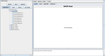
Go to the SOCR Charts and select Pie Charts from the items located on the left. Then select one of the different types of Pie Charts according to your data format and the Chart look-and-feel you desire:

This image of a Pie Chart illustrates the proportions of the data set by a clear 3D visualization.
By selecting the other demonstrations under Pie Charts, notice that any set of data may be more eye appealing by allowing the data to rotate, applying different colors, or even display the images as a Ring Chart:

Data Type and Format
There are two different types of data spreadsheet formats/types that are allowed for plotting Pie-Charts. In both cases, one needs to provide two columns - one of a categorical variable (e.g., Name) and one of a quantitative variable (numerical value associated with the name in first column). The different between these is the presence of an additional column in the second case (Pullout Flag), which indicates whether the (name, value) pair on this row will be plotted as a pulled out slice in the Pie Chart.


Applications
One of the most persuasive elements when proposing data and literature to others is a well-designed chart presentation. For example, students have the ability to display their outcome of a Statistics project by utilizing the Pie Chart as a reference of proportions in the total data set.
For industries, Pie Charts will give them the advantage of organizing their income of different types of products sold to consumers.
Translate this page: