Difference between revisions of "SOCR EduMaterials Activities Difference Chart"
(→Description) |
|||
| (2 intermediate revisions by the same user not shown) | |||
| Line 6: | Line 6: | ||
For references, visit [http://confluence.atlassian.com/display/JIRAEXT/JIRA+Charting+Plugin Difference Chart Example] and [http://www.java2s.com/Code/Java/Chart/JFreeChartDifferenceChartDemo2.htm Difference Chart Java Demonstration]. | For references, visit [http://confluence.atlassian.com/display/JIRAEXT/JIRA+Charting+Plugin Difference Chart Example] and [http://www.java2s.com/Code/Java/Chart/JFreeChartDifferenceChartDemo2.htm Difference Chart Java Demonstration]. | ||
| + | |||
| + | == Summary== | ||
| + | This activity describes the construction of the difference chart in SOCR. The applets can be accessed at [http://www.socr.ucla.edu/htmls/SOCR_Charts.html SOCR Charts] under the Miscellaneous folder. | ||
| + | |||
| + | == Goals== | ||
| + | The purpose of this activity is to: | ||
| + | * display examples of the difference chart in SOCR Applets | ||
| + | * demonstrate how to use the difference chart in specified situations | ||
| + | * show the important of the difference chart | ||
== Description == | == Description == | ||
| Line 14: | Line 23: | ||
The image above is simple illustration of a Difference Chart which compares two graphs – one being red and the other being blue. Notice that the two shaded areas have different colors to easily distinguish when one graph has larger values than the other. The area shaded green is when the red graph has larger values than the blue graph and the region shaded red is when the blue graph has larger values than the red graph. | The image above is simple illustration of a Difference Chart which compares two graphs – one being red and the other being blue. Notice that the two shaded areas have different colors to easily distinguish when one graph has larger values than the other. The area shaded green is when the red graph has larger values than the blue graph and the region shaded red is when the blue graph has larger values than the red graph. | ||
| + | |||
| + | *'''Exercise 1:''' Suppose you are given the temperatures of 2 different cities. City A consists of temperature measures of 76,78,80,81,76 during the week, and city B consists of temperatures 55, 60, 62, 60, 63. Create a difference chart. What conclusions can be drawn? Is there a pattern? | ||
| + | *'''Exercise 2:''' If you are given five variables, can a difference chart be used? Why or why not? | ||
| + | *'''Exercise 3:''' If two variables who are dependent upon each other were graphed with the difference chart, would it be useful? | ||
| + | *'''Exercise 4:''' Given the varying population values of three cities in a year, use the difference chart to display the result. Note the pattern created and what may be the causes of the increases/decreases of population. | ||
| + | |||
| + | == Data Type and Format == | ||
| + | |||
| + | By clicking '''Data''' between the ''Graph'' and ''Mapping'' button, it allows users to input or vary the values of the data set. For Difference Charts, there are two variables required which are the independent variables and the dependent variables of each graph. The independent variable is typically categorical (e.g. Date, Time, etc.) and the dependent variable is quantitative or numerical (e.g., Values, etc.). After entering the data, the applet will graph the sets and shade in the region of difference among them. The image below demonstrates how the data should be entered into the applet: | ||
| + | |||
| + | <center>[[Image:SOCR Activitites Miscellaneous DifferenceChart Chui 090807 Fig2.jpg|400px]]</center> | ||
== Applications == | == Applications == | ||
Latest revision as of 12:53, 4 May 2008
Contents
DIFFERENCE CHART
Background
The Difference Chart usually displays two graphs on one chart with the area of the differences of the two graphs being shaded for easy comparison. It is often useful to distinguish one variable among two or more graphs.
For references, visit Difference Chart Example and Difference Chart Java Demonstration.
Summary
This activity describes the construction of the difference chart in SOCR. The applets can be accessed at SOCR Charts under the Miscellaneous folder.
Goals
The purpose of this activity is to:
- display examples of the difference chart in SOCR Applets
- demonstrate how to use the difference chart in specified situations
- show the important of the difference chart
Description
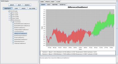
Go to the SOCR Charts and select Miscellaneous from the items located on the left, then select Difference Chart Demo:

The image above is simple illustration of a Difference Chart which compares two graphs – one being red and the other being blue. Notice that the two shaded areas have different colors to easily distinguish when one graph has larger values than the other. The area shaded green is when the red graph has larger values than the blue graph and the region shaded red is when the blue graph has larger values than the red graph.
- Exercise 1: Suppose you are given the temperatures of 2 different cities. City A consists of temperature measures of 76,78,80,81,76 during the week, and city B consists of temperatures 55, 60, 62, 60, 63. Create a difference chart. What conclusions can be drawn? Is there a pattern?
- Exercise 2: If you are given five variables, can a difference chart be used? Why or why not?
- Exercise 3: If two variables who are dependent upon each other were graphed with the difference chart, would it be useful?
- Exercise 4: Given the varying population values of three cities in a year, use the difference chart to display the result. Note the pattern created and what may be the causes of the increases/decreases of population.
Data Type and Format
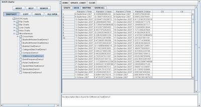
By clicking Data between the Graph and Mapping button, it allows users to input or vary the values of the data set. For Difference Charts, there are two variables required which are the independent variables and the dependent variables of each graph. The independent variable is typically categorical (e.g. Date, Time, etc.) and the dependent variable is quantitative or numerical (e.g., Values, etc.). After entering the data, the applet will graph the sets and shade in the region of difference among them. The image below demonstrates how the data should be entered into the applet:

Applications
One of the most persuasive elements when proposing data and literature to others is a well-designed chart presentation.
Researchers may utilize the Difference Chart whenever comparing two or more variables. Suppose that three products of dish washing liquid are being tested for most effective. After each test, the concentration of dirt is recorded. When updating every trial in their recordings, they may easily take note at which is more effective by noticing the differences among the three graphs that each represent one dish washing liquid.
Translate this page: