Difference between revisions of "SOCR EduMaterials Activities LineChart"
(→Description) |
|||
| (3 intermediate revisions by 2 users not shown) | |||
| Line 1: | Line 1: | ||
== LINE CHARTS == | == LINE CHARTS == | ||
| + | == Summary== | ||
| + | This activity describes the need, general methods and SOCR utilities for line charts. The simulated data may then be easily copied and pasted in different SOCR [http://www.socr.ucla.edu/htmls/SOCR_Analyses.html Analyses] or [http://www.socr.ucla.edu/htmls/SOCR_Charts.html Graphing] tools for further interrogation. | ||
| + | |||
| + | ==Goals== | ||
| + | The aims of this activity are: | ||
| + | * to show the important and usefulness of line charts | ||
| + | * allow users to exercise the process on how to use SOCR line charts | ||
==Background == | ==Background == | ||
| Line 8: | Line 15: | ||
For references, visit [http://en.wikipedia.org/wiki/Line_chart Wikipedia] and [http://www.advsofteng.com/gallery_line.html More Examples]. | For references, visit [http://en.wikipedia.org/wiki/Line_chart Wikipedia] and [http://www.advsofteng.com/gallery_line.html More Examples]. | ||
| − | |||
== Description == | == Description == | ||
| Line 21: | Line 27: | ||
<center>[[Image:SOCR_Activities_LineCharts_Chui_090607_Fig2.jpg|400px]]</center> | <center>[[Image:SOCR_Activities_LineCharts_Chui_090607_Fig2.jpg|400px]]</center> | ||
| + | |||
| + | == Examples & Exercises == | ||
| + | *'''Exercise 1:''' Suppose you are in a chemistry lab and have been experimenting upon three types of chemicals. Use the line chart to display their behaviors under different temperatures. Can any conclusions or relationships between the chemicals be drawn? What factors may affect the illustration of line charts in a physical experimentation? | ||
| + | *'''Exercise 2:''' After strengthening your knowledge in regards to line charts, are there any correlations that may be formed from using line charts? How are the beneficial compared to other types of charts? What are the best kinds of data to use for line charts? | ||
== Data Type and Format == | == Data Type and Format == | ||
| Line 27: | Line 37: | ||
<center>[[Image:SOCR_Activities_LineCharts_Chui_090707_Fig3.jpg|400px]]</center> | <center>[[Image:SOCR_Activities_LineCharts_Chui_090707_Fig3.jpg|400px]]</center> | ||
| + | |||
| + | ==Example (Human Heights and Weights)== | ||
| + | |||
| + | Generate a Line Chart of the first 20 pairs of the [[SOCR_Data_Dinov_020108_HeightsWeights | Human Height and Weight data]]. Copy the data with your mouse. | ||
| + | <center>[[Image:SOCR_Activities_ScatterCharts_Dinov_020808_Fig3.jpg|500px]]</center> | ||
| + | |||
| + | Paste it in the [http://socr.ucla.edu/htmls/SOCR_Charts.html SOCR Line Chart (Demo 1b)]. | ||
| + | <center>[[Image:SOCR_Activities_LineCharts_Dinov_020808_Fig5.jpg|500px]]</center> | ||
| + | |||
| + | You should get Line plots for height and weight like this. Notice the summary statistics on the bottom! | ||
| + | <center>[[Image:SOCR_Activities_LineCharts_Dinov_020808_Fig6.jpg|500px]]</center> | ||
== Applications == | == Applications == | ||
Latest revision as of 14:11, 11 May 2008
Contents
LINE CHARTS
Summary
This activity describes the need, general methods and SOCR utilities for line charts. The simulated data may then be easily copied and pasted in different SOCR Analyses or Graphing tools for further interrogation.
Goals
The aims of this activity are:
- to show the important and usefulness of line charts
- allow users to exercise the process on how to use SOCR line charts
Background
Line Charts are often used for physical experiments. From the tables of collected data, values of physical processes can be visually analyzed by the use of line graphs. These charts are typically two-dimensional with unique values that are consecutively connected by a straight line. The dependent variable appears on the vertical axis and the independent variable appears on the horizontal axis.
Physical characteristics such as behaviors of the physical experiment may be easily determined by observing the visualizations of Line Charts.
For references, visit Wikipedia and More Examples.
Description
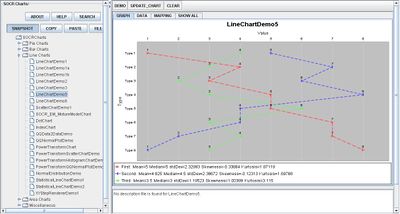
Go to the SOCR Charts and select Line Charts from the items located on the left, then select the demonstrations for Line Charts:

The image above is a demonstration of a Line Chart with multiple graphs. Notice that the values are connected by a straight line. In this graph, the independent variable lies on the horizontal axis and the dependent variable lies on the vertical axis.
In some events, the independent variables could lie on the vertical axis and the dependent variable could lie on the horizontal axis as long as the values are consistent with the graph. The image below demonstrates this:

Examples & Exercises
- Exercise 1: Suppose you are in a chemistry lab and have been experimenting upon three types of chemicals. Use the line chart to display their behaviors under different temperatures. Can any conclusions or relationships between the chemicals be drawn? What factors may affect the illustration of line charts in a physical experimentation?
- Exercise 2: After strengthening your knowledge in regards to line charts, are there any correlations that may be formed from using line charts? How are the beneficial compared to other types of charts? What are the best kinds of data to use for line charts?
Data Type and Format
By clicking Data inbetween the Graph and Mapping button, it allows users to input or vary the values of the data set. There are two different types of data that is allowed for plotting data points which are one categorical variable (e.g., Series) and the remaining values as quantitative variables (numerical values).

Example (Human Heights and Weights)
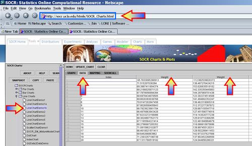
Generate a Line Chart of the first 20 pairs of the Human Height and Weight data. Copy the data with your mouse.

Paste it in the SOCR Line Chart (Demo 1b).

You should get Line plots for height and weight like this. Notice the summary statistics on the bottom!

Applications
One of the most persuasive elements when proposing data and literature to others is a well-designed chart presentation.
For example, scientists may want to compare values of experiments. Suppose researchers are comparing the maximum speed of three different types of engines. Setting the independent variable as the trial number, the dependent variable will be the maximum speed measured for the corresponding event.
For students in physical sciences labs, graphing values of experiments in Line Charts may help present their outcomes in a more appealing way.
Translate this page: