Difference between revisions of "SOCR EduMaterials Activities NormalDistribution"
| Line 15: | Line 15: | ||
The image above is a demonstration of a Normal Distribution. Notice the bell shaped curve that is centered at 0 on the horizontal axis. | The image above is a demonstration of a Normal Distribution. Notice the bell shaped curve that is centered at 0 on the horizontal axis. | ||
| + | == Data Type and Format == | ||
| + | |||
| + | By clicking '''Data''' between the ''Graph'' and ''Mapping'' button, it allows users to input or vary the values of the data set. For the Normal Distribution, the mean and standard deviation are the only two important values in the table. Adjusting the mean will shift the graph and varying the standard deviation will change the range or horizontal length of the graph: | ||
| + | |||
| + | <center>[[Image:SOCR_Activities_NormalCharts_Chui_090707_Fig2.jpg|400px]]</center> | ||
== Applications == | == Applications == | ||
Revision as of 15:55, 7 September 2007
NORMAL DISTRIBUTION
Background
Also known as the Gaussian Distribution, the Normal Distribution is often associated with the bell curve because the graph resembles the shape of a bell. The Normal Distribution is essential when modeling quantitative data in natural environments. Statistical data may be implemented in these graphs as the mean, variance, and standard deviation may be labeled.
For references, visit Wikipedia and WolFram.
Description
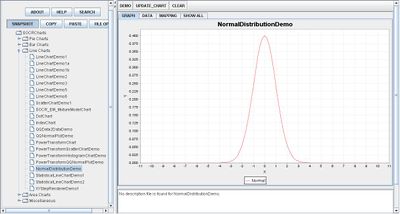
Go to the SOCR Charts and select Line Charts from the items located on the left, then select the demonstration for Normal Distribution:

The image above is a demonstration of a Normal Distribution. Notice the bell shaped curve that is centered at 0 on the horizontal axis.
Data Type and Format
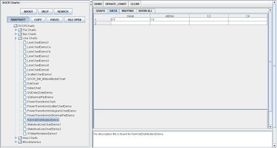
By clicking Data between the Graph and Mapping button, it allows users to input or vary the values of the data set. For the Normal Distribution, the mean and standard deviation are the only two important values in the table. Adjusting the mean will shift the graph and varying the standard deviation will change the range or horizontal length of the graph:

Applications
One of the most persuasive elements when proposing data and literature to others is a well-designed chart presentation.
Suppose a professor wants to grade his students based on the Normal Distribution Graph in which a small percentage of the class will receive A’s and F’s while the majority of the class will receive C’s.
Translate this page: