Difference between revisions of "SOCR EduMaterials Activities BarCharts XYPlot"
(→Background) |
(→Description) |
||
| Line 16: | Line 16: | ||
== Description == | == Description == | ||
| − | Go to the [http://socr.ucla.edu/htmls/SOCR_Charts.html SOCR Charts] and select '''Bar Charts''' from the items located on the left. | + | Go to the [http://socr.ucla.edu/htmls/SOCR_Charts.html SOCR Charts] and select '''Bar Charts''' from the items located on the left. Click on the Miscellaneous folder and then on BarChartsDemo. The demonstration data can be viewed by clicking on DATA. Clicking on MAPPING you can choose the variables. Clicking on SHOW ALL the applet will present the graph, the data, and the mapping environment. Let’s clear this data set (click on CLEAR) so that we can enter our own data. After you click on CLEAR button, click on the DATA tab to enter data into the spreadsheet |
<center>[[Image:SOCR_Activitites_BarCharts_XYPlot_Chui_090507_Fig1.jpg|400px]]</center> | <center>[[Image:SOCR_Activitites_BarCharts_XYPlot_Chui_090507_Fig1.jpg|400px]]</center> | ||
| Line 27: | Line 27: | ||
<center>[[Image:SOCR_Activitites_BarCharts_XYPlot_Chui_090507_Fig3.jpg|400px]]</center> | <center>[[Image:SOCR_Activitites_BarCharts_XYPlot_Chui_090507_Fig3.jpg|400px]]</center> | ||
| + | |||
| + | *'''Example 1:''' If you were given the frequencies of drivers running a red light at a busy intersection every ten minutes, woud the bar chart be helpful to display the outcome? If so, use SOCR to do so. | ||
| + | |||
| + | *'''Example 2:''' Suppose you want to know the total number of students that attend class regularly, twice a week, or rarely in a semester. Use the SOCR Bar Chart to help display the information. | ||
== Data Type and Format == | == Data Type and Format == | ||
Revision as of 08:53, 3 May 2008
Contents
BAR CHARTS
XY PLOT
Background
When comparing groups of data, Bar Charts are one of the best approaches for single category data analysis.
With two variables, X and Y, these Bar Charts are used for displaying the values for each variable represented by column length extending from each X-Y point. Each bar shows the contribution of two or more variable or the total, and the length is the sum of the parts that make up the total data set.
For reference: XY Plot
Goals
- To illustrate the important of bar charts in displaying information
- To show how to use SOCR Bar Chart applet and apply to every day activities
Description
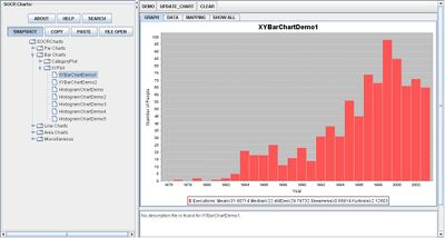
Go to the SOCR Charts and select Bar Charts from the items located on the left. Click on the Miscellaneous folder and then on BarChartsDemo. The demonstration data can be viewed by clicking on DATA. Clicking on MAPPING you can choose the variables. Clicking on SHOW ALL the applet will present the graph, the data, and the mapping environment. Let’s clear this data set (click on CLEAR) so that we can enter our own data. After you click on CLEAR button, click on the DATA tab to enter data into the spreadsheet

The first two set of demonstrations are basic XY Plot Bar Charts:

The Histogram Demonstration Charts are categorized as XY Plot Charts because they display the values for each variable. One difference from the Histogram Bar Charts is that the Dependent variable is the Frequency, or how many times the specific data appears, of the data set.
- Example 1: If you were given the frequencies of drivers running a red light at a busy intersection every ten minutes, woud the bar chart be helpful to display the outcome? If so, use SOCR to do so.
- Example 2: Suppose you want to know the total number of students that attend class regularly, twice a week, or rarely in a semester. Use the SOCR Bar Chart to help display the information.
Data Type and Format
By clicking Data inbetween the Graph and Mapping button, it allows users to input or vary the values of the data set. There are two different types of data that is allowed for plotting data points which are the independent variable (e.g., Series Number, Time, Date, etc.) and the dependent variable (e.g., Frequency, Values, etc.). The image below illustrates this:

Applications
One of the most persuasive elements when proposing data and literature to others is a well-designed chart presentation. The XY Plot Bar Charts are very useful when comparing two variables of data.
For example, suppose students are issued a project to compare the opinions of favoring soda between age groups. The Independent variable may be intervals of every 5 years among their sample of population, and the dependent variable may represent the outcome of the individual preferences.
For industries, XY Plot Bar Charts may be applied to illustrate their growth of the company in regards to their production.
Translate this page: