SOCR MotionCharts Earthquakes
Revision as of 17:15, 25 July 2011 by JayZzz (talk | contribs) (Created page with '== SOCR MotionCharts Activities - California Earthquakes Data Activity== '''Goal:''' Illustrate the use of SOCR Motion Charts using the California Earthqua…')
SOCR MotionCharts Activities - California Earthquakes Data Activity
Goal: Illustrate the use of SOCR Motion Charts using the California Earthquakes Data by visualizing relationships between multiple variables, including time variables.
Data: California Earthquakes Data. Data with earthquake locations, magnitudes, depths, and various other variables.
Activity
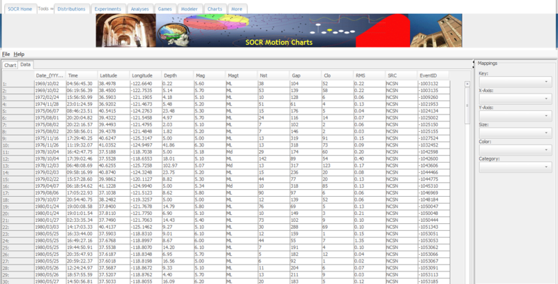
- Go to the California Earthquakes Data and find the table with the dataset. Select all of the data, including the headers, and copy it (Ctrl+C on Windows and Command+C on Mac).
- Go to the SOCR Motion Charts: http://socr.ucla.edu/SOCR_MotionCharts/
- Select the "Data" tab, click on the first white cell of the table and paste in the data that we have just copied (Ctrl+V on Windows and Command+V on Mac).
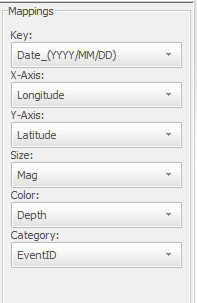
- On the right side of the page, there will be a panel called “mappings” with drop-down menus.
- Key should be your time variable. We can first put in the “Date_(YYYY/MM/DD)” variable. If you want to see all of the data on the chart at the same time, leave this blank.
- X-axis and Y-axis should be the Longitude and Latitude variables, respectively. Earthquakes will show up as bubbles on the chart, in the correct geographical locations relative to each other.
- Size is the variable which will govern the size of the bubbles on the chart. We will choose “Mag” as the size variable. This way, earthquakes with larger magnitudes will be represented by a bigger bubble.
- Color is the variable which will govern the color of the bubbles on the chart. We will choose “Depth” as the color variable. Earthquakes with greater depths will be red.
- Category is the variable that differentiates the bubbles. We want each bubble to be a different earthquake, so we choose “EventID” for this option.
Our selections for our mappings are as follows:
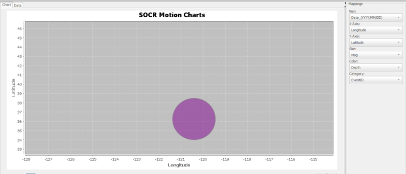
- Now click on the "Chart" tab:
- Each bubble represents one earthquake. Because we have longitude and latitude data, these bubbles are in the correct geographical locations relative to each other. The larger the bubble, the larger the magnitude for that earthquake. Red bubbles are earthquakes with high values for their depth. You can mouse over a bubble to see the Event ID of the earthquake. Notice that because we have included a time variable, we can use the scroll bar at the bottom or the play button to cycle through each earthquake, ordered by the time that it occurred.
- Make sure the seeker button is at the very left side, and press play. Each bubble that pops up represents a single earthquake. The size and color of the bubble represents the magnitude and depth of the earthquake, respectively.
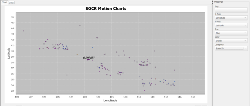
- Now leave the Key dropdown menu blank. All of the earthquakes will now be displayed at the same time:
Translate this page:


