SOCR EduMaterials Activities Difference Chart
DIFFERENCE CHART
Background
The Difference Chart usually displays two graphs on one chart with the area of the differences of the two graphs being shaded for easy comparison. It is often useful to distinguish one variable among two or more graphs.
For references, visit Difference Chart Example and Difference Chart Java Demonstration.
Description
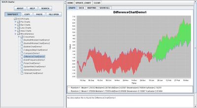
Go to the SOCR Charts and select Miscellaneous from the items located on the left, then select Difference Chart Demo:

The image above is simple illustration of a Difference Chart which compares two graphs – one being red and the other being blue. Notice that the two shaded areas have different colors to easily distinguish when one graph has larger values than the other. The area shaded green is when the red graph has larger values than the blue graph and the region shaded red is when the blue graph has larger values than the red graph.
Data Type and Format
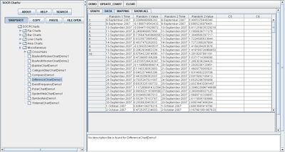
By clicking Data between the Graph and Mapping button, it allows users to input or vary the values of the data set. For Difference Charts, there are two variables required which are the independent variables and the dependent variables of each graph. The independent variable is typically categorical (e.g. Date, Time, etc.) and the dependent variable is quantitative or numerical (e.g., Values, etc.). After entering the data, the applet will graph the sets and shade in the region of difference among them. The image below demonstrates how the data should be entered into the applet:

Applications
One of the most persuasive elements when proposing data and literature to others is a well-designed chart presentation.
Researchers may utilize the Difference Chart whenever comparing two or more variables. Suppose that three products of dish washing liquid are being tested for most effective. After each test, the concentration of dirt is recorded. When updating every trial in their recordings, they may easily take note at which is more effective by noticing the differences among the three graphs that each represent one dish washing liquid.
Translate this page: