SOCR MotionCharts CAOzoneData
Contents
SOCR MotionCharts Activities - California Ozone Data Activity
Summary
This activity demonstrates the usage and functionality of SOCR MotionCharts using the SOCR California Ozone dataset.
Goals
The aims of this activity is to:
- demonstrate data import, MotionChart data manipulations and graphical data interpretation
- explore the interactive graphical visualization of real-life multidimensional datasets
- data navigation from different directions (using data mappings).
Background
Suppose we are asked to analyze a complex dataset that included observational multivariate ozone depletion data. The data included California Ozone measurements from 20 locations between 1980 and 2006. The figure on the right illustrates a dynamic interactive map of the geographic locations of the data measurements. This dataset consists of 540 rows and 22 variables. The goals of the study were to identify relationships and associations between the variables and map geographically the significant ozone layer effects. Any such quantitative study requires a preliminary exploratory data analysis. The complexity of the dataset and the intrinsic measurement characteristics of the ozone data demands a new approach to visualization and exploration of these heterogeneous measurements.
Case Study
This Ozone pollution case study addresses the following specific driving environmental challenges:
- Are there temporal changes in California Ozone?
- What is the geographic distribution of the California Ozone pollution and it it changing with time?
The following chart illustrates the interpretation of the Ozone data in terms of the particulate (particles per million, ppm) recordings, according to the National Oceanic and Atmospheric Administration's (NOAA) Air Quality Index (AQI).
Temporal changes in California Ozone
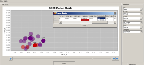
- Observation: Notice the annualized increase of the ozone pollution with time (increase of the proportion of hot-colored bubbles with time).
- Motion Chart: Use the following variable-mapping to demonstrate the significant time effect on the increase of the ozone pollution as measured by ppm recordings:
| Variables | ||||||
|---|---|---|---|---|---|---|
| SOCR MotionChart Property | Key | X-Axis | Y-Axis | Size | Color | Category |
| Data Column Name | Year | MTN_1 | MTH_8 | HI_COVER | ANNUAL | Location |
- You should see an image like this one shown below. Play this motion charts by clicking the Play button and observe the increase of hot-colored bubbles in the chart as time goes from 1980 to 2006.

Geographic distribution of of California Ozone pollution
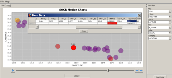
- Observation: The ozone pollution appears to be a more geographically spread out phenomenon in the 2000's, compared to the 1980's -- most of the bubbles cluster together in later years, whereas there were wider geographic-driven fluctuations in the ozone particles in the earlier years. The size of the bubbles reflects the maximum annual pollution and the bubble color indicates the average annual ozone pollution -- hot-colors represent high and cool-colors represent low ozone pollution levels, respectively.
- Motion Chart: Use the following variable-mapping to demonstrate the significant geographic temporal re-distribution of the ozone pollution as measured by ppm recordings:
| Variables | ||||||
|---|---|---|---|---|---|---|
| SOCR MotionChart Property | Key | X-Axis | Y-Axis | Size | Color | Category |
| Data Column Name | Year | LONGITUDE | LATITUDE | HI_COVER | ANNUAL | Location |
- You should see an image like this one shown below. In this mapping, each bubble corresponds spatially to a geographic location, just like in the geographic-map above. Play this motion charts by clicking the Play button and observe the increase of hot-colored bubbles in later years at geographic locations which did not show unhealthy ozone pollution levels int he early years.

Description
In addition to this activity, open 2 more browser tabs - one pointing to the SOCR MotionCharts applet and the other displaying the SOCR California Ozone dataset. The image below shows this setting.


Activity
- Using the mouse, copy the SOCR California Ozone dataset, click on the first cell (top-left) in the DATA tab of the SOCR Motion Charts applet, and paste the data in the spreadsheet.

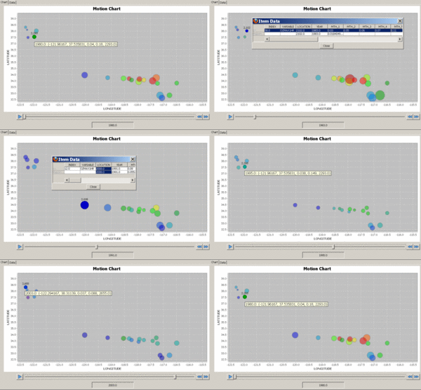
- Next, you need to map the column-variables to different properties it the SOCR MotionChart. For example, you can us the following mapping:
| Variables | ||||||
|---|---|---|---|---|---|---|
| SOCR MotionChart Property | Key | X-Axis | Y-Axis | Size | Color | Category |
| Data Column Name | Year | Longitude | Latitude | MTH_1 | MTN_7 | Location |
The figures below represent snapshots of the generated dynamic SOCR motion chart. In the real applet, you can play (animate) or scroll (1-year steps) through the years (1980, ..., 2006). Notice the position change between different snapshots of the time slider on the bottom of these figures. Also, mouse-over a blob triggers a dynamic graphical pop-up providing additional information about the data for the specified blob in the chart.
You can also change what variables are mapped to the following SOCR MotionCharts properties:
- Key, X-Axis, Y-Axis, Size, Color and Category.

Data type and format
SOCR Motion Charts currently accepts three types of data: numbers, dates/time, and strings. With these data types, we feel that the application is able to handle the majority of data out here. We use the natural ordering of these types as defined by Java however. While many types of data can be interpreted as a string, it may not make sense to use lexicological ordering on all the different types. When designing SOCR Motion Charts, we took this into consideration and designed the application so that it can easily be extended to provide a greater variety of interpreted types. Thus, a developer should be able to easily provide better type interpretation for particular types of data.
Applications
The SOCR MotionCharts can be used in a variety of applications to visualize dynamic relationships in multidimensional data in up to four dimensions and a fifth temporal component. Its design and implementation allow for extensions allowing and supporting higher dimensions plug-ins. The overall purpose of SOCR MotionCharts is to provide users with a way to visualize the relationships between multiple variables over a period of time in a simple, intuitive and animated fashion.
Translate this page:


