SMHS LinearModeling
Scientific Methods for Health Sciences - Linear Modeling
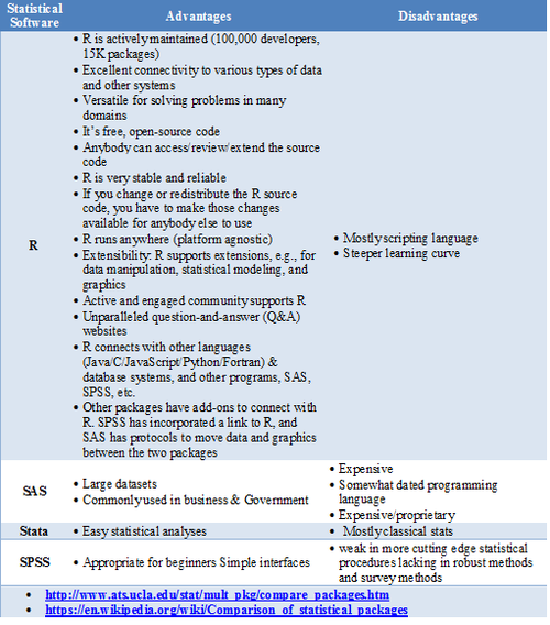
Statistical Software- Pros/Cons Comparison
GoogleScholar Research Article Pubs
| Year | R | SAS | SPSS |
|---|---|---|---|
| 1995 | 8 | 8620 | 6450 |
| 1996 | 2 | 8670 | 7600 |
| 1997 | 6 | 10100 | 9930 |
| 1998 | 13 | 10900 | 14300 |
| 1999 | 26 | 12500 | 24300 |
| 2000 | 51 | 16800 | 42300 |
| 2001 | 133 | 22700 | 68400 |
| 2002 | 286 | 28100 | 88400 |
| 2003 | 627 | 40300 | 78600 |
| 2004 | 1180 | 51400 | 137000 |
| 2005 | 2180 | 58500 | 147000 |
| 2006 | 3430 | 64400 | 142000 |
| 2007 | 5060 | 62700 | 131000 |
| 2008 | 6960 | 59800 | 116000 |
| 2009 | 9220 | 52800 | 61400 |
| 2010 | 11300 | 43000 | 44500 |
| 2011 | 14600 | 32100 | 32000 |
require(ggplot2)
require(reshape)
Data_R_SAS_SPSS_Pubs <-read.csv('https://umich.instructure.com/files/522067/download?download_frd=1', header=T)
df <- data.frame(Data_R_SAS_SPSS_Pubs)
# convert to long format
df <- melt(df ,  id.vars = 'Year', variable.name = 'Time')
ggplot(data=df, aes(x=Year, y=value, colour=variable, group = variable)) +  geom_line() + geom_line(size=4) + labs(x='Year', y='Citations')
Quality Control
Questions:
- Is the data what it’s supposed to (does it represent the study cohort/population)?
- How to inspect the quality of the data?
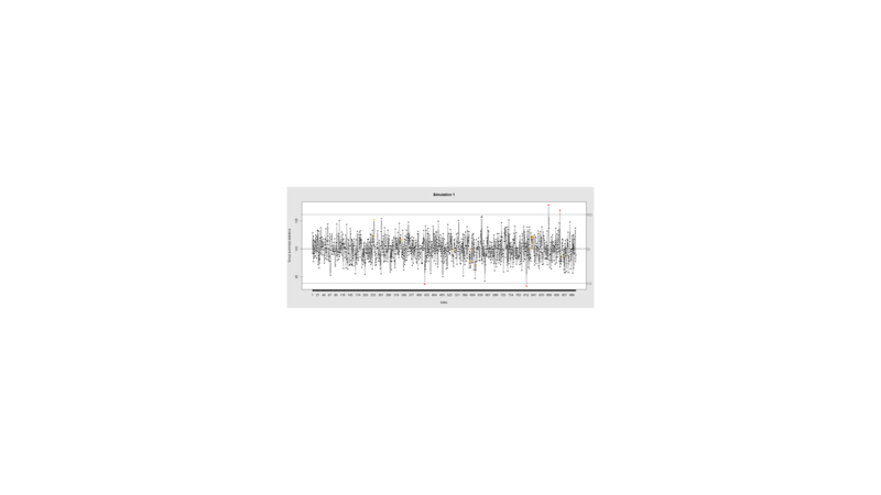
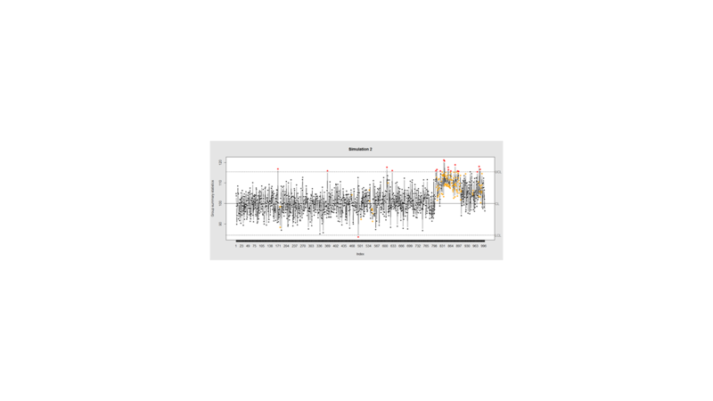
Data Quality Control (QC) and Quality Assurance (QA) represent important components of all modeling, analytics and visualization that precede all subsequent data processing steps. QC and QA may be performed manually or automatically. Statistical quality control involves quantitative methods for monitoring and controlling a process or data derived from observing a natural phenomenon. For example, is there evidence in the plots below of a change in the mean of these processes?
# simulate data with base value of 100 w/ normally distributed error
# install.packages("qcc")
library(qcc)
demo.data.1 <- rep(100, 1000) + rnorm(1000, mean=0, sd=2)
qcc(demo.data.1, type="xbar.one", center=100, add.stats=FALSE,
   title="Simulation 1", xlab="Index")
Now let’s introduce a trend
# first 800 points have base value of 100 w/ normally distributed error,
# next 100 points have base value of 105 w/ normally distributed error
# last 100 points have base value of 110 w/ normally distributed error
M <- 110
SD=5
demo.data.2 <- c(rep(100, 800), rep(M, 100), rep(100+(M-100)/2, 100)) + rnorm(1000, mean=0, sd=SD)
qcc(demo.data.2, type="xbar.one", center=100, add.stats=FALSE,
   title="Simulation 2", xlab="Index")
Our goal is to use statistical quality control to automatically identify issues with the data. The qcc package in R provides methods for statistical quality control – given the data, it identifies candidate points as outliers based on the Shewhart Rules. Color-coding the data also helps point out irregular points.
The Shewhart control charts rules (cf. 1930’s) are based on monitoring events that unlikely when the controlled process is stable. Incidences of such atypical events are alarm signals suggesting that stability of the process may be compromised and the process is changed.
An instance of such an unlikely event is the situation when the upper/lower control limits (UCL or LCL) are exceeded. UCL and LCL are constructed as ±3 limits, indicating that the process is under control within them. Additional warning limits (LWL and UWL) are constructed at ±2 or ±. Other rules specifying events having low probability when the process is under control can be constructed:
1. One point exceeds LCL/UCL.
2. Nine points above/below the central line.
3. Six consecutive points show increasing/decreasing trend.
4. Difference of consecutive values alternates in sign for fourteen points.
5. Two out of three points exceed LWL or UWL limits.
6. Four out of five points are above/below the central line and exceed ± limit.
7. Fifteen points are within ± limits.
8. Eight consecutive values are beyond ± limits.
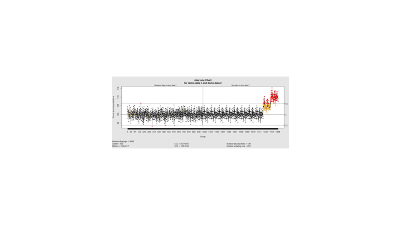
We can define training/testing dataset within qcc by adding the data we want to calibrate it with as the first parameter (demo.data.1), followed by the new data (demo.data.2) representing the test data.
#example using holdout/test sets
demo.data.1 <- rep(100, 1000) + rnorm(1000, mean=0, sd=2)
demo.data.2 <- c(rep(100, 800), rep(105, 100), rep(110, 100)) + rnorm(100, mean=0, sd=2)
MyQC <- qcc(demo.data.1, newdata=demo.data.2, type="xbar.one", center=100, add.stats=FALSE, title="Simulation 1 vs. 2", xlab="Index")
plot(MyQC) # , chart.all=FALSE)
# add warning limits at 2 std. deviations
MyQC2 <- qcc(demo.data.1, newdata=demo.data.2, type="xbar.one", center=100, add.stats=FALSE,  title="Second Simulation 1 vs. 2", xlab="Index")
warn.limits <- limits.xbar(MyQC2$\$$center, MyQC2$\$$std.dev, MyQC2$\$$sizes, 0.95)
 plot(MyQC2, restore.par = FALSE)
 abline(h = warn.limits, lty = 2, lwd=2, col = "blue")

 ## limits.xbar(center, std.dev, sizes, conf)
 Center = sample/group center statistic
 Sizes= samples sizes.
 std.dev= within group standard deviation.
 Conf= a numeric value used to compute control limits, specifying the number of standard deviations (if conf > 1) or the confidence level (if 0 < conf < 1)

[[Image:SMHS_LinearModeling_Fig3.png|800px]]

Natural processes may have errors that are non-normally distributed. However, using (appropriate) transformations we can often normalize the errors.

We can use thresholds to define zones in the data where each zone represents, say, one standard deviation span of the range of the dataset.

 find_zones <- function(x) {
  x.mean <- mean(x)
  x.sd <- sd(x)
  boundaries <- seq(-3, 3)
  # creates a set of zones for each point in x
  zones <- sapply(boundaries, function(i) {
    i * rep(x.sd, length(x))
  })
  zones + x.mean
 }
 head(find_zones(demo.data.2))

 evaluate_zones <- function(x) {
  zones <- find_zones(x)
  colnames(zones) <- paste("zone", -3:3, sep="_")
  x.zones <- rowSums(x > zones) - 3
  x.zones
 }

 evaluate_zones(demo.data.2)

 find_violations <- function(x.zones, i) {
  values <- x.zones[max(i-8, 1):i]
  # rule4 <- ifelse(any(values > 0), 1,
  rule4 <- ifelse(all(values > 0), 1,
                  ifelse(all(values < 0), -1,
                         0))
  values <- x.zones[max(i-5, 1):i]
  rule3 <- ifelse(sum(values >= 2) >= 2, 1,
                  ifelse(sum(values <= -2) >= 2, -1,
                         0))
  values <- x.zones[max(i-3, 1):i]
  rule2 <- ifelse(mean(values >= 3) >= 1, 1,
                  ifelse(mean(values <= -3) >= 1, -1,
                         0))
  #values <- x.zones[]
 values <- x.zones[max(i-3, 1):i]
 rule1 <- ifelse(any(values > 2), 1,
                  ifelse(any(values < -2), -1,
                         0))
  c("rule1"=rule1, "rule2"=rule2, "rule3"=rule3, "rule4"=rule4)
 }

 find_violations(evaluate_zones(demo.data.2), 20)

Now we can compute the rules for each point and assign a color to any violations.

 library("plyr")
 compute_violations <- function(x, start=1) {
  x.zones <- evaluate_zones(x)
  results <- ldply (start:length(x), function(i) {
    find_violations(x.zones, i)
  })
  results$\$$color <- ifelse(results$\$$rule1!=0, "pink",
                          ifelse(results$\$$rule2!=0, "red",
                                ifelse(results$\$$rule3!=0, "orange",
                                        ifelse(results$\$$rule4!=0, "yellow",
                                              "black"))))
 results
}

tail(compute_violations(demo.data.2))
Now let’s make a quality control chart.
.....
....
- SOCR Home page: http://www.socr.umich.edu
Translate this page:


