Test
Contents
Scientific Methods for Health Sciences - Linear Modeling
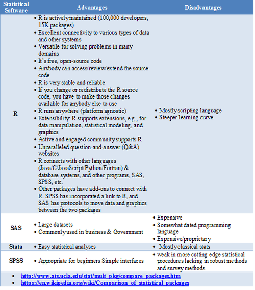
Statistical Software- Pros/Cons Comparison
GoogleScholar Research Article Pubs
| Year | R | SAS | SPSS |
|---|---|---|---|
| 1995 | 8 | 8620 | 6450 |
| 1996 | 2 | 8670 | 7600 |
| 1997 | 6 | 10100 | 9930 |
| 1998 | 13 | 10900 | 14300 |
| 1999 | 26 | 12500 | 24300 |
| 2000 | 51 | 16800 | 42300 |
| 2001 | 133 | 22700 | 68400 |
| 2002 | 286 | 28100 | 88400 |
| 2003 | 627 | 40300 | 78600 |
| 2004 | 1180 | 51400 | 137000 |
| 2005 | 2180 | 58500 | 147000 |
| 2006 | 3430 | 64400 | 142000 |
| 2007 | 5060 | 62700 | 131000 |
| 2008 | 6960 | 59800 | 116000 |
| 2009 | 9220 | 52800 | 61400 |
| 2010 | 11300 | 43000 | 44500 |
| 2011 | 14600 | 32100 | 32000 |
require(ggplot2)
require(reshape)
Data_R_SAS_SPSS_Pubs <-read.csv('https://umich.instructure.com/files/522067/download?download_frd=1', header=T)
df <- data.frame(Data_R_SAS_SPSS_Pubs)
# convert to long format
df <- melt(df ,  id.vars = 'Year', variable.name = 'Time')
ggplot(data=df, aes(x=Year, y=value, colour=variable, group = variable)) +  geom_line() + geom_line(size=4) + labs(x='Year', y='Citations')
Quality Control
Questions:
- Is the data what it’s supposed to be (does it represent the study cohort/population)?
- How to inspect the quality of the data?
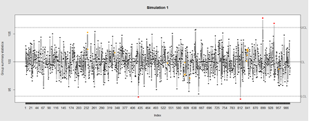
Data Quality Control (QC) and Quality Assurance (QA) represent important components of all modeling, analytics and visualization that precede all subsequent data processing steps. QC and QA may be performed manually or automatically. Statistical quality control involves quantitative methods for monitoring and controlling a process or data derived from observing a natural phenomenon. For example, is there evidence in the plots below of a change in the mean of these processes?
# simulate data with base value of 100 w/ normally distributed error
# install.packages("qcc")
library(qcc)
demo.data.1 <- rep(100, 1000) + rnorm(1000, mean=0, sd=2)
qcc(demo.data.1, type="xbar.one", center=100, add.stats=FALSE,
   title="Simulation 1", xlab="Index")
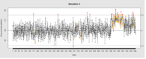
Now let’s introduce a trend
# first 800 points have base value of 100 w/ normally distributed error,
# next 100 points have base value of 105 w/ normally distributed error
# last 100 points have base value of 110 w/ normally distributed error
M <- 110
SD=5
demo.data.2 <- c(rep(100, 800), rep(M, 100), rep(100+(M-100)/2, 100)) + rnorm(1000, mean=0, sd=SD)
qcc(demo.data.2, type="xbar.one", center=100, add.stats=FALSE,
   title="Simulation 2", xlab="Index")
Our goal is to use statistical quality control to automatically identify issues with the data. The qcc package in R provides methods for statistical quality control – given the data, it identifies candidate points as outliers based on the Shewhart Rules. Color-coding the data also helps point out irregular points.
The Shewhart control charts rules (cf. 1930’s) are based on monitoring events that unlikely when the controlled process is stable. Incidences of such atypical events are alarm signals suggesting that stability of the process may be compromised and the process is changed.
An instance of such an unlikely event is the situation when the upper/lower control limits (UCL or LCL) are exceeded. UCL and LCL are constructed as ±3? limits, indicating that the process is under control within them. Additional warning limits (LWL and UWL) are constructed at ±2? or ±?. Other rules specifying events having low probability when the process is under control can be constructed:
1. One point exceeds LCL/UCL.
2. Nine points above/below the central line.
3. Six consecutive points show increasing/decreasing trend.
4. Difference of consecutive values alternates in sign for fourteen points.
5. Two out of three points exceed LWL or UWL limits.
6. Four out of five points are above/below the central line and exceed ±? limit.
7. Fifteen points are within ±? limits.
8. Eight consecutive values are beyond ±? limits.
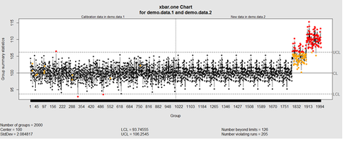
We can define training/testing dataset within qcc by adding the data we want to calibrate it with as the first parameter (demo.data.1), followed by the new data (demo.data.2) representing the test data.
#example using holdout/test sets
demo.data.1 <- rep(100, 1000) + rnorm(1000, mean=0, sd=2)
demo.data.2 <- c(rep(100, 800), rep(105, 100), rep(110, 100)) + rnorm(100, mean=0, sd=2)
MyQC <- qcc(demo.data.1, newdata=demo.data.2, type="xbar.one", center=100, add.stats=FALSE, title="Simulation 1 vs. 2", xlab="Index")
plot(MyQC) # , chart.all=FALSE)
# add warning limits at 2 std. deviations
MyQC2 <- qcc(demo.data.1, newdata=demo.data.2, type="xbar.one", center=100, add.stats=FALSE,  title="Second Simulation 1 vs. 2", xlab="Index")
warn.limits <- limits.xbar(MyQC2$\$$center, MyQC2$\$$std.dev, MyQC2$\$$sizes, 0.95)
 plot(MyQC2, restore.par = FALSE)
 abline(h = warn.limits, lty = 2, lwd=2, col = "blue")

 ## limits.xbar(center, std.dev, sizes, conf)
 Center = sample/group center statistic
 Sizes= samples sizes.
 std.dev= within group standard deviation.
 Conf= a numeric value used to compute control limits, specifying the number of standard deviations (if conf > 1) or the confidence level (if 0 < conf < 1)

[[Image:SMHS_LinearModeling_Fig006.png|500px]]

Natural processes may have errors that are non-normally distributed. However, using (appropriate) transformations we can often normalize the errors.

We can use thresholds to define zones in the data where each zone represents, say, one standard deviation span of the range of the dataset.

 find_zones <- function(x) {
  x.mean <- mean(x)
  x.sd <- sd(x)
  boundaries <- seq(-3, 3)
  # creates a set of zones for each point in x
  zones <- sapply(boundaries, function(i) {
    i * rep(x.sd, length(x))
  })
  zones + x.mean
 }
 head(find_zones(demo.data.2))

 evaluate_zones <- function(x) {
  zones <- find_zones(x)
  colnames(zones) <- paste("zone", -3:3, sep="_")
  x.zones <- rowSums(x > zones) - 3
  x.zones
 }

 evaluate_zones(demo.data.2)

 find_violations <- function(x.zones, i) {
  values <- x.zones[max(i-8, 1):i]
  # rule4 <- ifelse(any(values > 0), 1,
  rule4 <- ifelse(all(values > 0), 1,
                  ifelse(all(values < 0), -1,
                         0))
  values <- x.zones[max(i-5, 1):i]
  rule3 <- ifelse(sum(values >= 2) >= 2, 1,
                  ifelse(sum(values <= -2) >= 2, -1,
                         0))
  values <- x.zones[max(i-3, 1):i]
  rule2 <- ifelse(mean(values >= 3) >= 1, 1,
                  ifelse(mean(values <= -3) >= 1, -1,
                         0))
  #values <- x.zones[]
 values <- x.zones[max(i-3, 1):i]
 rule1 <- ifelse(any(values > 2), 1,
                  ifelse(any(values < -2), -1,
                         0))
  c("rule1"=rule1, "rule2"=rule2, "rule3"=rule3, "rule4"=rule4)
 }

 find_violations(evaluate_zones(demo.data.2), 20)

Now we can compute the rules for each point and assign a color to any violations.

 library("plyr")
 compute_violations <- function(x, start=1) {
  x.zones <- evaluate_zones(x)
  results <- ldply (start:length(x), function(i) {
    find_violations(x.zones, i)
  })
  results$\$$color <- ifelse(results$\$$rule1!=0, "pink",
                          ifelse(results$\$$rule2!=0, "red",
                                ifelse(results$\$$rule3!=0, "orange",
                                        ifelse(results$\$$rule4!=0, "yellow",
                                              "black"))))
 results
}

tail(compute_violations(demo.data.2))
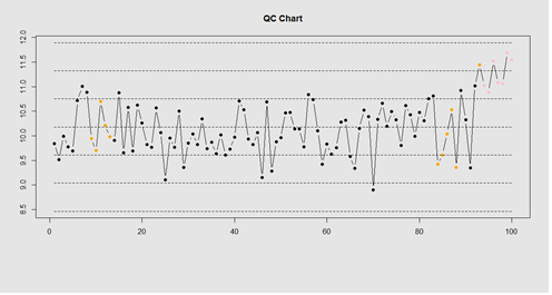
Now let’s make a quality control chart.
plot.qcc <- function(x, holdout) {
 my.qcc <- compute_violations(x, length(x) - holdout)
 bands <- find_zones(x)
 plot.data <- x[(length(x) - holdout):length(x)]
 plot(plot.data, col= my.qcc$\$$color, type='b', pch=19,
       ylim=c(min(bands), max(bands)),
       main="QC Chart",
       xlab="", ylab="")

  for (i in 1:7) {
    lines(bands[,i], col= my.qcc$\$$color[i], lwd=0.75, lty=2)
 }
}
demo.data.4 <- c(rep(10, 90), rep(11, 10)) + rnorm(100, mean=0, sd=0.5)
plot.qcc (demo.data.4, 100)
Let’s use the "Student's Sleep Data" (sleep) data.
library("qcc")
attach(sleep)
q <- qcc.groups(extra, group)
dim(q)
obj_avg_test_1_2  <-  qcc(q[1:2,],  type="xbar")
obj_avg_test_1_5  <-  qcc(q[,1:5],  type="xbar")
summary(obj_avg_test_1_5)
obj_avg_test_train <-  qcc(q[,1:5],  type="xbar", newdata=q[,6:10])
# How is this different from this?
obj_avg_new <-  qcc(q[,1:10],  type="xbar")
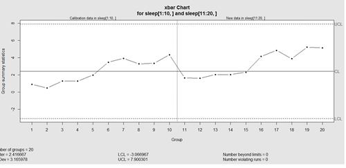
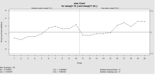
This control chart has the solid horizontal line (center), the upper and lower control limits (dashed lines), and the sample group statistics (e.g., mean) are drawn as a piece-wise line connecting the points. The bottom of the plot includes summary statistics and the number of points beyond control limits and the number of violating runs. If the process is "in-control", we can use estimated limits for monitoring prospective (new) data sampled from the same process/protocol. For instance,
obj_test_1_10_train_11_20 <- qcc(sleep[1:10,], type="xbar", newdata=sleep[11:20,])
plots the X chart for training and testing (11-20) sleep data where the statistics and the control limits are based on the first 10 (training) samples.
Now try (range) QCC plot
obj_R  <-  qcc(q[,1:5],  type="R", newdata=q[,6:10])
A control chart aims to enhance our ability to monitor and track a process proxied by the data. When special causes of variation (random or not) are present the data may be considered "out of control". Corresponding action may need to be taken to identify, control for, or eliminate such causes. A process is declared to be "controlled" if the plot of all data points are randomly spread out within the control limits. These Lower and Upper Control Limits (LCL, UCL) are usually computed as ±3s from the center (e.g., mean). This QCC default limits can be changed using the argument nsigmas or by specifying the confidence level via the confidence level argument.
When the process is governed by a Gaussian distribution the ±3s limits correspond to a two-tails probability of p=0.0027.
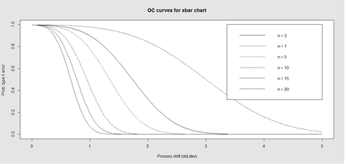
Finally, an operating characteristic (OC) curve shows the probability of not detecting a shift in the process (false-negative, type II error), i.e., the probability of erroneously accepting a process as being "in control", when in fact, it’s out of control.
# par(mfrow=c(1,1))
oc.curves(obj_test_1_10_train_11_20)
# oc.curves(obj_test_1_10_train_11_20, identify=TRUE) # to manually identify specific OC points
The function oc.curves returns a matrix or a vector of probabilities values representing the type II errors for different sample-sizes. See help(oc.curves), e.g., identify=TRUE, which allows to interactively identify values on the plot, for all options.
Notice that the OC curve is "S"-shaped. As expected, this is because as the percent of non-conforming values increases, the probability of acceptance decreases. A small sub-sample, instead of inspecting the entire data, may be used to determine the quality of a process. We can accept the data as in-control as long as the process percent nonconforming is below a predefined level.
Multiple Linear Regression
Questions:
- Are there (linear) associations between predictors and a response variable(s)?
- When to look for linear relations and what assumptions play role?
Let’s use some of the data included in the Appendix. Snapshots of the first few rows in the data are shown below:
Eyeballing the data may suggest that Race "2" subjects may have higher "Weights" (first dataset), or "Treatment A" yields higher "Observations" (second dataset). However this cursory observation may be incorrect as we may be looking at a small/exceptional sub-sample of the entire population. Data-driven linear modeling allows us to quantify such patterns and compute probability values expressing the strength of the evidence in the data to make such conclusions. In a nutshell, we express relationships of interest (e.g., weight as a function of race, or Observation as a function of treatment) using a linear function as an analytical representation of these inter-variable relations:
Weight ~ Race, Weight ~ Genotype, Obs ~ Treatment, Obs ~ Day, etc.
W = a +b*R,
This "~" (tilde) notation implies "Weight predicted by Race" or "Observation as a linear function of Treatment". The "dependent variable" (a measurable response) on the left is predicted by the factor on the right acting as an "independent variable", co-variate, predictor, "explanatory variable", or "fixed effect".
Often times inter-dependencies may not be perfect, deterministic, or rigid (like in the case of predicting the Area of a disk knowing its radius, or predicting the 3D spatial location of a planet having a precise date and time). Weight may not completely and uniquely determined by Race alone, as many different factors play role (genetics, environment, aging, etc.) Even if we can measure all factors we can identify as potentially influencing Weight, there will still be intrinsic random variability into the observed Weight measures, which can’t be control for. This intrinsic random variation may be captured and accounted for using "random" term at the end.
Weight ~ Race + e ~ D(m=0, s).
Epsilon "e" represent the error term of predicting Weight by Gender alone and summarize the aggregate impact of all factors aside from Race that impact individual’s Weight, which are experimentally uncontrollable or random. This formula a schematic analytic representation of a linear model that we’re going to estimate, quantify and use for prediction and inference. The right hand side splits the knowledge representation of Weight into 2 complementary components - a "fixed effect" for Race, which we understand and expect, and a "random effect" ("e") what we don’t know well. (W ~ R represents the "structural" or "systematic" part of the linear model and "e" stands for the "random" or "probabilistic" part of the model.
R Experiment (See Appendix)
mydata1 <- data.frame(
    Subject  = c(13, 14, 15, 16, 17, 18),
    Day       = c("Day1", "Day1", "Day1", "Day2", "Day2", "Day2"),
    Treatment = c("B", "B", "B", "A", "A", "A"),
    Obs       = c(6.472687, 7.017110, 6.200715, 6.613928, 6.829968, 7.387583)
)
We construct an R frame object concatenating 3 data-elements for 6 subjects, and saving it into "mydata1."
| Subject | Day | Treatment | Obs |
| 13 | Day1 | B | 6.472687 |
| 14 | Day1 | B | 7.017110 |
| 15 | Day1 | B | 6.200715 |
| 16 | Day2 | A | 6.613928 |
| 17 | Day2 | A | 6.829968 |
| 18 | Day2 | A | 7.387583 |
Using the linear model Obs ~ Treatment + e, we can invoke the linear modeling function lm() . The "e" term is implicit in all models so it need not be specified.
lm.1 <- lm(Obs ~ Treatment, mydata1)
The assignment operator "<-" stores the linear model result in object lm.1. For these data (the data object is "mydata1"), this model expresses Obs as a function of Treatment. To inspect the result of the linear model use the "summarize" function summary():
AIC(lm.1); BIC(lm.1)
summary(lm.1)
The result is:
Call:
lm(formula = Obs ~ Treatment, data = mydata1)
Residuals:
1 2 3 4 5 6
-0.10342 0.44100 -0.37540 0.03782 -0.27881 0.27881
Coefficients:
Estimate Std. Error t value Pr(>|t|)
(Intercept) 7.1088 0.2507 28.350 9.21e-06 ***
TreatmentB -0.5327 0.3071 -1.734 0.158
Signif. codes: 0 ‘***’ 0.001 ‘**’ 0.01 ‘*’ 0.05 ‘.’ 0.1 ‘ ’ 1
Residual standard error: 0.3546 on 4 degrees of freedom
Multiple R-squared: 0.4293, Adjusted R-squared: 0.2866
F-statistic: 3.008 on 1 and 4 DF, p-value: 0.1579
The report shows:
- The model analytical formula specified by the lm() call.
- The residuals (errors, discrepancies between observed and model-predicted outcomes).
- The coefficients of the fixed effects (predictors, explanatory variables).
- And finally, the overall model quality (describing the ability of the model to describe the linear relations in these data). "Multiple R-squared" refers to the R2 statistic that measures the "variance explained by the model" or "variance accounted for by the model". 0=R2=1, in our result, R2 = 0.4293, which is good, but not great. In essence, 42.93% of the data variability may be explained by this specific (best linear fit) model. In this case, the model solely relies on "Treatment" (fixed effect) to explain Obs (outcome). So, the R2 reflects how much of the Obs variance is accounted for by different Treatments (A or B).
Models with high R2 values are preferred subject to 2 conditions:
- What is considered a high R2 value is relative and depends on study/application.
- When the study phenomenon is highly deterministic, R2 values can be approach 1.
Higher number of explanatory variable and higher model-complexity tend to yield higher R2 values, but are more difficult to interpret.
The "Adjusted R-squared" value is a modified R2 value normalizes the total variance "explained" by the model by the number of fixed effects included in the model. Larger number of predictors will lower the "Adjusted R-squared". The adjusted R2adj = 0.2866, but in general, R2adj can be much lower when the model includes many fixed effects.
The statistical test of "model significance" is quantified by the output "F-statistic: 3.008 on 1 and 4 DF, p-value: 0.1579". Under a null hypothesis where the model captures little or no information about the process, the probability value quantifies the data-driven evidence to reject the null and accept an alternative stating that this model does capture useful patterns in the data. Specifically, the p-value represents the conditional probability under the condition that the null hypothesis is true. In this case,
- The null hypothesis is Ho: "Treatment has no effect on Obs".
- Alternative research Hypothesis is H1: "Treatment has effect on Obs".
This p-value is 0.1579, and the linear model fails to reject the null hypothesis. This leaves open the possibility that Treatment may have no effect on Obs (just based on using these 6 data points).
However, if the p-value was much smaller, and assuming Ho were true, then this data would be less likely to be observed in reality (hence we would interpret small p-values as showing that the alternative hypothesis "Treatment affects Obs" as more likely and the model result is "statistically significant").
There is a distinction between the overall "model-significance" (as quantified by the p-value at the very bottom of the output, which considers all effects together) and the p-value of individual effects (coefficients table including significance for each predictor). The model F-statistic and the degrees of freedom are in 1-1 correspondence with the p-value – the latter is computed as the right tail probability for an F(df1,df2) distribution corresponding to the F-statistics (critical value). To report the overall model inference in this case, we can state:
"Using a simple linear model of Obs as a function of Treatment, the model was not significant (F(1,4)=3.001, p>0.15), which indicates that "Treatment" may not be a critical explanatory factor describing the "Obs" outcome."
To examine the coefficient table for (lm.1 model).
Coefficients:
Estimate Std. Error t value Pr(>|t|)
(Intercept) 7.1088 0.2507 28.350 9.21e-06 ***
TreatmentB -0.5327 0.3071 -1.734 0.158
The overall model p-value (0.1579) is similar to the p-value quantifying the significance of the "Treatment" factor to explain Obs. This is because the model had only one fixed effect ("Treatment" itself). So, the significance of the overall model is the same as the significance for this coefficient (subject to rounding error).
In the presence of multiple fixed effects, the overall model significance will be different from the significance of each coefficient corresponding to a specific covariate.
Why does he report shows "TreatmentB" not "Treatment"? The estimate of the "(Intercept)" is 7.1088. Let’s look at the mean Obs values within each of the 2 Treatment groups (A and B):
# Model: lm.1 <- lm(Obs ~ Treatment, mydata1)
mean(mydata1[mydata1$\$$Treatment=="A",]$\$$Obs)
> 7.108776
mean(mydata1[mydata1$\$$Treatment=="B",]$\$$Obs)
> 6.57611
# in general, subsetting can be accomplished by:
subset_data <- mydata1[ which(mydata1$\$$Treatment=='A' & mydata1$\$$Day=='Day2'),]
The mean of the Obs values for {Treatment=A} is the same as the "Intercept" term.
The estimate for "TreatmentB" is negative (-0.5327). Note that:
7.108776 - 0.5327 = 6.57611,
which is the mean of the "TreatmentB" cohort. Thus, the estimate for "(Intercept)" represents for the "TreatmentA" category, and the estimate for "TreatmentB" represents the difference between the "Treatment" "A" and "B" categories
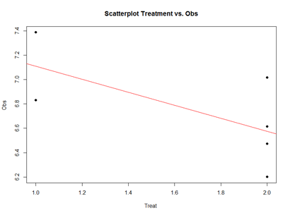
Analytically, the linear models represent "linear" associations, as in the plot below:
mydata2 <- data.frame(
Subject = c(13, 14, 15, 16, 17, 18), Day = c("Day1", "Day1", "Day1", "Day1", "Day1", "Day1"),
Treatment = c(2, 2, 2, 2, 1, 1),
Obs = c(6.472687, 7.017110, 6.200715, 6.613928, 6.829968, 7.387583)
)
plot(mydata2$\$$Treatment, mydata2$\$$Obs, main="Scatterplot Treatment vs. Obs",
xlab="Treatment", ylab="Obs ", pch=19)
# Add fit lines
abline(lm(mydata2$\$$Obs~mydata2$\$$Treatment), col="red")
The linear model represents the difference between Treatments "A" and "B" as a slope. Going From Treatment "A" to "B" we go down -0.5327 (in terms of the units measuring the "Obs" variable), which is exactly the "TreatmentB" coefficient, relative to Treatment "A".
Treatment "A" acts as baseline (center of the local coordinate system) and is represented by the "(Intercept)". The difference between Treatments "A" and "B" is expressed as a slope heading down from 7.108776 by 0.5327. The p-values in the coefficient table correspond to the significance that each coefficient (intercept or Treatment) is "non-trivial".
In our case, the Intercept is significant (10-5), but the Treatment change (from A to B) is not (0.15). By default, the lm() function takes lexicographical ordering to determine which level (A or B) of the predictor (Treatment) comes first to label Treatment "A" as the intercept and "B" as the slope. Categorical differences like Treatment "A" and "B" can be expressed as slopes because difference between two categories is directly correlated with the slope between the two categories.
The advantage of representing difference between two categories as lines crossing the two categories is that it allows us to use the same computational principles for numeric and categorical variables. That is the same interpretations can be made for Treatment as for continuous (e.g., age) or discrete (e.g., dosage) covariates.
For example, using the MBL Data , we can examine player’s Weight as a function of Age. Save the data table as a text file "01a_data.txt" and load it in RStudio:
# data <- read.table('C:\\Users\\Dinov\\Desktop\\01a_data.txt',as.is=T, header=T)
# Data: https://umich.instructure.com/courses/38100/files/folder/data
data <- read.table('https://umich.instructure.com/courses/38100/files/folder/data/01a_data.txt',as.is=T, header=T)
attach(data)
# Weight = Age + e
df.2 = data.frame(Age, Weight)
lm.2 = lm(Weight ~ Age, df.2)
summary(lm.2)
Call:
lm(formula = Weight ~ Age, data = df.2)
Residuals:
Min 1Q Median 3Q Max
-52.479 -14.489 -0.814 13.400 89.915
Coefficients:
Estimate Std. Error t value Pr(>|t|)
(Intercept) 179.6684 4.3418 41.381 < 2e-16 ***
Age 0.7672 0.1494 5.135 3.37e-07 ***
---
Signif. codes: 0 ‘***’ 0.001 ‘**’ 0.01 ‘*’ 0.05 ‘.’ 0.1 ‘ ’ 1
Residual standard error: 20.75 on 1032 degrees of freedom
Multiple R-squared: 0.02492, Adjusted R-squared: 0.02397
F-statistic: 26.37 on 1 and 1032 DF, p-value: 3.368e-07
The significance of the intercept is not very interesting as it just specifies the baseline. However, the p-value in each (predictor) row evaluates whether the corresponding coefficient is significantly non-trivial. Trivial coefficients can be removed from the model. The intercept (179.6684) represents the predicted Weight for a player at Age 0, which doesn’t make sense for Baseball players, but it captures the constant impact of Age on Weight.
The interesting part is the coefficient of Age (0.7672), which is a significant predictor of Weight ($3.368\times 10^{-7}$). Thus, for every increase of age by 1 year, The Weight is expected to go up by 0.7 to 0.8 lbs.
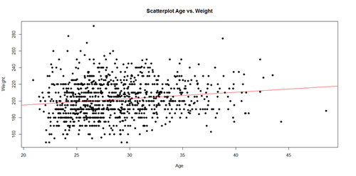
The regression line in the scatterplot represents the model-predicted mean Weight-gain with Age. The y-intercept (179.6684), for Age=0, and slope (0.7672) of the line represents the corresponding (Intercept and Age) coefficients of the model output.
plot(Age, Weight, main="Scatterplot Age vs. Weight", xlab="Age", ylab="Weight", pch=19)
abline(lm(Weight ~ Age), col="red")
Interpreting Model Intercepts The model estimates of the intercept may not always be useful. For instance, if we subtract the mean Age from each player's Age:
df.2$\$$Age.centered = df.2$\$$Age - mean(df.2$\$$Age)
lm.2a = lm(Weight ~ Age.centered, df.2)
summary(lm.2a)
This creates a new column in the data.frame (df.2) called Age.centered representing the Age variable with the mean subtracted from it. This is the resulting coefficient table from running a linear model analysis of this centered data:
Coefficients:
Estimate Std. Error t value Pr(>|t|)
(Intercept) 201.7166 0.6452 312.648 < 2e-16 ***
Age.centered 0.7672 0.1494 5.135 3.37e-07 ***
Residual standard error: 20.75 on 1032 degrees of freedom
Multiple R-squared: 0.02492, Adjusted R-squared: 0.02397
F-statistic: 26.37 on 1 and 1032 DF, p-value: 3.368e-07
The intercept estimate has changed from 179.6684 (predicted Player Weight at birth, Age=0) to 201.7166 (predicted player Weight at mean Age). However, the slope and its significance (0.7672, 3.37x10-07) are unchanged and neither is the significance of the full model (3.368x10-07). So, centering the Age does not impact the nature of the linear model, it just changed the intercept that now points to the Weight at the mean Age.
As we have additional information for each MLB player, e.g., Team, Position, Height, Weight, Age) we can include additional factors into the linear model (lm.2a) to increase its explanatory power (R2 = 0.02492). We can start by adding:
Weight ~ Age + Height + e.
lm.3 = lm(Weight ~ Age.centered + Height, df.2)
summary(lm.3)
Call:
lm(formula = Weight ~ Age.centered + Height, data = df.2)
Residuals:
Min 1Q Median 3Q Max
-50.818 -12.148 -0.344 10.720 74.175
Coefficients:
Estimate Std. Error t value Pr(>|t|)
(Intercept) -164.0141 17.2897 -9.486 < 2e-16 ***
Age.centered 0.9624 0.1252 7.690 3.43e-14 ***
Height 4.9626 0.2345 21.163 < 2e-16 ***
---
Signif. codes: 0 ‘***’ 0.001 ‘**’ 0.01 ‘*’ 0.05 ‘.’ 0.1 ‘ ’ 1
Residual standard error: 17.33 on 1031 degrees of freedom
Multiple R-squared: 0.3202, Adjusted R-squared: 0.3189
F-statistic: 242.8 on 2 and 1031 DF, p-value: < 2.2e-16
And them adding additional factors:
Weight ~ Age + Height + Position + Team + e.
lm.4 = lm(Weight ~ Age.centered + Height+ Position + Team, df.2)
summary(lm.4)
Call:
lm(formula = Weight ~ Age.centered + Height + Position + Team,
data = df.2)
Residuals:
Min 1Q Median 3Q Max
-48.692 -10.909 -0.778 9.858 73.649
Coefficients:
Estimate Std. Error t value Pr(>|t|)
(Intercept) -139.4055 18.8556 -7.393 3.04e-13 ***
Age.centered 0.8906 0.1259 7.075 2.82e-12 ***
Height 4.7175 0.2563 18.405 < 2e-16 ***
PositionDesignated_Hitter 8.9037 4.4533 1.999 0.045842 *
PositionFirst_Baseman 2.4237 3.0058 0.806 0.420236
PositionOutfielder -6.2636 2.2784 -2.749 0.006084 **
PositionRelief_Pitcher -7.7695 2.1959 -3.538 0.000421 ***
PositionSecond_Baseman -13.0843 2.9638 -4.415 1.12e-05 ***
PositionShortstop -16.9562 3.0406 -5.577 3.16e-08 ***
PositionStarting_Pitcher -7.3599 2.2976 -3.203 0.001402 **
PositionThird_Baseman -4.6035 3.1689 -1.453 0.146613
TeamARZ 7.1881 4.2590 1.688 0.091777
TeamATL -1.5631 3.9757 -0.393 0.694278
TeamBAL -5.3128 4.0193 -1.322 0.186533
TeamBOS -0.2838 4.0034 -0.071 0.943492
TeamCHC 0.4026 3.9949 0.101 0.919749
TeamCIN 2.1051 3.9934 0.527 0.598211
TeamCLE -1.3160 4.0356 -0.326 0.744423
TeamCOL -3.7836 4.0287 -0.939 0.347881
TeamCWS 4.2944 4.1022 1.047 0.295413
TeamDET 2.3024 3.9725 0.580 0.562326
TeamFLA 2.6985 4.1336 0.653 0.514028
TeamHOU -0.6808 4.0634 -0.168 0.866976
TeamKC -4.7664 4.0242 -1.184 0.236525
TeamLA 2.8598 4.0817 0.701 0.483686
TeamMIN 2.1269 4.0947 0.519 0.603579
TeamMLW 4.2897 4.0243 1.066 0.286706
TeamNYM -1.9736 3.9493 -0.500 0.617370
TeamNYY 1.7483 4.1234 0.424 0.671655
TeamOAK -0.5464 3.9672 -0.138 0.890474
TeamPHI -6.8486 3.9949 -1.714 0.086778
TeamPIT 4.3023 4.0210 1.070 0.284890
TeamSD 2.6133 4.0915 0.639 0.523148
TeamSEA -0.9147 4.0516 -0.226 0.821436
TeamSF 0.8411 4.0520 0.208 0.835593
TeamSTL -1.1341 4.1193 -0.275 0.783132
TeamTB -2.6616 4.0944 -0.650 0.515798
TeamTEX -0.7695 4.0283 -0.191 0.848556
TeamTOR 1.3943 4.0681 0.343 0.731871
TeamWAS -1.7555 4.0038 -0.438 0.661142
---
Signif. codes: 0 ‘***’ 0.001 ‘**’ 0.01 ‘*’ 0.05 ‘.’ 0.1 ‘ ’ 1
Residual standard error: 16.78 on 994 degrees of freedom
Multiple R-squared: 0.3858, Adjusted R-squared: 0.3617
F-statistic: 16.01 on 39 and 994 DF, p-value: < 2.2e-16
Notice the linear model coefficients, the corresponding p-values, and the overall model quality, at the bottom of the output change. Are these changed between the 2 models?
- new model (Weight ~ Age + Height + Position + Team + e.) vs.
- old model (Weight ~ Age + Height + e)?
These examples illustrate "multiple linear regression" as a linear modeling technique involving 1 response (dependent) variable expressed as a (affine) function of multiple predictor (independent) variables.
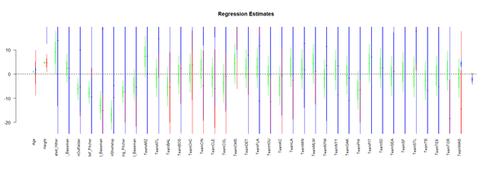
Visualizing the Regression-Model coefficients (effect-sizes):
#library("arm")
# data <- read.table('01a_data.txt',as.is=T, header=T)
data <- read.table('01a_data.txt',as.is=T, header=T)
attach(data)
df.2 = data.frame(Age, Weight, Height, Position, Team)
lm.2 = lm(Weight ~ Age + Height+ Position + Team, df.2)
lm.3 = lm(Weight ~ Age*Height+ Position*Team, df.2)
lm.4 = lm(Weight ~ Age*Team + Position*Height, df.2)
par (mfrow=c(1,1))
# coefplot(lm.2, xlim=c(-2, 2),  intercept=TRUE)
coefplot(lm.2, vertical=FALSE, col.pts="green")
coefplot(lm.3, vertical=FALSE, add=TRUE, col.pts="red", offset=0.2)
coefplot(lm.3a, vertical=FALSE, add=TRUE, col.pts="black", offset=0.4)
coefplot(lm.4, vertical=FALSE, add=TRUE, col.pts="blue", offset=0.6)
(Fixed-Effect) Linear Model Assumptions The linear modeling approach (above) is referred to as a linear model, as opposed to another type of model (e.g., non-linear, exponential, etc.) for 2 reasons. First, functional analytic representation of the model involves linear terms of the predictive variables. Second, the model assumptions dictate linear relationships among the covariates and between covariates and response.
Linearity: The response variable (Y=Weight, in our case) can be expressed via a linear combination formula of the independent variable (e.g., Height, Age, etc.) If it assumption is invalid, the residual plot may include patterns (e.g., quadratic curve or non-linear trend) indicating another type of model may be appropriate. For instance, the residuals may include a pair of lines when we have dichotomous categorical data. Similarly, the QQ Normal Probability Plot may not be perfectly linear (e.g., S-shaped), which again indicates the distribution of the residuals (observed minus fitted (predicted) values) may not be IID Normal (Gaussian distributed).
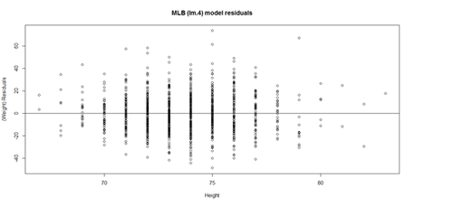
This plot shows the age/pitch relationship along with the depiction of the residuals:
# Weight ~ Age + Height + Position + Team + e
# lm.4 = lm(Weight ~ Age.centered + Height+ Position + Team, df.2)
lm.4.res = resid(lm.4)
plot(Height, lm.4.res, ylab="(Weight) Residuals", xlab="Height", main="MLB (lm.4) model residuals")
abline(0, 0)
# Weight ~ Age + Height + Position + Team + e
# lm.4 = lm(Weight ~ Age.centered + Height+ Position + Team, df.2)
# lm.4.res = resid(lm.4)
qqnorm(lm.4.res) 	# A quantile normal plot - good for checking normality
qqline(lm.4.res)
Mind that now, for illustrative purposes, we change the model to (lm.2: Weight ~ Age)!
# lm.2 = lm(Weight ~ Age, df.2)
# calculate residuals and predicted values
lm.2.res = resid(lm.2)
residuals <- signif(lm.2.res, 5)
predicted <- predict(lm.2)
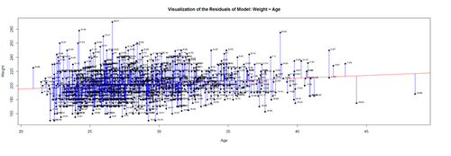
plot(Age, Weight, main="Visualization of the Residuals of Model: Weight ~ Age", xlab="Age", ylab="Weight", pch=19)
abline(lm(Weight ~ Age), col="red")
# plot distances between points and the regression line
segments(Age, Weight, Age, predicted, col="blue")
# add residual-value labels to (Age) points
# install.packages("calibrate")
# library("calibrate", lib.loc="~/R/win-library/3.1")
library(calibrate)
textxy(Age, Weight, residuals, cx=0.7)
The blue lines indicate the (magnitude of the) residuals and represent the deviations of the observed data points from the model-predicted values (fitted values). The sum of all residuals (positive and negative) is zero, ensured by the least-squares method for estimating the linear model parameters (intercept and slope).
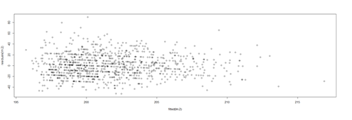
An alternative view is to plot the fitted values (predicted means) on the horizontal line and the residuals, as deviations, on the vertical line.
plot(fitted(lm.2),residuals(lm.2))
Protocols for rectifying residual plots indicating nonlinearity:
Model may be excluding important fixed effects that interact with fixed effects already accounted for in the model. If new fixed effects are added, the pattern in the residual plot may disappear.
- Variable transformation – Perform a nonlinear transformation of the response, e.g., log, or reciprocal transform. See this SOCR Activity .
- Perform a nonlinear transformation to explanatory variables. For instance, if Age is related to Weight in a U-shaped way (e.g., quadratic relation), then the model could include Age and Age2 as predictors.
- If residual plots include stripes, then there may be categorical variables playing role, which may necessitate alternative class of models, such as logistic or multinomial models.
Lack of collinearity: A pair of (linearly) correlated predictors are also called collinear. Suppose Age and Height are correlated (which is certainly to be expected!), then including both as predictors of Weight presents a collinearity problem. In the presence of significant variable collinearity, the interpretation of the model becomes challenging. Depending on which correlated predictors are included in the model, the fixed effects may (incorrectly) become significant or insignificant. Significant findings for these correlated or collinear fixed effects is difficult to interpret as there may be trading-off between the "explanatory power" of the pair of covariates. Multiple predictors that are very similar (linearly correlated) inhibit our ability to decide what plays a big role and what has only marginal impact on the response.
Collinearity may be avoided early during the study-design/data-collection phase of the study to collect fewer fixed effects known to not be linearly correlated. Alternatively, we can selectively include/exclude predictors (e.g., only include in model the most meaningful independent variable and drop the others). Dimensionality reduction methods (e.g., Principal/Independent Component Analyses) also identify (fuse) linearly correlated variables into factors (representing linear combinations transforming several correlated variables into one component variable, which can be used as new fixed effect).
Heteroskedasticity (lack of homoscedasticity). If the variance of the data is (approximately) stable across the range of the predicted values, then the process is homoscedastic (equal variance assumption). Otherwise, when the homoscedasticity criterion is violated, the process is called heteroskedastic (unequal variances).
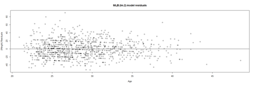
Satisfying the homoscedasticity assumption requires the model residuals to roughly have a similar amount of deviation from the predicted values. This can be checked by examining the residual plot.
# lm.2 = lm(Weight ~ Age, df.2)
lm.2.res = resid(lm.2)
plot(Age, lm.2.res, ylab="(Weight) Residuals", xlab="Age", main="MLB (lm.2) model residuals")
abline(0, 0)
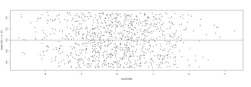
Overall, these data are mostly homoscedastic. A good residual plot essentially looks random blob cluster. For instance, using real (simulated) random data, we can see the expectation for the residuals under the linear model assumptions:
plot(rnorm(1000), rbeta(1000, 1,1)-0.5)
abline(0, 0)
This creates two sets of 1,000 random numbers (x and y axes representing Normal(mean=0,SD=1) and Beta(1,1) distributions, respectively ). Redoing this simulation multiple times and recreating the residual plots will *not* change the appearance of the scatter!
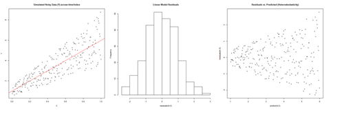
However there are many situations where the residual plots may show clear heteroskedasticity:
set.seed(11)		# see the random generator with some integer
n <- 256		# define sample size
X <- (1:n)/n           # The set of the predictor X values (uniform steps of 1/n from 0 to 1)
E <- rnorm(n, sd=1)         # A set of *normally distributed* random noise E values
i <- order(runif(n, max=dnorm(E))) # Reorder E, by putting larger errors at the end, on average
Y <- 1 + 5 * X + E[rev(i)]   # Simulate new (observed responses) Y values, X plus "error" `E`.
lm.5 <- lm(Y ~ X)             # Regress `Y` against `X`.
par(mfrow=c(1,3))             # Set up 1 row of 3 plots for drawing the graphs
plot(X,Y, main="Simulated Noisy Data (Y) across time/index", cex=0.8)
abline(coef(lm.5), col="Red")
hist(residuals(lm.5), main="Linear Model Residuals")
plot(predict(lm.5), residuals(lm.5), cex=0.8, main="Residuals vs. Predicted (Heteroskedasticity)")
In this example, larger fitted values correspond with larger residuals (the opposite may be true as well). Transforming the data often helps resolve such Heteroskedasticity.
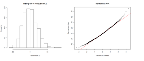
Normality of residuals. The normality of residuals assumption (parametric assumptions) is also important. Linear models may be robust and gracefully handle certain some violations of the normality assumption.
# lm.2 = lm(Weight ~ Age, df.2)
par(mfrow=c(1,2))
hist(residuals(lm.2))
qqnorm(residuals(lm.2))
qqline(lm.2.res, col="red")
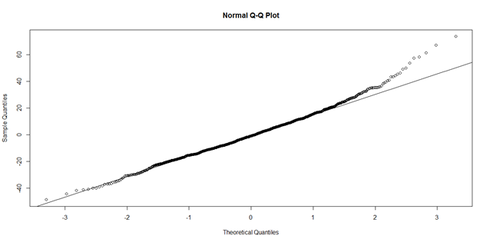
The histogram (left) is relatively bell-shaped and the Q-Q normal probability plot (right) indicates the residuals are mostly on a straight line (suggesting errors (observed-predicted) are similar to a normal distribution). Thus, there is no strong evidence suggesting possible violation of the normality assumption.
Outliers (influential data points). Data should not include extreme influential points, otherwise the linear model may be heavily biased. Outliers (influential data points) can drastically change the interpretation of model results and inference, similarly to variable collinearity.
The R function dfbeta() computes some of the regression (leave-one-out deletion) diagnostics for linear models and allows us to check for outliers.
- SOCR Home page: http://www.socr.umich.edu
Translate this page:
