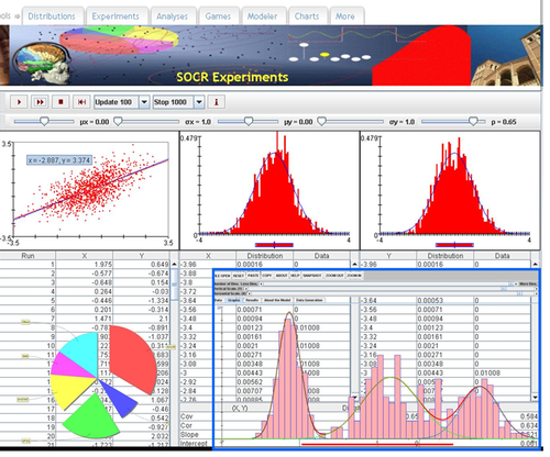
SMHS SciVisualization
Questions
• How and why should we “look” at data?
• What data characteristics are important for exploratory data analytics (EDAs)?
Scientific Data-driven or Simulation-driven visualization methods may be classified in many alternative ways. Visualization techniques can be classified according to many criteria:

• Data Type: structured/unstructured, small/large, complete/incomplete, time/space, ascii/binary, Euclidean/non-Euclidean, etc.
• Task type: Task type is one of the aspects considered in classification of visualization techniques, which provides means of interaction between the researcher, the data and the display software/platform
• Scalability: Visualization techniques are subject to some limitations, such as the amount of data that a particular technique can exhibit
• Dimensionality: Visualization techniques can also be classified according to the number of attributes
• Positioning and Attributes: the distribution of attributes on the chart may affect the interpretation of the display representation, e.g., correlation analysis, where the relative distance among the plotted attributes is relevant for observation
• Investigative Need: the specific scientific question or exploratory interest may also determine the type of visualization:
o Examining the composition of the data
o Exploring the distribution of the data
o Contrasting or comparing several data elements, relations, association
o Unsupervised exploratory data mining
http://www.socr.umich.edu/CSCD/html/Cores/Macore2/SciViz.html
SOCR Charts
• URL: http://socr.umich.edu/html/cha/ (Java applet)
• About/List: http://wiki.stat.ucla.edu/socr/index.php/About_pages_for_SOCR_Chart_List
• Activities: http://wiki.stat.ucla.edu/socr/index.php/SOCR_EduMaterials_ChartsActivities
• Data: http://wiki.socr.umich.edu/index.php/SOCR_Data

Excel Charts
MS Excel provides a large number of charts that can be used to quickly and effectively render complex multivariate data. For instance, the table below contains the principal component analysis (PCA) of 50 derived neuroimaging biomarkers (region of interest (ROI) by shape morphometry metric). The loadings of these 50 variables on the top 5 (most significant) principal component directions are shown in the table. Experiment with effective visualizations of these data.