SMHS SciVisualization
Contents
Questions
• How and why should we “look” at data?
• What data characteristics are important for exploratory data analytics (EDAs)?
Scientific Data-driven or Simulation-driven visualization methods may be classified in many alternative ways. Visualization techniques can be classified according to many criteria:

• Data Type: structured/unstructured, small/large, complete/incomplete, time/space, ascii/binary, Euclidean/non-Euclidean, etc.
• Task type: Task type is one of the aspects considered in classification of visualization techniques, which provides means of interaction between the researcher, the data and the display software/platform
• Scalability: Visualization techniques are subject to some limitations, such as the amount of data that a particular technique can exhibit
• Dimensionality: Visualization techniques can also be classified according to the number of attributes
• Positioning and Attributes: the distribution of attributes on the chart may affect the interpretation of the display representation, e.g., correlation analysis, where the relative distance among the plotted attributes is relevant for observation
• Investigative Need: the specific scientific question or exploratory interest may also determine the type of visualization:
o Examining the composition of the data
o Exploring the distribution of the data
o Contrasting or comparing several data elements, relations, association
o Unsupervised exploratory data mining
http://www.socr.umich.edu/CSCD/html/Cores/Macore2/SciViz.html
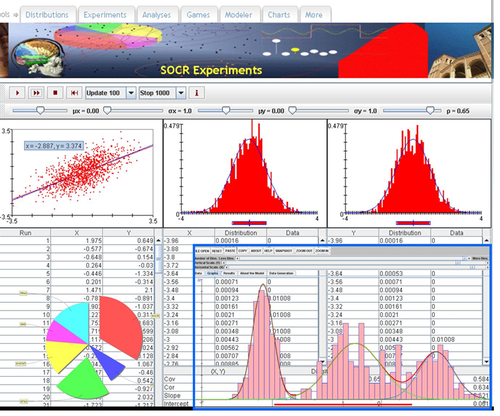
SOCR Charts
• URL: http://socr.umich.edu/html/cha/ (Java applet)
• About/List: http://wiki.stat.ucla.edu/socr/index.php/About_pages_for_SOCR_Chart_List
• Activities: http://wiki.stat.ucla.edu/socr/index.php/SOCR_EduMaterials_ChartsActivities
• Data: http://wiki.socr.umich.edu/index.php/SOCR_Data
Excel Charts
MS Excel provides a large number of charts that can be used to quickly and effectively render complex multivariate data. For instance, the table below contains the principal component analysis (PCA) of 50 derived neuroimaging biomarkers (region of interest (ROI) by shape morphometry metric). The loadings of these 50 variables on the top 5 (most significant) principal component directions are shown in the table. Experiment with effective visualizations of these data.
| Hemi | ROI | measure | ROI_Measure | Dim.1 | Dim.2 | Dim.3 | Dim.4 | Dim.5 |
|---|---|---|---|---|---|---|---|---|
| L | insular | AvgMeanCurvature | L_insular_cortex_AvgMeanCurvature | 0.72 | 0 | 0.06 | 0.06 | 0 |
| L | insular | ComputeArea | L_insular_cortex_ComputeArea | 0.77 | 0.06 | 0.04 | 0.01 | 0 |
| L | insular | Volume | L_insular_cortex_Volume | 0.72 | 0.09 | 0.04 | 0.03 | 0.01 |
| L | insular | ShapeIndex | L_insular_cortex_ShapeIndex | 0.46 | 0.06 | 0.01 | 0.02 | 0.01 |
| L | insular | Curvedness | L_insular_cortex_Curvedness | 0.78 | 0 | 0.05 | 0.03 | 0.01 |
| R | insular | AvgMeanCurvature | R_insular_cortex_AvgMeanCurvature | 0.79 | 0 | 0.03 | 0.08 | 0 |
| R | insular | ComputeArea | R_insular_cortex_ComputeArea | 0.79 | 0.09 | 0.03 | 0.01 | 0 |
| R | insular | Volume | R_insular_cortex_Volume | 0.73 | 0.11 | 0.03 | 0.03 | 0 |
| R | insular | ShapeIndex | R_insular_cortex_ShapeIndex | 0.27 | 0.17 | 0 | 0.07 | 0 |
| R | insular | Curvedness | R_insular_cortex_Curvedness | 0.84 | 0.02 | 0.03 | 0.01 | 0 |
| L | cingulate | AvgMeanCurvature | L_cingulate_gyrus_AvgMeanCurvature | 0.72 | 0 | 0.05 | 0.02 | 0.02 |
| L | cingulate | ComputeArea | L_cingulate_gyrus_ComputeArea | 0.74 | 0.05 | 0.06 | 0.04 | 0.01 |
| L | cingulate | Volume | L_cingulate_gyrus_Volume | 0.69 | 0.08 | 0.05 | 0.05 | 0.01 |
| L | cingulate | ShapeIndex | L_cingulate_gyrus_ShapeIndex | 0.53 | 0 | 0.05 | 0 | 0.03 |
| L | cingulate | Curvedness | L_cingulate_gyrus_Curvedness | 0.7 | 0.01 | 0.05 | 0.04 | 0.03 |
| R | cingulate | AvgMeanCurvature | R_cingulate_gyrus_AvgMeanCurvature | 0.6 | 0 | 0.02 | 0.03 | 0.01 |
| R | cingulate | ComputeArea | R_cingulate_gyrus_ComputeArea | 0.73 | 0.06 | 0.04 | 0.03 | 0.01 |
| R | cingulate | Volume | R_cingulate_gyrus_Volume | 0.68 | 0.09 | 0.04 | 0.04 | 0.01 |
| R | cingulate | ShapeIndex | R_cingulate_gyrus_ShapeIndex | 0.56 | 0.01 | 0.05 | 0 | 0.01 |
| R | cingulate | Curvedness | R_cingulate_gyrus_Curvedness | 0.25 | 0 | 0.01 | 0.04 | 0 |
| L | caudate | AvgMeanCurvature | L_caudate_AvgMeanCurvature | 0.52 | 0 | 0.05 | 0 | 0.01 |
| L | caudate | ComputeArea | L_caudate_ComputeArea | 0.51 | 0.09 | 0.03 | 0.04 | 0.02 |
| L | caudate | Volume | L_caudate_Volume | 0.44 | 0.09 | 0.03 | 0.06 | 0.03 |
| L | caudate | ShapeIndex | L_caudate_ShapeIndex | 0.2 | 0.03 | 0.04 | 0.04 | 0 |
| L | caudate | Curvedness | L_caudate_Curvedness | 0.51 | 0.12 | 0.02 | 0.01 | 0.01 |
| R | caudate | AvgMeanCurvature | R_caudate_AvgMeanCurvature | 0.68 | 0.04 | 0.04 | 0.02 | 0 |
| R | caudate | ComputeArea | R_caudate_ComputeArea | 0.67 | 0.17 | 0.03 | 0.02 | 0.01 |
| R | caudate | Volume | R_caudate_Volume | 0.61 | 0.16 | 0.02 | 0.03 | 0.01 |
| R | caudate | ShapeIndex | R_caudate_ShapeIndex | 0.18 | 0.02 | 0.03 | 0.11 | 0 |
| R | caudate | Curvedness | R_caudate_Curvedness | 0.65 | 0.19 | 0.01 | 0 | 0 |
| L | putamen | AvgMeanCurvature | L_putamen_AvgMeanCurvature | 0.62 | 0 | 0.04 | 0.03 | 0.02 |
| L | putamen | ComputeArea | L_putamen_ComputeArea | 0.56 | 0.05 | 0.04 | 0.03 | 0.05 |
| L | putamen | Volume | L_putamen_Volume | 0.52 | 0.07 | 0.04 | 0.05 | 0.05 |
| L | putamen | ShapeIndex | L_putamen_ShapeIndex | 0.06 | 0.13 | 0 | 0.15 | 0 |
| L | putamen | Curvedness | L_putamen_Curvedness | 0.64 | 0.11 | 0.03 | 0.01 | 0.03 |
| R | putamen | AvgMeanCurvature | R_putamen_AvgMeanCurvature | 0.62 | 0 | 0.07 | 0.04 | 0.01 |
| R | putamen | ComputeArea | R_putamen_ComputeArea | 0.66 | 0.08 | 0.03 | 0.01 | 0.03 |
| R | putamen | Volume | R_putamen_Volume | 0.64 | 0.12 | 0.03 | 0.02 | 0.03 |
| R | putamen | ShapeIndex | R_putamen_ShapeIndex | 0.15 | 0.24 | 0 | 0.08 | 0.03 |
| R | putamen | Curvedness | R_putamen_Curvedness | 0.65 | 0.05 | 0.05 | 0 | 0.02 |
| L | hippocampus | AvgMeanCurvature | L_hippocampus_AvgMeanCurvature | 0.78 | 0 | 0.01 | 0.04 | 0 |
| L | hippocampus | ComputeArea | L_hippocampus_ComputeArea | 0.75 | 0.07 | 0.01 | 0 | 0.02 |
| L | hippocampus | Volume | L_hippocampus_Volume | 0.72 | 0.09 | 0.01 | 0.01 | 0.01 |
| L | hippocampus | ShapeIndex | L_hippocampus_ShapeIndex | 0.45 | 0.17 | 0 | 0.04 | 0.02 |
| L | hippocampus | Curvedness | L_hippocampus_Curvedness | 0.79 | 0.03 | 0.01 | 0 | 0.02 |
| R | hippocampus | AvgMeanCurvature | R_hippocampus_AvgMeanCurvature | 0.72 | 0 | 0 | 0.1 | 0.01 |
| R | hippocampus | ComputeArea | R_hippocampus_ComputeArea | 0.71 | 0.09 | 0 | 0 | 0.05 |
| R | hippocampus | Volume | R_hippocampus_Volume | 0.68 | 0.1 | 0 | 0 | 0.04 |
| R | hippocampus | ShapeIndex | R_hippocampus_ShapeIndex | 0.37 | 0.18 | 0 | 0.02 | 0.03 |
| R | hippocampus | Curvedness | R_hippocampus_Curvedness | 0.77 | 0.03 | 0 | 0.02 | 0.04 |


R-Charts
There are 100’s of packages and 1,000 of different charts, plots and graphs that can be generated using R. Such interactive visualizations enable deeper exploration of data, models and results. JavaScript libraries, e.g., D3, provide advantages for data visualization as these involve HTML5 and are easily shareable online. The R community is developing R interfaces to some popular JavaScript libraries to allow users to create interactive visualizations without detailed knowledge of JavaScript.
Examples of powerful R interactive visualization packages
• ggplot2 – http://ggplot2.org
• ggvis – interactive plots extending the static ggplot2 charts, http://ggvis.rstudio.com
• rCharts – R interface to multiple JavaScript charting libraries, http://rcharts.io
• plotly – transforming ggplot2 charts into interactive plots, https://plot.ly/r
• googleVis – Google Charts using R, http://cran.r-project.org/web/packages/googleVis/vignettes/googleVis_examples.html
• HTMLWidgets
o leaflet – library for creating dynamic maps, supports panning and zooming, annotations, markers, polygons, etc. http://www.htmlwidgets.org/showcase_leaflet.html
o dygraphs – provides mechanism for charting time-series data, supports interactive navigation features including series/point highlighting, zooming, and panning, http://www.htmlwidgets.org/showcase_dygraphs.html
o networkD3 – library for creating D3 network graphs including force directed networks, Sankey diagrams, and Reingold-Tilford tree networks, http://www.htmlwidgets.org/showcase_networkD3.html
o DataTables – displays R matrices or data frames as interactive HTML tables that support filtering, pagination, and sorting, http://www.htmlwidgets.org/showcase_datatables.html
o Rthreejs – features 3D scatterplots and globes based on WebGL, http://www.htmlwidgets.org/showcase_threejs.html
• Other R graphic examples
o To write out plots out to file use:
# pdf() command all graphs are redirected to test.pdf.  Also works with other common formats:  jpeg, png, ps, tiff.
pdf("C:\\Users\\Dinov\\Desktop\\test.pdf"); plot(1:100, 1:100); dev.off()
# Generates Scalable Vector Graphics (SVG) that can be edited by vector graphics software
svg("test.svg"); plot(1:100, 1:100); dev.off()
Paired ScatterPlots
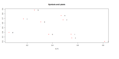
set.seed(100)
x <- matrix(runif(50), ncol=5, dimnames=list(letters[1:10], LETTERS[1:5]))
describe(x)    # library("Hmisc")
plot(x[,1], x[,2], pch=20, col="red", main="Symbols and Labels")
text(x[,1]+0.03, x[,2], rownames(x))
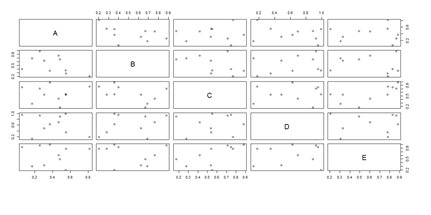
pairs(x)
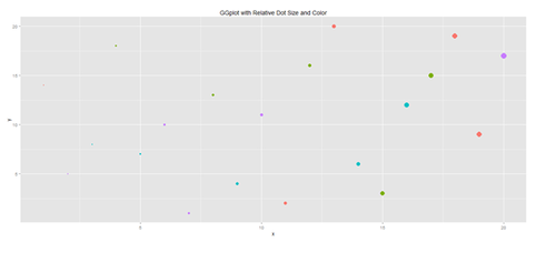
Another way to generate scatterplots is by using ggplot:
# library(ggplot2)
x <- sample(1:20, 20); y <- sample(1:20, 20); cat <- rep(c("A", "B", "C", "D"), 5)
#vs. cat <- rep(c("A", "B", "C", "D"), each=5)
plot.1 <- qplot(x, y, geom="point", size=5*x, color=cat, main="GGplot with Relative Dot Size and Color") + theme(legend.position = "topleft")
print(plot.1)
# Use Case-Studies: https://umich.instructure.com/courses/38100/files/folder/Case_Studies
#  Case_03_MentalHealthServicesSurvey
# data1 <- read.table('https://umich.instructure.com/files/399128/download?download_frd=1&verifier=AG2e9QUKUm1jvDBpkX7D9jbEjKNc4irA0ECk0f7p', header=T)
head(data1)
attach(data1)
# library("Hmisc")
describe(data1)
plot(data1[,3], data1[,4], pch=20, col="red", main="Symbols and Labels")
# text(data1 [,3]+0.03, data1 [,4], rownames(data1))
plot.1 <- qplot(x, y, geom="point", size=5*x, color=cat, main="GGplot with Relative Dot Size and Color") + theme(legend.position = "topleft")
print(plot.1)
# redo plots using majorfundtype FacilityType Ownership Focus
# pairs(data1, na.action=na.omit)
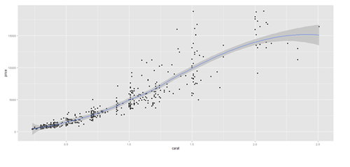
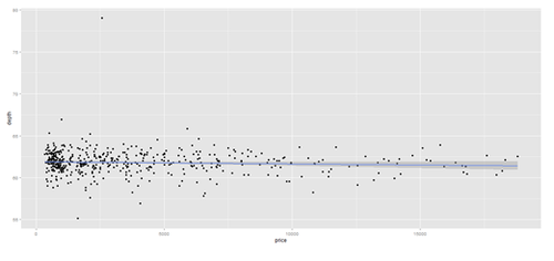
# Scatterplot with regression line. Use the “diamonds” dataset, which is a data frame with
# 53,940 rows and 10 variables ()
# describe(diamonds)
# Use Case-Studies: https://umich.instructure.com/courses/38100/files/folder/Case_Studies
# CaseStudy01_Divorce_YoungAdults
# data1 <- read.csv('https://umich.instructure.com/files/399118/download?download_frd=1&verifier=ESACv31KcyiHbkPZPuT8Oo4V7XzPtgTTbs6PQLTv', header=T)
attach(data1)
# plot variables: DIVYEAR momint dadint momclose depression livewithmom gethitched
set.seed(110)
# par(mfrow=c(1,2))
data.2 <- diamonds[sample(nrow(diamonds), 500), ]
plot.2 <- qplot(price, depth, data = data.2, geom = c("point", "smooth"), method = "lm")
plot.3 <- qplot(carat, price, data=data.2, geom=c("point", "smooth"), span=0.4)
print(plot.2); print(plot.3)
Barplots
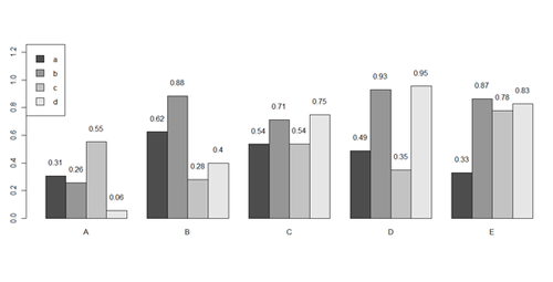
x <- matrix(runif(50), ncol=5, dimnames=list(letters[1:10], LETTERS[1:5]))
barplot(x[1:4,], ylim=c(0, max(x[1:4,])+0.3), beside=TRUE, legend.text = letters[1:4],
       args.legend = list(x = "topleft"))
text(labels=round(as.vector(as.matrix(x[1:4,])),2), x=seq(1.5, 21, by=1) + sort(rep(c(0,1,2,3,4), 4)), y=as.vector(as.matrix(x[1:4,]))+0.1)
# to put error bars on barplot:
# 10 rows (a, b, c, …):
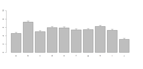
bar <- barplot(m <- rowMeans(x) * 10, ylim=c(0, 10))
stdev <- sd(t(x))
arrows(bar, m, bar, m + stdev, length=0.15, angle = 90)
# Case_04_ChildTrauma
# data1 <- read.table('https://umich.instructure.com/files/399129/download?download_frd=1&verifier=Hmv0YW2Kie5ZTV9CKBUNArSHR66f3GWSmVzZDBxc', header=T)
attach(data1)
head(x)
head(data1)
# plot data
data2 <- data1[,-5]   # remove the 5th columns text
data1 <- data2[,-5]   # remove the 6th columns text
# or data1 <- data1[,c(-5,-6)]
data2 <- as.data.frame(data1)
Blacks <- data2[which(data2$\$$race=="black"),]
 Other <- data2[which(data2$\$$race=="other"),]
Hispanic <- data2[which(data2$\$$race=="hispanic"),]
 White <- data2[which(data2$\$$race=="white"),]
A <- c(mean(Blacks$\$$age), mean(Blacks$\$$service))
#colnames(A) <- c("age "," service ")
B <- c(mean(Other$\$$age), mean(Other$\$$service))
C <- c(mean(Hispanic$\$$age), mean(Hispanic$\$$service))
D <- c(mean(White$\$$age), mean(White$\$$service))
x <- cbind(A, B, C, D)
bar <- barplot(x[1:2,], ylim=c(0, max(x[1:2,])+2.0), beside=TRUE,
legend.text = c("age","service") ,  args.legend = list(x = "right"))
text(labels=round(as.vector(as.matrix(x[1:2,])),2), x=seq(1.4, 21, by=1.5), #y=as.vector(as.matrix(x[1:2,]))+0.3)
y=11.5)
m <- x; stdev <- sd(t(x))
arrows(bar, m, bar, m + stdev, length=0.15, angle = 90)
barplot(as.matrix(data1[1:4,]), ylim=c(0, max(data1[1:4,])+0.3), beside=TRUE, legend.text = data1[1:4,1], args.legend = list(x = "topleft"))
text(labels=round(as.vector(as.matrix(data1[1:4,])),2), x=seq(1.5, 21, by=1), y=as.vector(as.matrix(data1[1:4,]))+0.1)
# Columns (A, B, C, D, E):
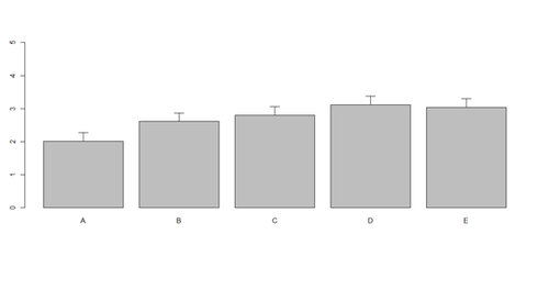
bar <- barplot(m <- colMeans(x) * 5, ylim=c(0, 5))
stdev <- sd(t(x))
arrows(bar, m, bar, m + stdev, length=0.15, angle = 90)
Histograms and Density Plots
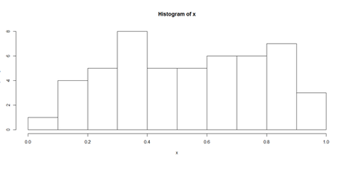
hist(x, freq=TRUE, breaks=10)
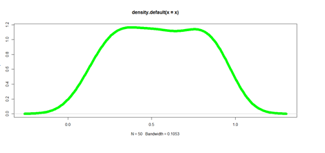
plot(density(x), lwd = 10, col="green")
Pie Chart
# first , “A”, and second, “B”, columns
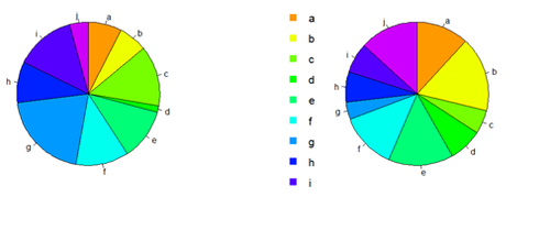
par (mfrow=c(1,2))
pie(x[,1], col=rainbow(length(x[,1]), start=0.1, end=0.8), clockwise=TRUE)
pie(x[,1], col=rainbow(length(x[,1]), start=0.1, end=0.8), clockwise=TRUE)
pie(x[,2], col=rainbow(length(x[,2]), start=0.1, end=0.8), clockwise=TRUE)
legend("topleft", legend=row.names(x), cex=1.3, bty="n", pch=15, pt.cex=1.8, col=rainbow(length(x[,2]), start=0.1, end=0.8), ncol=1)
You can export the data:
write.table(x, " ", "data.txt")
# copy-paste it in SOCR Pie chart to generate another Pie view of data
Line Plots Using ggplot
head(diamonds)
| Carat | Cut | Color | Clarity | Depth | Table | Price | X | Y | Z | |
| 1 | 0.23 | Ideal | E | SI2 | 61.5 | 55 | 326 | 3.95 | 3.98 | 2.43 |
| 2 | 0.21 | Premium | E | SI1 | 59.8 | 61 | 326 | 3.89 | 3.84 | 2.31 |
| 3 | 0.23 | Good | E | VS1 | 56.9 | 65 | 237 | 4.05 | 4.07 | 2.31 |
| 4 | 0.29 | Premium | I | VS2 | 62.4 | 58 | 334 | 4.2 | 4.23 | 2.63 |
| 5 | 0.31 | Good | J | SI2 | 63.3 | 58 | 335 | 4.34 | 4.35 | 4.75 |
| 6 | 0.24 | VeryGood | J | VVS2 | 62.8 | 57 | 336 | 3.94 | 3.96 | 2.48 |
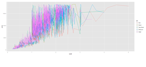
plot.2 <- ggplot(diamonds, aes(carat, price, group=cut, color=cut)) + geom_line()
print(plot.2)
plot.2 <- ggplot(data1, aes(age, service, group=race, color=race)) + geom_line()
print(plot.2)
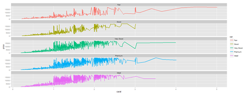
# Faceting plot (geometrically, faceting (or facetting) is the process of removing parts of a polygon, polyhedron or polytope, without creating any new vertices)
plot.3 <- ggplot(diamonds, aes(carat, price)) + geom_line(aes(color=cut), size=1) +
facet_wrap(~cut, ncol=1)
print(plot.3)
Barplots with ggplot
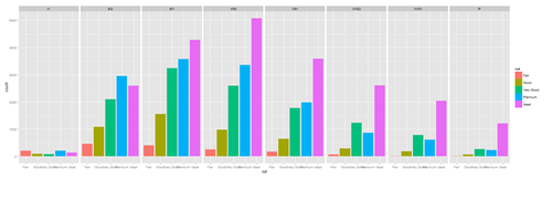
plot.4 <- ggplot(diamonds, aes(cut, fill=cut)) + geom_bar() + facet_grid(. ~ clarity)
print(plot.4)
New_var <- service+rnorm(1000, 0,1)
data1$\$$New_var <- int(New_var)
plot.4 <- ggplot(data1, aes(race, fill= traumatype)) + geom_bar() + facet_grid(. ~ New_var)
print(plot.4)
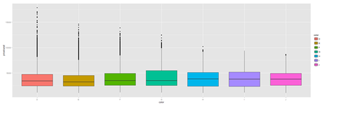
plot.4a <- ggplot(diamonds, aes(color, price/carat, fill=color)) + geom_boxplot()
print(plot.4a)
Jitter plot
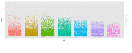
plot.5 <- ggplot(diamonds, aes(color, price/carat)) + geom_jitter(alpha = I(1 / 2), aes(color=color))
print(plot.5)
Density Plots
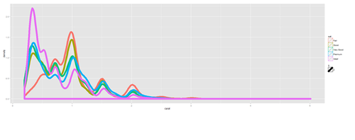
plot.6 <- ggplot(diamonds, aes(carat, size=2)) + geom_density(aes(color = cut))
print(plot.6)
plot.6 <- ggplot(data1, aes(age, size=2)) + geom_density(aes(color = traumatype))
print(plot.6)
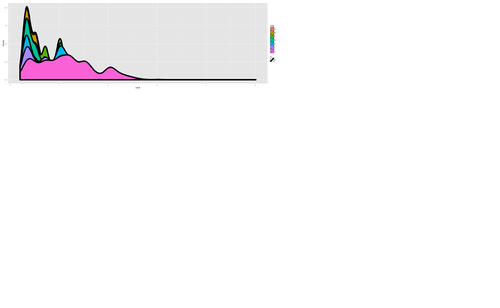
plot.7 <- ggplot(diamonds, aes(carat, size=2)) + geom_density(aes(fill = color))
print(plot.7)
plot.8 <- ggplot(diamonds, aes(x=carat, size=1)) + geom_histogram(aes(y = price), binwidth=0.2) + geom_density()
print(plot.8)