SMHS SciVisualization
Contents
Questions
• How and why should we “look” at data?
• What data characteristics are important for exploratory data analytics (EDAs)?
Scientific Data-driven or Simulation-driven visualization methods may be classified in many alternative ways. Visualization techniques can be classified according to many criteria:

• Data Type: structured/unstructured, small/large, complete/incomplete, time/space, ascii/binary, Euclidean/non-Euclidean, etc.
• Task type: Task type is one of the aspects considered in classification of visualization techniques, which provides means of interaction between the researcher, the data and the display software/platform
• Scalability: Visualization techniques are subject to some limitations, such as the amount of data that a particular technique can exhibit
• Dimensionality: Visualization techniques can also be classified according to the number of attributes
• Positioning and Attributes: the distribution of attributes on the chart may affect the interpretation of the display representation, e.g., correlation analysis, where the relative distance among the plotted attributes is relevant for observation
• Investigative Need: the specific scientific question or exploratory interest may also determine the type of visualization:
o Examining the composition of the data
o Exploring the distribution of the data
o Contrasting or comparing several data elements, relations, association
o Unsupervised exploratory data mining
http://www.socr.umich.edu/CSCD/html/Cores/Macore2/SciViz.html
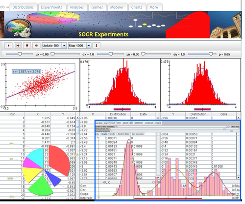
SOCR Charts
• URL: http://socr.umich.edu/html/cha/ (Java applet)
• About/List: http://wiki.stat.ucla.edu/socr/index.php/About_pages_for_SOCR_Chart_List
• Activities: http://wiki.stat.ucla.edu/socr/index.php/SOCR_EduMaterials_ChartsActivities
• Data: http://wiki.socr.umich.edu/index.php/SOCR_Data
Excel Charts
MS Excel provides a large number of charts that can be used to quickly and effectively render complex multivariate data. For instance, the table below contains the principal component analysis (PCA) of 50 derived neuroimaging biomarkers (region of interest (ROI) by shape morphometry metric). The loadings of these 50 variables on the top 5 (most significant) principal component directions are shown in the table. Experiment with effective visualizations of these data.
| Hemi | ROI | measure | ROI_Measure | Dim.1 | Dim.2 | Dim.3 | Dim.4 | Dim.5 |
|---|---|---|---|---|---|---|---|---|
| L | insular | AvgMeanCurvature | L_insular_cortex_AvgMeanCurvature | 0.72 | 0 | 0.06 | 0.06 | 0 |
| L | insular | ComputeArea | L_insular_cortex_ComputeArea | 0.77 | 0.06 | 0.04 | 0.01 | 0 |
| L | insular | Volume | L_insular_cortex_Volume | 0.72 | 0.09 | 0.04 | 0.03 | 0.01 |
| L | insular | ShapeIndex | L_insular_cortex_ShapeIndex | 0.46 | 0.06 | 0.01 | 0.02 | 0.01 |
| L | insular | Curvedness | L_insular_cortex_Curvedness | 0.78 | 0 | 0.05 | 0.03 | 0.01 |
| R | insular | AvgMeanCurvature | R_insular_cortex_AvgMeanCurvature | 0.79 | 0 | 0.03 | 0.08 | 0 |
| R | insular | ComputeArea | R_insular_cortex_ComputeArea | 0.79 | 0.09 | 0.03 | 0.01 | 0 |
| R | insular | Volume | R_insular_cortex_Volume | 0.73 | 0.11 | 0.03 | 0.03 | 0 |
| R | insular | ShapeIndex | R_insular_cortex_ShapeIndex | 0.27 | 0.17 | 0 | 0.07 | 0 |
| R | insular | Curvedness | R_insular_cortex_Curvedness | 0.84 | 0.02 | 0.03 | 0.01 | 0 |
| L | cingulate | AvgMeanCurvature | L_cingulate_gyrus_AvgMeanCurvature | 0.72 | 0 | 0.05 | 0.02 | 0.02 |
| L | cingulate | ComputeArea | L_cingulate_gyrus_ComputeArea | 0.74 | 0.05 | 0.06 | 0.04 | 0.01 |
| L | cingulate | Volume | L_cingulate_gyrus_Volume | 0.69 | 0.08 | 0.05 | 0.05 | 0.01 |
| L | cingulate | ShapeIndex | L_cingulate_gyrus_ShapeIndex | 0.53 | 0 | 0.05 | 0 | 0.03 |
| L | cingulate | Curvedness | L_cingulate_gyrus_Curvedness | 0.7 | 0.01 | 0.05 | 0.04 | 0.03 |
| R | cingulate | AvgMeanCurvature | R_cingulate_gyrus_AvgMeanCurvature | 0.6 | 0 | 0.02 | 0.03 | 0.01 |
| R | cingulate | ComputeArea | R_cingulate_gyrus_ComputeArea | 0.73 | 0.06 | 0.04 | 0.03 | 0.01 |
| R | cingulate | Volume | R_cingulate_gyrus_Volume | 0.68 | 0.09 | 0.04 | 0.04 | 0.01 |
| R | cingulate | ShapeIndex | R_cingulate_gyrus_ShapeIndex | 0.56 | 0.01 | 0.05 | 0 | 0.01 |
| R | cingulate | Curvedness | R_cingulate_gyrus_Curvedness | 0.25 | 0 | 0.01 | 0.04 | 0 |
| L | caudate | AvgMeanCurvature | L_caudate_AvgMeanCurvature | 0.52 | 0 | 0.05 | 0 | 0.01 |
| L | caudate | ComputeArea | L_caudate_ComputeArea | 0.51 | 0.09 | 0.03 | 0.04 | 0.02 |
| L | caudate | Volume | L_caudate_Volume | 0.44 | 0.09 | 0.03 | 0.06 | 0.03 |
| L | caudate | ShapeIndex | L_caudate_ShapeIndex | 0.2 | 0.03 | 0.04 | 0.04 | 0 |
| L | caudate | Curvedness | L_caudate_Curvedness | 0.51 | 0.12 | 0.02 | 0.01 | 0.01 |
| R | caudate | AvgMeanCurvature | R_caudate_AvgMeanCurvature | 0.68 | 0.04 | 0.04 | 0.02 | 0 |
| R | caudate | ComputeArea | R_caudate_ComputeArea | 0.67 | 0.17 | 0.03 | 0.02 | 0.01 |
| R | caudate | Volume | R_caudate_Volume | 0.61 | 0.16 | 0.02 | 0.03 | 0.01 |
| R | caudate | ShapeIndex | R_caudate_ShapeIndex | 0.18 | 0.02 | 0.03 | 0.11 | 0 |
| R | caudate | Curvedness | R_caudate_Curvedness | 0.65 | 0.19 | 0.01 | 0 | 0 |
| L | putamen | AvgMeanCurvature | L_putamen_AvgMeanCurvature | 0.62 | 0 | 0.04 | 0.03 | 0.02 |
| L | putamen | ComputeArea | L_putamen_ComputeArea | 0.56 | 0.05 | 0.04 | 0.03 | 0.05 |
| L | putamen | Volume | L_putamen_Volume | 0.52 | 0.07 | 0.04 | 0.05 | 0.05 |
| L | putamen | ShapeIndex | L_putamen_ShapeIndex | 0.06 | 0.13 | 0 | 0.15 | 0 |
| L | putamen | Curvedness | L_putamen_Curvedness | 0.64 | 0.11 | 0.03 | 0.01 | 0.03 |
| R | putamen | AvgMeanCurvature | R_putamen_AvgMeanCurvature | 0.62 | 0 | 0.07 | 0.04 | 0.01 |
| R | putamen | ComputeArea | R_putamen_ComputeArea | 0.66 | 0.08 | 0.03 | 0.01 | 0.03 |
| R | putamen | Volume | R_putamen_Volume | 0.64 | 0.12 | 0.03 | 0.02 | 0.03 |
| R | putamen | ShapeIndex | R_putamen_ShapeIndex | 0.15 | 0.24 | 0 | 0.08 | 0.03 |
| R | putamen | Curvedness | R_putamen_Curvedness | 0.65 | 0.05 | 0.05 | 0 | 0.02 |
| L | hippocampus | AvgMeanCurvature | L_hippocampus_AvgMeanCurvature | 0.78 | 0 | 0.01 | 0.04 | 0 |
| L | hippocampus | ComputeArea | L_hippocampus_ComputeArea | 0.75 | 0.07 | 0.01 | 0 | 0.02 |
| L | hippocampus | Volume | L_hippocampus_Volume | 0.72 | 0.09 | 0.01 | 0.01 | 0.01 |
| L | hippocampus | ShapeIndex | L_hippocampus_ShapeIndex | 0.45 | 0.17 | 0 | 0.04 | 0.02 |
| L | hippocampus | Curvedness | L_hippocampus_Curvedness | 0.79 | 0.03 | 0.01 | 0 | 0.02 |
| R | hippocampus | AvgMeanCurvature | R_hippocampus_AvgMeanCurvature | 0.72 | 0 | 0 | 0.1 | 0.01 |
| R | hippocampus | ComputeArea | R_hippocampus_ComputeArea | 0.71 | 0.09 | 0 | 0 | 0.05 |
| R | hippocampus | Volume | R_hippocampus_Volume | 0.68 | 0.1 | 0 | 0 | 0.04 |
| R | hippocampus | ShapeIndex | R_hippocampus_ShapeIndex | 0.37 | 0.18 | 0 | 0.02 | 0.03 |
| R | hippocampus | Curvedness | R_hippocampus_Curvedness | 0.77 | 0.03 | 0 | 0.02 | 0.04 |


R-Charts
There are 100’s of packages and 1,000 of different charts, plots and graphs that can be generated using R. Such interactive visualizations enable deeper exploration of data, models and results. JavaScript libraries, e.g., D3, provide advantages for data visualization as these involve HTML5 and are easily shareable online. The R community is developing R interfaces to some popular JavaScript libraries to allow users to create interactive visualizations without detailed knowledge of JavaScript.
Examples of powerful R interactive visualization packages
• ggplot2 – http://ggplot2.org
• ggvis – interactive plots extending the static ggplot2 charts, http://ggvis.rstudio.com
• rCharts – R interface to multiple JavaScript charting libraries, http://rcharts.io
• plotly – transforming ggplot2 charts into interactive plots, https://plot.ly/r
• googleVis – Google Charts using R, http://cran.r-project.org/web/packages/googleVis/vignettes/googleVis_examples.html
• HTMLWidgets
o leaflet – library for creating dynamic maps, supports panning and zooming, annotations, markers, polygons, etc. http://www.htmlwidgets.org/showcase_leaflet.html
o dygraphs – provides mechanism for charting time-series data, supports interactive navigation features including series/point highlighting, zooming, and panning, http://www.htmlwidgets.org/showcase_dygraphs.html
o networkD3 – library for creating D3 network graphs including force directed networks, Sankey diagrams, and Reingold-Tilford tree networks, http://www.htmlwidgets.org/showcase_networkD3.html
o DataTables – displays R matrices or data frames as interactive HTML tables that support filtering, pagination, and sorting, http://www.htmlwidgets.org/showcase_datatables.html
o Rthreejs – features 3D scatterplots and globes based on WebGL, http://www.htmlwidgets.org/showcase_threejs.html
• Other R graphic examples
o To write out plots out to file use:
# pdf() command all graphs are redirected to test.pdf.  Also works with other common formats:  jpeg, png, ps, tiff.
pdf("C:\\Users\\Dinov\\Desktop\\test.pdf"); plot(1:100, 1:100); dev.off()
# Generates Scalable Vector Graphics (SVG) that can be edited by vector graphics software
svg("test.svg"); plot(1:100, 1:100); dev.off()
Paired ScatterPlots
set.seed(100)
x <- matrix(runif(50), ncol=5, dimnames=list(letters[1:10], LETTERS[1:5]))
describe(x)    # library("Hmisc")
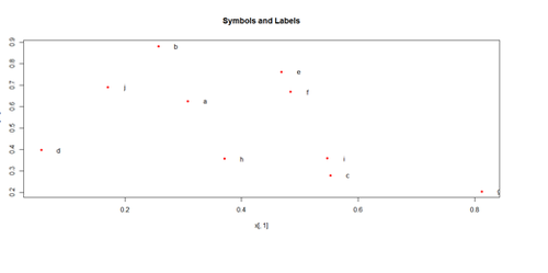
plot(x[,1], x[,2], pch=20, col="red", main="Symbols and Labels")
text(x[,1]+0.03, x[,2], rownames(x))
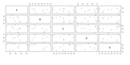
pairs(x)
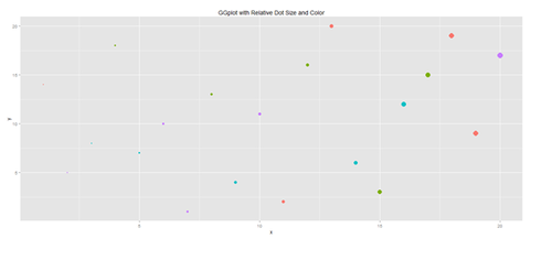
Another way to generate scatterplots is by using ggplot:
# library(ggplot2)
x <- sample(1:20, 20); y <- sample(1:20, 20); cat <- rep(c("A", "B", "C", "D"), 5)
#vs. cat <- rep(c("A", "B", "C", "D"), each=5)
plot.1 <- qplot(x, y, geom="point", size=5*x, color=cat, main="GGplot with Relative Dot Size and Color") + theme(legend.position = "topleft")
print(plot.1)
# Use Case-Studies: https://umich.instructure.com/courses/38100/files/folder/Case_Studies
#  Case_03_MentalHealthServicesSurvey
# data1 <- read.table('https://umich.instructure.com/files/399128/download?download_frd=1&verifier=AG2e9QUKUm1jvDBpkX7D9jbEjKNc4irA0ECk0f7p', header=T)
head(data1)
attach(data1)
# library("Hmisc")
describe(data1)
plot(data1[,3], data1[,4], pch=20, col="red", main="Symbols and Labels")
# text(data1 [,3]+0.03, data1 [,4], rownames(data1))
plot.1 <- qplot(x, y, geom="point", size=5*x, color=cat, main="GGplot with Relative Dot Size and Color") + theme(legend.position = "topleft")
print(plot.1)
# redo plots using majorfundtype FacilityType Ownership Focus
# pairs(data1, na.action=na.omit)
# Scatterplot with regression line. Use the “diamonds” dataset, which is a data frame with
# 53,940 rows and 10 variables ()
# describe(diamonds)
# Use Case-Studies: https://umich.instructure.com/courses/38100/files/folder/Case_Studies
# CaseStudy01_Divorce_YoungAdults
# data1 <- read.csv('https://umich.instructure.com/files/399118/download?download_frd=1&verifier=ESACv31KcyiHbkPZPuT8Oo4V7XzPtgTTbs6PQLTv', header=T)
attach(data1)
# plot variables: DIVYEAR momint dadint momclose depression livewithmom gethitched
set.seed(110)
# par(mfrow=c(1,2))
data.2 <- diamonds[sample(nrow(diamonds), 500), ]
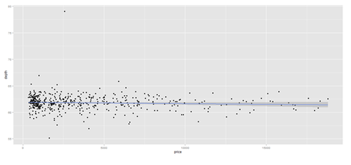
plot.2 <- qplot(price, depth, data = data.2, geom = c("point", "smooth"), method = "lm")
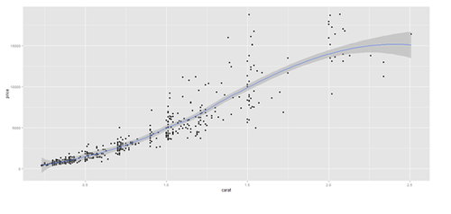
plot.3 <- qplot(carat, price, data=data.2, geom=c("point", "smooth"), span=0.4)
print(plot.2); print(plot.3)
Barplots
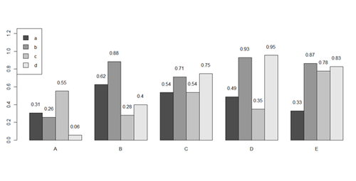
x <- matrix(runif(50), ncol=5, dimnames=list(letters[1:10], LETTERS[1:5]))
barplot(x[1:4,], ylim=c(0, max(x[1:4,])+0.3), beside=TRUE, legend.text = letters[1:4],
       args.legend = list(x = "topleft"))
text(labels=round(as.vector(as.matrix(x[1:4,])),2), x=seq(1.5, 21, by=1) + sort(rep(c(0,1,2,3,4), 4)), y=as.vector(as.matrix(x[1:4,]))+0.1)
# to put error bars on barplot:
# 10 rows (a, b, c, …):
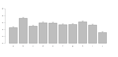
bar <- barplot(m <- rowMeans(x) * 10, ylim=c(0, 10))
stdev <- sd(t(x))
arrows(bar, m, bar, m + stdev, length=0.15, angle = 90)
# Case_04_ChildTrauma
# data1 <- read.table('https://umich.instructure.com/files/399129/download?download_frd=1&verifier=Hmv0YW2Kie5ZTV9CKBUNArSHR66f3GWSmVzZDBxc', header=T)
attach(data1)
head(x)
head(data1)
# plot data
data2 <- data1[,-5]   # remove the 5th columns text
data1 <- data2[,-5]   # remove the 6th columns text
# or data1 <- data1[,c(-5,-6)]
data2 <- as.data.frame(data1)
Blacks <- data2[which(data2$\$$race=="black"),]
 Other <- data2[which(data2$\$$race=="other"),]
Hispanic <- data2[which(data2$\$$race=="hispanic"),]
 White <- data2[which(data2$\$$race=="white"),]
A <- c(mean(Blacks$\$$age), mean(Blacks$\$$service))
#colnames(A) <- c("age "," service ")
B <- c(mean(Other$\$$age), mean(Other$\$$service))
C <- c(mean(Hispanic$\$$age), mean(Hispanic$\$$service))
D <- c(mean(White$\$$age), mean(White$\$$service))
x <- cbind(A, B, C, D)
bar <- barplot(x[1:2,], ylim=c(0, max(x[1:2,])+2.0), beside=TRUE,
legend.text = c("age","service") ,  args.legend = list(x = "right"))
text(labels=round(as.vector(as.matrix(x[1:2,])),2), x=seq(1.4, 21, by=1.5), #y=as.vector(as.matrix(x[1:2,]))+0.3)
y=11.5)
m <- x; stdev <- sd(t(x))
arrows(bar, m, bar, m + stdev, length=0.15, angle = 90)
barplot(as.matrix(data1[1:4,]), ylim=c(0, max(data1[1:4,])+0.3), beside=TRUE, legend.text = data1[1:4,1], args.legend = list(x = "topleft"))
text(labels=round(as.vector(as.matrix(data1[1:4,])),2), x=seq(1.5, 21, by=1), y=as.vector(as.matrix(data1[1:4,]))+0.1)
# Columns (A, B, C, D, E):
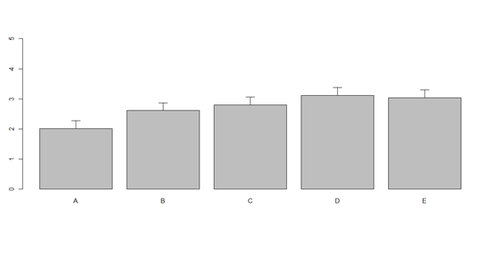
bar <- barplot(m <- colMeans(x) * 5, ylim=c(0, 5))
stdev <- sd(t(x))
arrows(bar, m, bar, m + stdev, length=0.15, angle = 90)
Histograms and Density Plots
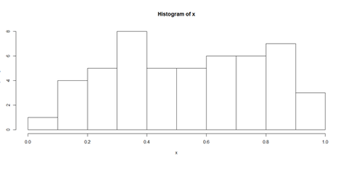
hist(x, freq=TRUE, breaks=10)
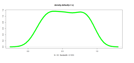
plot(density(x), lwd = 10, col="green")
Pie Chart
# first , “A”, and second, “B”, columns
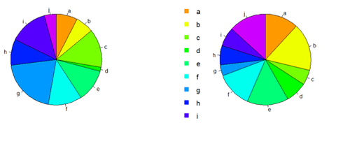
par (mfrow=c(1,2))
pie(x[,1], col=rainbow(length(x[,1]), start=0.1, end=0.8), clockwise=TRUE)
pie(x[,1], col=rainbow(length(x[,1]), start=0.1, end=0.8), clockwise=TRUE)
pie(x[,2], col=rainbow(length(x[,2]), start=0.1, end=0.8), clockwise=TRUE)
legend("topleft", legend=row.names(x), cex=1.3, bty="n", pch=15, pt.cex=1.8, col=rainbow(length(x[,2]), start=0.1, end=0.8), ncol=1)
You can export the data:
write.table(x, " ", "data.txt")
# copy-paste it in SOCR Pie chart to generate another Pie view of data
Line Plots Using ggplot
head(diamonds)
| Carat | Cut | Color | Clarity | Depth | Table | Price | X | Y | Z | |
| 1 | 0.23 | Ideal | E | SI2 | 61.5 | 55 | 326 | 3.95 | 3.98 | 2.43 |
| 2 | 0.21 | Premium | E | SI1 | 59.8 | 61 | 326 | 3.89 | 3.84 | 2.31 |
| 3 | 0.23 | Good | E | VS1 | 56.9 | 65 | 237 | 4.05 | 4.07 | 2.31 |
| 4 | 0.29 | Premium | I | VS2 | 62.4 | 58 | 334 | 4.2 | 4.23 | 2.63 |
| 5 | 0.31 | Good | J | SI2 | 63.3 | 58 | 335 | 4.34 | 4.35 | 4.75 |
| 6 | 0.24 | VeryGood | J | VVS2 | 62.8 | 57 | 336 | 3.94 | 3.96 | 2.48 |
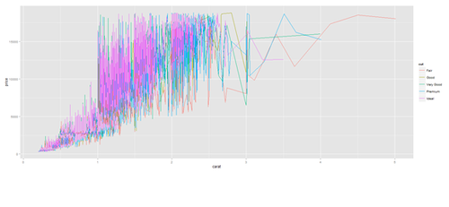
plot.2 <- ggplot(diamonds, aes(carat, price, group=cut, color=cut)) + geom_line()
print(plot.2)
plot.2 <- ggplot(data1, aes(age, service, group=race, color=race)) + geom_line()
print(plot.2)
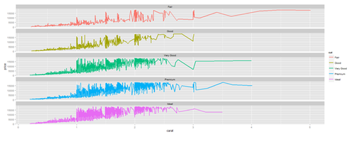
# Faceting plot (geometrically, faceting (or facetting) is the process of removing parts of a polygon, polyhedron or polytope, without creating any new vertices)
plot.3 <- ggplot(diamonds, aes(carat, price)) + geom_line(aes(color=cut), size=1) +
facet_wrap(~cut, ncol=1)
print(plot.3)
Barplots with ggplot
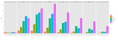
plot.4 <- ggplot(diamonds, aes(cut, fill=cut)) + geom_bar() + facet_grid(. ~ clarity)
print(plot.4)
New_var <- service+rnorm(1000, 0,1)
data1$\$$New_var <- int(New_var)
plot.4 <- ggplot(data1, aes(race, fill= traumatype)) + geom_bar() + facet_grid(. ~ New_var)
print(plot.4)
plot.4a <- ggplot(diamonds, aes(color, price/carat, fill=color)) + geom_boxplot()
print(plot.4a)
<center>[[Image:SMHS_SciVisualization20.png|500px]] </center>
==='"`UNIQ--h-9--QINU`"'Jitter plot===
plot.5 <- ggplot(diamonds, aes(color, price/carat)) + geom_jitter(alpha = I(1 / 2), aes(color=color))
print(plot.5)
<center>[[Image:SMHS_SciVisualization21.png|500px]] </center>
==='"`UNIQ--h-10--QINU`"'Density Plots===
plot.6 <- ggplot(diamonds, aes(carat, size=2)) + geom_density(aes(color = cut))
print(plot.6)
<center>[[Image:SMHS_SciVisualization22.png|500px]] </center>
plot.6 <- ggplot(data1, aes(age, size=2)) + geom_density(aes(color = traumatype))
print(plot.6)
plot.7 <- ggplot(diamonds, aes(carat, size=2)) + geom_density(aes(fill = color))
print(plot.7)
<center>[[Image:SMHS_SciVisualization23.png|500px]] </center>
plot.8 <- ggplot(diamonds, aes(x=carat, size=1)) + geom_histogram(aes(y = price), binwidth=0.2) + geom_density()
print(plot.8)
<center>[[Image:SMHS_SciVisualization24.png|500px]] </center>
plot.8a <- ggplot(diamonds, aes(x=carat, size=1)) + geom_histogram(aes(y = price), stat="identity") + geom_density()
print(plot.8a)
<center>[[Image:SMHS_SciVisualization25.png|500px]] </center>
==='"`UNIQ--h-11--QINU`"'Heatmaps===
# Generating Dendogram Association Heatmap Plot (Genotype vs. Imaging phenotype
# http://stat.ethz.ch/R-manual/R-patched/library/stats/html/heatmap.html
# http://www.ncbi.nlm.nih.gov/pmc/articles/PMC4005931/
AD_Associations_Data <- read.table("https://umich.instructure.com/files/330387/download?download_frd=1&verifier=gLk2ADgrLhXGeknI6mqIeJugi2ODr8RARsQlBUMe", header=TRUE, row.names=1, sep=",", dec=".")
MCI_Associations_Data <- read.table("https://umich.instructure.com/files/330390/download?download_frd=1&verifier=FczlJD6ISRPZhu69xvHuoZHx2c7gXX9YEvvPCTBG", header=TRUE, row.names=1, sep=",", dec=".")
NC_Associations_Data <- read.table("https://umich.instructure.com/files/330391/download?download_frd=1&verifier=i2BEtSpmpbrzQUPoA2ST06IzzcaenyVEHRepHSF3", header=TRUE, row.names=1, sep=",", dec=".")
require(graphics)
require(grDevices)
library(gplots)
AD_Data <- AD_Associations_Data
MCI_Data <- MCI_Associations_Data
NC_Data <- NC_Associations_Data
AD_mat <- as.matrix(AD_Data); class(AD_mat) <- "numeric"
MCI_mat <- as.matrix(MCI_Data); class(MCI_mat) <- "numeric"
NC_mat <- as.matrix(NC_Data); class(NC_mat) <- "numeric"
# set up the rol (rc) and column (cc) colors for each cohort
rcAD <- rainbow(nrow(AD_mat), start = 0, end = 1.0); ccAD<-rainbow(ncol(AD_mat), start = 0, end = 1.0)
rcMCI <- rainbow(nrow(MCI_mat), start = 0, end=1.0); ccMCI<-rainbow(ncol(MCI_mat),start=0,end=1.0)
rcNC <- rainbow(nrow(NC_mat), start = 0, end = 1.0); ccNC<-rainbow(ncol(NC_mat), start = 0, end = 1.0)
# set up 1x3 graph display - par (mfrow=c(1,3)) – does not work with ‘heatmap’
hvAD <- heatmap(AD_mat, col = cm.colors(256), scale = "column", RowSideColors = rcAD, ColSideColors = ccAD, margins = c(2,2), main="AD Cohort SNP-ROI_volume Association (p_values)")
hvMCI <- heatmap(MCI_mat, col = cm.colors(256), scale = "column", RowSideColors = rcMCI, ColSideColors = ccMCI, margins = c(2,2), main="MCI Cohort SNP-ROI_volume Association (p_values)")
hvNC <- heatmap(NC_mat, col = cm.colors(256), scale = "column", RowSideColors = rcNC, ColSideColors = ccNC, margins = c(2,2), main="NC Cohort SNP-ROI_volume Association (p_values)")
<center>[[Image:SMHS_SciVisualization26.png|500px]] </center>
# Alternatively, we can use the R package gplots
install.packages("gplots")
library(gplots)
## col dendrogram plotted and col reordering done.
# heatmap.2(AD_mat, keysize=2)
## A more decorative heatmap, with z-score scaling along columns
heatmap.2(AD_mat, col=cm.colors(255), scale="column", RowSideColors=rcAD, ColSideColors=ccAD, margin=c(8, 7), xlab="Imaging Biomarkers (ROI volume)", ylab= "Genetics Biomarkers (SNPs)", main="AD Associations Heatmap (SNP-Imaging)", tracecol="green", density="density")
<center>[[Image:SMHS_SciVisualization27.png|500px]] </center>
==='"`UNIQ--h-12--QINU`"'Correlation Plots===
The <b>corrplot</b> package is a graphical display of a correlation matrix, and confidence intervals, with some tools for matrix reordering. There are seven visualization methods (parameter method) in corrplot package, named "circle", "square", "ellipse", "number", "shade", "color", "pie".
# install.packages("corrplot")
library(corrplot)
NC_Associations_Data <- read.table("https://umich.instructure.com/files/330391/download?download_frd=1&verifier=i2BEtSpmpbrzQUPoA2ST06IzzcaenyVEHRepHSF3", header=TRUE, row.names=1, sep=",", dec=".")
M <- cor(NC_Associations_Data)
<center>[[Image:SMHS_SciVisualization28.png|500px]] </center>
==='"`UNIQ--h-13--QINU`"'Hyperbolic Visualization===
• URL: http://socr.umich.edu/html/Navigators.html
• Tools:
<blockquote>o Java/Jar applet: http://socr.umich.edu/html/navigators/HW/jars/SOCR_HW_Viewer.jar</blockquote>
<blockquote>o JavaScript: http://socr.umich.edu/html/navigators/D3/SOCR_D3_Viewer.html (JSON)</blockquote>
• Data Format
<blockquote>o XML data: http://socr.umich.edu/html/navigators/HW/SOCR_HyperTree.xml</blockquote>
<blockquote>o JSON data: http://socr.umich.edu/html/navigators/D3/xml/SOCR_HyperTree.json</blockquote>
• D3 Visualization
<blockquote>o E:\Ivo.dir\Research\UMichigan\Education_Teaching_Curricula\2015_2016\HS_853_Fall_2015\Modules_docx\Tools\TreeViewer_JS</blockquote>
<blockquote> treeJS.json</blockquote>
<blockquote> flareD3.json</blockquote>
<center>[[Image:SMHS_SciVisualization29.png|500px]] </center>
<center>[[Image:SMHS_SciVisualization30.png|500px]] </center>
• URL: https://github.com/mbostock/d3/wiki/Gallery
• Source code: https://github.com/mbostock/d3
<center>[[Image:SMHS_SciVisualization31.png|500px]] </center>
==='"`UNIQ--h-14--QINU`"'Motion Charts===
• Video: http://www.socr.ucla.edu/SOCR_MotionCharts/SOCR_HTML5_MotionChart_Video2.gif
• Java: http://www.socr.ucla.edu/SOCR_MotionCharts/
• HTML5: http://socr.umich.edu/HTML5/MotionChart/
• Activities: http://wiki.socr.umich.edu/index.php/SOCR_MotionCharts
<center>[[Image:SMHS_SciVisualization32.png|500px]] </center>
==='"`UNIQ--h-15--QINU`"'1D/2D/3D signal/area/volume/surface/model/atlas visualization===
• 1D: (See R/SOCR Visualization tools above)
• 2D: http://imagej.nih.gov/ij/
• 3D: http://socr.umich.edu/HTML5/BrainViewer/
<b>Supported File Formats:</b>
Volumes (.nii / .nii.gz / .img&.hdr / .mgh / .mgz / .nrrd)
Shapes (.dx / .vtk / .stl / FreeSurfer)
Fibers (.trk)
<center>[[Image:SMHS_SciVisualization33.png|500px]] </center>
==='"`UNIQ--h-16--QINU`"'Trees and Graphs===
• Trees/Hierarchies and general Graphs
# Install and load the APE package, needed for the phylogenetic tree rendering (as.phylo)
# install.packages("ape")
library("ape")
Load data
# Data: 02_Nof1_Data.csv
data.1 <- read.table("https://umich.instructure.com/files/330385/download?download_frd=1&verifier=DwJUGSd6t24dvK7uYmzA2aDyzlmsohyaK6P7jK0Q ", sep=",", header = TRUE)
head(data.1)
<center>
{| class="wikitable" style="text-align:center; width:35%" border="1"
|-
mydata1
|-
|||ID||Day||Tx||SelfEff||SelfEff25||WPSS||SocSuppt||PMss||PMss3||PhyAct
|-
|1||1||1||1||33||8||0.97||5.00||4.03||1.03||53
|-
|2||1||2||1||33||8||-0.17||3.87||4.03||1.03||73
|-
|3||1||3||0||33||8||0.81||4.84||4.03||1.03||23
|-
|4||1||4||0||33||8||-0.41||3.62||4.03||1.03||36
|-
|5||1||5||1||33||8||0.59||4.62||4.03||1.03||21
|-
|6||1||6||1||33||8||-1.16||2.87||4.03||1.03||0
|}
</center>
Clustering
hc = hclust(dist(data.1), 'ave')
# the agglomeration method can be specified "ward.D", "ward.D2", "single","complete", "average" (= UPGMA), "mcquitty" (= WPGMA),"median" (= WPGMC) or "centroid" (= UPGMC)
# (3) Plot clustering diagram
par (mfrow=c(1,1))
# very simple dendrogram
plot(hc)
<center>[[Image:SMHS_SciVisualization34.png|500px]] </center>
require(graphics)
(x <- identify(hc)) ## Terminate with 2nd mouse button !!
identify(hc, <mark>function(k)</mark> print(table(data.1[k,5])))
You can now cut the tree into branches. You can split the tree into 2 groups, by setting the number of cuts with the k=2 parameter, or by specifying height to cut the tree at (?cutree):
k an integer scalar or vector with the desired number of groups
h numeric scalar or vector with heights where the tree should be cut
cutree(hc, k = 2)
# alternatively specify the height, which is, the value of the criterion associated with the clustering method
# for the particular agglomeration.
cutree(hc, h= 50) # cut at h=50
table(cutree(hc, h= 50)) # cluster distribution
# To identify the number of cases for varying number of clusters we can combine calls to cutree and table
# in a call to <b>sapply</b> -- to see the sizes of the clusters for 2≤ k≤10 cluster-solutions:
# numbClusters=5;
myClusters = sapply(2:10,function(numbClusters)table(cutree(hc, numbClusters)))
names(myClusters) <- paste("Number of Clusters=", 2:10, sep = "")
myClusters
#To see which SubjectIDs are in which clusters:
groups.10 <- cutree(hc, k = 10)
sapply(unique(groups.10),function(g)data.1$\$$ID[groups.10 == g])
#To see which Treatments (Tx) are in which clusters:
groups.2 <- cutree(hc, k = 2)
sapply(unique(groups.2),function(g)data.1$\$$Tx[groups.2 == g])
# drill down deeper
table(groups.2, data.1$\$$Tx)
# For a small number of observations, we can often interpret the cluster solution directly by looking
# at the labels of the observations that are in each cluster.
# This is hard for larger data sets. To characterize clusters we can look at cluster summary statistics,
# like the median, of the variables that were used to perform the cluster analysis broken down
# by the groups that the cluster analysis identified.
The aggregate function will compute stats (e.g., median) on many variables simultaneously.
To look at the median values for the variables we've used in the cluster analysis, broken up by the cluster groups:
aggregate(data.1, list(groups.10),median) # may have to shrink data.1 prior to clustering!
# data.2 <- data.1[,-c(1,3)]  # Remove ID and Tx variables?
aggregate(data.2, list(groups.2),median) # for only 2 clusters
| Group | ID | Day | Tx | SelfEff | SelfEff25 | WPSS | SocSuppt | PMss | PMss3 | PhyAct | |
| 1 | 1 | 14 | 16 | 0 | 20 | -5 | -0.040 | 2.995 | 3.275 | 0.275 | 41 |
| 2 | 2 | 16 | 15 | 1 | 25 | 0 | 0.025 | 3.280 | 3.360 | 0.360 | 104 |
table(groups.2, data.1$\$$<u><b>PhyAct</b></u>)

 # library("Hmisc")

 describe(data.1$\$$PhyAct)
# It’s useful to add the numbers of observations in each group (aggregate returns a data frame,
# that can be manipulated)
df.2 <- aggregate(data.1, list(groups.2),median)
data.frame(Cluster= df.2[,1], Freq=as.vector(table(groups.2)), df.2[,-1])
| Cluster | Freq | ID | Day | Tx | SelfEff | SelfEff25 | WPSS | SocSuppt | PMss | PMss3 | PhyAct | |
| 1 | 1 | 570 | 14 | 16 | 0 | 20 | -5 | -0.040 | 2.995 | 3.275 | 0.275 | 41 |
| 2 | 2 | 330 | 16 | 15 | 1 | 25 | 0 | 0.025 | 3.280 | 3.360 | 0.360 | 104 |
Publications
• This paper examines nasal and bronchial tissue cultures as appropriate in vitro models for the assessment of smoking-induced adverse effects in the respiratory system (doi: 10.1177/1091581814551647), using “hclust” package. No data.
• This paper classified subtypes of gastric cancer based on epidemiologic and histologic and gene expression data. These new classifications of gastric cancer have implications for improving our understanding of disease biology and identification of unique molecular drivers for each gastric cancer subtype (doi: 10.1158/1078-0432.CCR-10-2203).
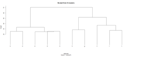
Repeat the clustering
# using centroids and squared Euclidean distance
# cut the tree into 10 clusters and reconstruct the upper part of the tree from the cluster centers.
hc <- hclust(dist(data.1), "cen")
mem <- cutree(hc, k = 10)
cent <- NULL
for(k in 1:10){
 		cent <- rbind(cent, colMeans(data.1[mem == k, , drop = FALSE]))
}
hc1 <- hclust(dist(cent), method = "cen", members = table(mem))
opar <- par(mfrow = c(1, 2))
plot(hc,  labels = FALSE, hang = -1, main = "Original Tree")
plot(hc1, hang = -1, main = "Re-start from 10 clusters")
par(opar)
Identify subjects within each of the 10 classes
rect.hclust(hc, h=10)
# To save the cluster numbers to a new variable in the dataset, use the cutree function.
# data.1$\$$clusterID <- cutree(hc, 10)
 data.1$\$$clusterID <- cutree(hc, 10)
head(data.1)