SOCR Videos Dashboard
Contents
SOCR Videos: SOCR Data Dashboard Videos
The SOCR Dashboard is a webapp providing a mechanism to integrate dispersed multi-source data and service the mashed information via human and machine interfaces in a secure, scalable manner. The Dashboard enables the exploration of subtle associations between variables, population strata, or clusters of data elements, which may be opaque to standard independent inspection of the individual sources. This a new platform includes a device agnostic tool for graphical querying, navigating and exploring the multivariate associations in complex heterogeneous datasets.
As an integrated Big-Data analytics suite, the SOCR Analytics Dashboard is designed for web-based merging, integration, and analysis of large, heterogeneous datasets. The package features a non-relational database for storage and integration of heterogeneous datasets, a JavaScript-based web server built using node.js, and a sleek front-end for visualization and real-time manipulation of data.
Video Tutorial
- SOCR Data Dashboard Video Tutorial.
- SOCR Dashboard demonstration using user-specified data (in this case, multi-source pediatric obesity data).
Script/Story Board
(Time: concepts)
- Beginning: 2 different versions of webapp
- 1:22: Sample file contains many omissions and errors
- 1:46: Variable list auto-populated
- 2:20: Completely different dataset
- 2:45: Much larger data size
- 3:30: Cross-filtering functionality
- 3:47: Dynamic tile-based layout
- 4:30: Context sensitive menus
- 7:00: Custom Datasets
Test Data
The following datasets are used in this specific SOCR Data Dashboard demonstration:
- pediatric obesity dataset,
- Parkinson's disease neuroimaging-phenotypic-genetics dataset,
- A BDBag/BagIt/ZIP formatted version of the above 2 datasets is also available here.

Setting up the Dashboard
1. Ensure the node framework has been installed.
2. Install MongoDB. This is not required, but if you want to see the demo using the default CMS, BLS, and Census data you need MongoDB installed.
3. In a command prompt navigate to the server/mongodb/bin folder, and run mongod:
mongod --dbpath ../data
4. Navigate to the root directory of the project in node, and run
npm install
5. Once dependencies are installed, launch node server:
npm start
6. Navigate to selected address in browser to launch webapp (default is http://localhost:3000/).
Example Case-Study: Autism Brain Imaging Data Exchange (ABIDE)
This example describes a step-by-step recipe for using the Data Dashboard service to interrogate the ABIDE data archive.
The Autism Brain Imaging Data Exchange (ABIDE) data includes complex multi-source, incomplete, incongruent and multi-modal data for Autism spectrum disorder (ASD) pediatric cases. Core characteristics of ASD include impairment in social reciprocity, and by repetitive, restricted, and stereotyped behaviors/interests.
These data allow us to peak into the heterogeneous clinical, biological and physio-social characteristics of the ASD phenotypes. Specific biomedical questions that can be addressed via such data include early determination, tracking, diagnosis and prognosis, as well as assessing the clinical impact of alternative treatments.
The Data Dashboard webapp allows us to navigate this very heterogeneous data (n=1,112, k>2,000), graphically explore deep multivariate relations, associations, and trends. In addition, the dashboard service may be used to generate testable research hypothesis about various ASD traits that can be subsequently evaluated using prospective datasets.
Protocol
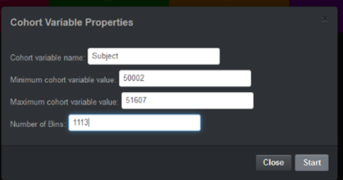
(1) Download the BDDS ABIDE BagIt data object. (2) Extract the 4 data files (neuroimaging_metrics.csv, neuroimaging_metrics_metadata.csv, neuroimaging_metrics_qc.csv, phenotypes.csv), which contain the relevant (appropriately named) components of the ABIDE dataset (3) Start the Data Dashboard app (4) Select Free—Anchored Data (5) Enter a new anchor variable subject_ID

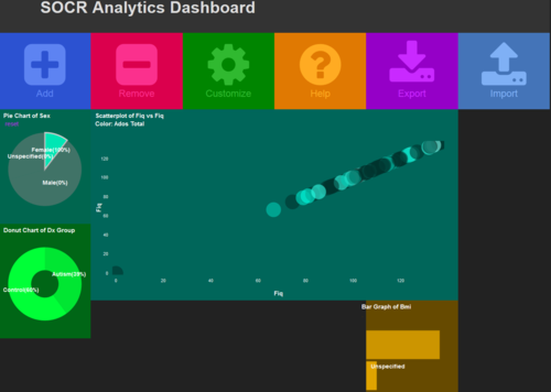
(6) Import -- Phenotypes data (Pheno) (7) Select a variable of interest (e.g., Sex) (8) Add -- Chart (e.g., Pie Chart for Sex) from the Pheno data (Variable Sex) (9) Add -- Chart (e.g., Histogram Chart for BMI) from the Pheno data (Variable BMI) – note that BMI has lots of missing data!!! (10) Add -- Chart (e.g., Pie Chart of DX_Group or DSM_IV_TR) from the Pheno data (11) Add -- Chart (e.g., Scatter Plot: FIQ vs. ADOS_COMM) (12) Manipulate some of the charts (e.g., select females, BMIs, etc.) to examine the change in the other features (e.g., FIQ score)

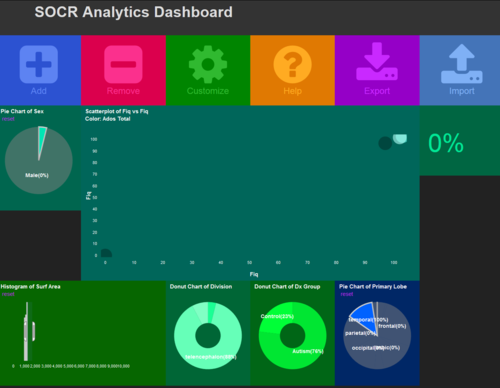
(13) Import -- Neuroimaging Data (NI), be patient, it will take some time to load the data. After the dialogue box shows up, click “Import” (14) Add -- NI -- Select a variable of interest (e.g., Volume or SurfArea, as an example of a feature) click “Continue” (15) Add -- NI -- Select a variable of interest (e.g., Fold_Ind, as an example of a feature) click “Continue” (16) Add -- NI -- Select a variable of interest (e.g., Primary_Lobe, as an example of a feature) click “Continue” (17) Manipulate some of the charts to study the impact on the other plots.

Reference Materials
- BagIt/BDBag Data File Format:
- Data Dashboard
Reference/Citation
- Husain, SS, Kalinin, A, Truong, A, Dinov, ID. (2015) SOCR data dashboard: an integrated big data archive mashing medicare, labor, census and econometric information. Journal of Big Data, 2(13):1-18. DOI: 10.1186/s40537-015-0018-z.
- Dashboard GitHub source code
- SOCR Dashboard Webapp
- SOCR Home page: http://www.socr.ucla.edu or http://www.StatisticsResource.org
Translate this page: