SOCR EduMaterials Activities SymbolicAxisChart
Contents
SYMBOLIC AXIS
Summary
This activity describes the need, general methods and SOCR utilities for the symbolic axis chart.
Goals
The primary purposes of this activity is to:
- strengthen one's understanding of the symbolic axis chart in SOCR
- show how it can be used
Background
The Symbolic Axis is basically a Scatter Plot with symbolic axes. It if often useful for concepts, theories, processes, etc.
For reference, see IEEE.
Description
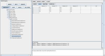
Go to the SOCR Charts and select Miscellaneous from the items located on the left, then select Symbol Axis Demo:

Note that in this demonstration, the axes are labeled with letters and the graph has Cartesian values.
Examples & Exercises
- Exercise 1: Transform a typical scatter plot into a symbolic axis chart. What conclusions can be made from the new set of display?
- Exercise 2: Can the values of the symbolic axis chart be negative? If so, what does it mean?
Data Type and Format
By clicking Data between the Graph and Mapping button, it allows users to input or vary the values of the data set. For Symbolic Axis Charts, there may be more than one data set plotted as long as observers can distinguish the different events. Symbolic Axis Charts only need numerical values to create although the original data set is typically categorical. The image below demonstrates the data table needed to create Symbolic Axis Charts:

Applications
One of the most persuasive elements when proposing data and literature to others is a well-designed chart presentation.
The Symbolic Axis approach is useful for displaying events that are not easily categorized such as color or dates, but for more complicated items such as theories and processes.
Suppose engineers want to visually display results of different approaches to a problem. Utilizing this type of chart may be useful for their illustrations.
Translate this page: