SMHS SciVisualization NetworkViz
Contents
[hide]SMHS Scientific Visualization - Complex Network Visualization
Background
First see the SOCR, Excel and R charts section.
# Install package
# install.packages("igraph")
library("igraph")
# build a simple graph
g <- graph( c(1,2, 1,3, 2,3, 3,4), n=10)
plot(g)
summary(g); g; is.igraph(g); is.directed(g); vcount(g); ecount(g)
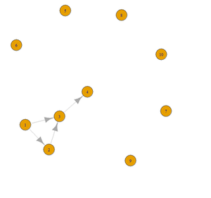
plot(g, layout=layout.circle)
plot(g, layout=layout.fruchterman.reingold)
plot(g, layout=layout.graphopt)
plot(g, layout=layout.kamada.kawai, vertex.color="cyan")
# Interactive
tkplot(g, layout=layout.kamada.kawai)
# 3D plot
rglplot(g, layout=layout.kamada.kawai(g))
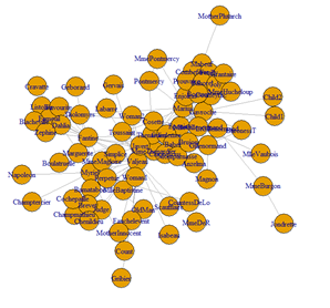
Dataset 1: Coappearance network in the novel “les miserablese”.
D. E. Knuth, The Stanford GraphBase: A Platform for Combinatorial Computing, Addison-Wesley, Reading, MA (1993).
The data contains the weighted network of coappearances of characters in Victor Hugo's novel "Les Miserables".
Nodes represent characters as indicated by the labels and edges connect any pair of characters that appear in the same chapter of the book. The values on the edges are the number of such coappearances.
Alternatively, we can use a directed, weighted network representing the neural network of the nematode
C. Elegans. D. Watts and S. Strogatz, Nature 393, 440-442 (1998).
The file celegansneural.gml describes a weighted, directed network where the nodes have been renumbered to be consecutive.
Edge weights are the weights given by Watts.
install.packages("rgl")
library("igraph")
g<-read.graph("C:\\Users\\Dinov\\Desktop\\celegansneural.gml",format=c("gml"))
g
plot(g, layout=layout.graphopt)
data_g <- read.table("https://umich.instructure.com/files/330389/download?download_frd=1&verifier=u1jqCGS8AAU0MsO5ffLCyvVFYXXAflpdLtg8RXhk", sep=" ", header = FALSE)
data_g_mat <- as.matrix(data_g, byrow=TRUE, nc=2)
g_miserab <- graph.edgelist(data_g_mat, dir=FALSE)
summary(g_miserab)
plot(g_miserab, layout=layout.graphopt)
# rglplot(g_miserab, layout=layout.kamada.kawai(g_miserab))
# to name the vertices and and plot the graph  of the first 10 vertices
V(g_miserab)$\$$name
 g_miserab.1 <- graph.ring(10)
 V(g_miserab.1)$\$$name <- sample(letters, vcount(g_miserab.1))
plot(g_miserab.1, layout=layout.graphopt)
# compute the node adjacency matrix
g <- g_miserab; as_adjacency_matrix(g)
E(g)$\$$weight <- runif(ecount(g))
 W <- get.adjacency(g, attr="weight")
 W

==='"`UNIQ--h-2--QINU`"'Social Network Analysis Example===

 # free memory
 # rm(list = ls())
 # gc()


 # load termDocMatrix dataset
 # These data include Twitter text data of @RDataMining representing a general social network analysis
 # example. The terms represent people and the tweets represent LinkedIn groups.
 # The term-document matrix can be viewed as the group membership of people.
 # We may want to build a network of terms based on their co-occurrence in the same tweets,
 # similarly to a network of people based on their group membership.
 # https://umich.instructure.com/files/541336/download?download_frd=1

load("E:\\Ivo.dir\\Research\\UMichigan\\Education_Teaching_Curricula\\2015_2016\\HS_853_Fall_2015\\Modules_docx\\data\\03_GraphNetwork_TermDocMatrix.rdata")

<center>Labeled graph [[Image:SMHS_SciVisualization40.png|300px]] </center>

<center>Adjacency matrix [[Image:SMHS_SciVisualization41.png|300px]] Coordinates are 1-6.</center>

 # inspect part of the matrix
 termDocMatrix [5:10,1:20]
 # change it to a Boolean matrix == incidence matrix
 termDocMatrix [termDocMatrix >=1] <- 1

 # transform into a term-term adjacency matrix (n×n), where (i,j)th entries correspond to the number of edges
 # node from xi to node xj.
 # Matrix Multiplication in R: http://www.statmethods.net/advstats/matrix.html, dim(t(termDocMatrix))
 termMatrix <- termDocMatrix %*% t(termDocMatrix)

 # A graph has no loops, when all entries of the adjacency matrix on the main diagonal of are zeroes
 # http://mathonline.wikidot.com/adjacency-matrices
 diag(termMatrix)

 # The matrix product of incidence matrix (B) and it’s transpose B×B<sup>T</sup> represents the degrees of all nodes!
 # inspect terms numbered 5 to 10
 termMatrix[5:10,5:10]

 # library("igraph")
 # build a graph from the adjacency matrix
 g <- graph.adjacency(termMatrix, weighted=T, mode="undirected")
 plot(g)

 # remove loops
 g <- simplify(g); plot(g)

 # set labels and degrees of  V(g)
 V(g)$\$$label <- V(g)$\$$name
 V(g)$\$$degree <- degree(g)
# set seed to make the layout reproducible
set.seed(1953)
layout1 <- layout.fruchterman.reingold(g)   # Fruchterman-Reingold layout
plot(g, layout=layout1)
# plot(g, layout=layout.kamada.kawai)
# tkplot(g, layout=layout.kamada.kawai)
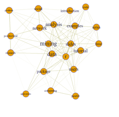
# Finesse the graph appearance – vertices and edges
V(g)$\$$label.cex <- 2.2 * V(g)$\$$degree / max(V(g)$\$$degree)+ .2
 V(g)$\$$label.color <- rgb(0, 0, .2, .8)
V(g)$\$$frame.color <- rgb(0,0,1)
 egam <- (log(E(g)$\$$weight)+.4) / max(log(E(g)$\$$weight)+.4)
 E(g)$\$$color <- rgb(.5, .5, 0, egam)		# Graph Edges, E(g)
E(g)$\$$width <- egam
 # plot the graph in layout1
 plot(g, layout=layout1)

 V(g)$\$$label <- V(g)$\$$name
 V(g)$\$$label.color <- rgb(0, 0, 0, 0.5)
V(g)$\$$label.dist <- 1.0	# relative distance of labels from node center
 V(g)$\$$label.angle<- 3/8   #in radians
V(g)$\$$label.cex <- 1.4*V(g)$\$$degree/max(V(g)$\$$degree) + 1
 V(g)$\$$color <- rgb(1, 0, 0, .4)
V(g)$\$$size <- 22 * V(g)$\$$degree / max(V(g)$\$$degree)+ 2
 V(g)$\$$shape <- "rectangle"
# V(g)$\$$.size=10*(strwidth(V(g)$\$$label) + strwidth("oo")) * 10
# V(g)$\$$.size2=strheight("I") * 10
 V(g)$\$$frame.color <- NA
# set vertex labels and their colors and sizes
# set edge width and color
E(g)$\$$width <- .3
 E(g)$\$$color <- rgb(.5, .5, 0, .3)
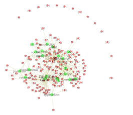
set.seed(1234)
plot(g, layout=layout.fruchterman.reingold)
Hands-on activity (oncological primary doctor and a second-opinion)
We use some of the Stanford Real Graph Data (http://snap.stanford.edu/data/) or this graph data on cancer patients seen by a primary doctor and a second-opinion doctor, stage of the disease, and diagnostic agreement between primary and secondary oncologist: Primary, Secondary, Stage, DxAgreement
# 03_GraphData_Health.txt
healthGraphTable <- read.table("https://umich.instructure.com/files/554234/download?download_frd=1", sep='\t', dec=',', header=T)
#specify the path, separator(tab, comma, ...), decimal point symbol, etc.
| Primary | Secondary | Stage | DxAgreement | |
| 1 | AA | DD | 3 | Y |
| 2 | AB | DD | 3 | R |
| 3 | AF | BA | 3 | Q |
| 4 | DD | DA | 3 | Q |
| 5 | CD | EC | 3 | X |
| 6 | DD | CE | 3 | Y |
# Transform the table into the required graph format:
healthGraph.network<-graph.data.frame(healthGraphTable, directed=F)
# the 'directed' attribute specifies whether the edges are directed
# or equivalent irrespective of the position (1st vs 2nd column). For directed graphs use 'directed=T'
# Inspect the data:
V(healthGraph.network)
# prints the list of vertices (physicians/oncologists)
E(healthGraph.network)
# prints the list of edges (primary-secondary relationships)
degree(healthGraph.network)
# print the number of edges (relationships) per node (physician)
# first plot of graph
plot(healthGraph.network)
#Subset the data. If we want to exclude only physicians who are mostly outside of the network
# i.e., participate only tangentially (with 1 or 2 relationships only)
# we can exclude nodes by subsetting the graph on the basis of the node/physician’s 'degree':
healthGraph.out.network <- V(healthGraph.network)[degree(healthGraph.network)<=2]
#identify those vertices part of less than or equal to 2 connections (edges)
healthGraph.in.network <- delete.vertices(healthGraph.network, healthGraph.out.network)
#exclude them from the graph
# Plot the data by specifying certain details about the graph, e.g., separate some nodes (people) by color:
V(healthGraph.in.network)$\$$color <- ifelse(V(healthGraph.in.network)$\$$name=='CA', 'blue', 'red')
#useful for highlighting certain people. Works by matching the name attribute of the vertex to the one specified in the 'ifelse' expression
# We can also color the connecting edges differently depending on the 'Stage':
E(healthGraph.in.network)$\$$color<-ifelse(E(healthGraph.in.network)$\$$Stage>3, "red", "grey")
# or depending on the different diagnostic agreement labels ('DxAgreement'):
E(healthGraph.in.network)$\$$color<-ifelse(E(healthGraph.in.network)$\$$DxAgreement =='X', "red", ifelse(E(healthGraph.in.network)$\$$DxAgreement=='Y', "blue", "grey"))


 # Note: the example uses nested ifelse expressions which can be improved
 # Additional attributes like size can be further specified in an analogous manner:
 V(healthGraph.in.network)$\$$size<-degree(healthGraph.in.network)/10
#here the size of the vertices is specified by the degree of the vertex, so that people supervising more have get proportionally bigger dots. Getting the right scale gets some playing around with the parameters of the scale function    (from the 'base' package)
# Note that if the same attribute is specified beforehand and inside the function, the former will be overridden.
# And finally the plot itself:
par(mai=c(0,0,1,0))
#this specifies the size of the margins, default settings leave too much free space on all sides
plot(healthGraph.in.network,		#the graph to be plotted
layout=layout.fruchterman.reingold,	# the layout method. see the igraph documentation for details
main='Onco Physician Network Example',	#specifies the title
vertex.label.dist=0.5,			#puts the name labels slightly off the dots
vertex.frame.color='blue', 		#the color of the border of the dots
vertex.label.color='black',		#the color of the name labels
vertex.label.font=2,			#the font of the name labels
vertex.label=V(healthGraph.in.network)$\$$name,   #specifies the labels of the vertices
 vertex.label.cex=1			#specifies the size of the font of the labels
 )

 # Save or export the plot as a metafile to the clipboard, a pdf or png (and other formats).
 png(filename="org_network.png", height=1900, width=1200) #call the png writer
 # alternatively print to high-res PDF file # pdf(file="org_network.pdf")

 #run the plot

 dev.off() #don’t forget to close the device

=='"`UNIQ--h-4--QINU`"'Pathway analysis==

Pathway analysis<sup>1</sup> is a technique that reduces complexity and increased explanatory power in studies examining underlying biological structure of differentially expressed genes and proteins.

 # install package
 # install.packages("dendsort") – contains the “” dataset
 # Data: Sample data matrix from the integrated pathway analysis of gastric cancer from the
 # Cancer Genome Atlas (TCGA) study. A multivariate table obtained from the integrated pathway analysis
 # of gastric cancer from the Cancer Genome Atlas (TCGA) study. Each column represents a pathway
 # <u><b>consisting of a set of genes and each row represents a cohort of samples based on specific clinical
 # or genetic features.</b></u> For each pair of a pathway and a feature, a continuous value of between
 # 1 and -1 is assigned to score positive or negative association, respectively.
 # A data frame with <u><b>215</b></u> rows and <u><b>117 variables</b></u>

 library("dendsort")
 data(sample_tcga)
 dataTable <- t(sample_tcga)
 head(dataTable)
 write.csv(dataTable, "E:\\Ivo.dir\\Research\\UMichigan\\Education_Teaching_Curricula\\2015_2016\\HS_853_Fall_2015\\Modules_docx\\data\\03_TCGA_Data_117x215.csv")
 # data.new <- read.csv("https://umich.instructure.com/files/330393/download?download_frd=1")

 # install SPIA package: http://bioconductor.org/packages/2.6/bioc/html/SPIA.html
 # source("http://bioconductor.org/biocLite.R")
 # biocLite("SPIA")
 library("SPIA")

 # “top” Colorectal cancer dataset provided by SPIA package.
 data(Vessels)
 head(top)
 # pathway analysis based on combined evidence;
 # use nB=2000 or more for more accurate results
 res<-spia(de=DE_Vessels,all=ALL_Vessels,organism="hsa",nB=500,plots=FALSE,beta=NULL,verbose=FALSE)
 #make the output fit this screen
 res$\$$Name=substr(res$\$$Name,1,10)
#show first 15 pathways, omitting KEGG links
res[1:15,-12]
GIS/Distortion mapping
# install the R GISTools package
# install.packages("GISTools")
library("GISTools")
data(georgia)
…
Java Applet: http://www.socr.ucla.edu/htmls/SOCR_Cartograhy.html
Activities: http://wiki.stat.ucla.edu/socr/index.php/SOCR_Cartography_Project
Circos Connectogram/Table visualization
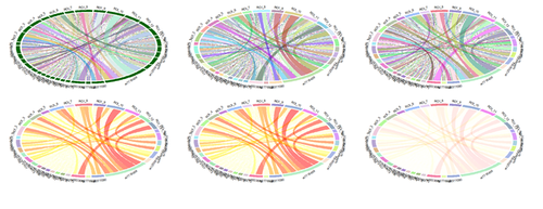
Circular chord/ribbon diagrams present a mechanism to visualize numeric tables containing information of directional relations. This type of chart visualizes tables in a circular way. Sectors of the plot is union(rownames(mat), colnames(mat)). When there is no rowname or colname, the chart assigns names for it (rows could be auto-named as "R1", "R2", ... and columns may be named as "C1", "C2").
- Circos: http://circos.ca
Example Early-Onset Alzheimer’s Disease
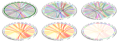
Recent studies2,3 examined the Interactions between imaging (Structural Brain Change) and genetics (SNP) biomarkers in Early-Onset Alzheimer's Disease Subjects. Circular representation of the significant SNP-Neuroimaging interactions. The left and right parts of the graph contain the 15-ROI imaging markers and the 20-SNP genotypes, respectively. The strength of the connection between each SNP-ROI pair is presented as a ribbon, whose size, color and location are proportional to -log (p). Clearly, there are a lot of spurious effects (skinny red lines on background) and several significantly strong associations (thicker purple ribbons on foreground), e.g., purple association between SNP_5 (rs7718456) and ROI_10 (L_hippocampus, Volume). SNP: single nucleotide polymorphism, ROI: region of interest.
| SNPROI | ROI_1 | ROI_2 | ROI_3 | ROI_4 | ROI_5 | ROI_6 | ROI_7 | ROI_8 | ROI_9 | ROI_10 | ROI_11 | ROI_12 | ROI_13 | ROI_14 | ROI_15 |
| rs17029131 | 10 | 10 | 10 | 10 | 10 | 10 | 10 | 10 | 10 | 10 | 188 | 10 | 10 | 10 | 10 |
| rs1822144 | 10 | 10 | 10 | 10 | 10 | 200 | 10 | 10 | 10 | 10 | 188 | 10 | 10 | 10 | 10 |
| rs6446443 | 10 | 10 | 10 | 126 | 113 | 10 | 10 | 113 | 10 | 10 | 10 | 10 | 10 | 10 | 10 |
| rs12506164 | 10 | 10 | 10 | 10 | 10 | 167 | 10 | 10 | 10 | 10 | 10 | 10 | 10 | 10 | 10 |
| rs7718456 | 10 | 202 | 144 | 206 | 10 | 10 | 10 | 169 | 225 | 321 | 10 | 10 | 290 | 10 | 10 |
| rs9377090 | 10 | 145 | 10 | 10 | 10 | 10 | 10 | 153 | 10 | 10 | 10 | 10 | 10 | 10 | 10 |
| rs2776932 | 10 | 10 | 10 | 10 | 10 | 10 | 10 | 10 | 10 | 10 | 10 | 10 | 10 | 10 | 10 |
| rs4933672 | 10 | 10 | 113 | 10 | 10 | 10 | 10 | 10 | 10 | 10 | 10 | 232 | 10 | 10 | 10 |
| rs11193270 | 10 | 10 | 10 | 10 | 10 | 10 | 10 | 10 | 10 | 10 | 10 | 10 | 10 | 10 | 10 |
| rs11193272 | 10 | 10 | 10 | 10 | 10 | 10 | 10 | 10 | 10 | 10 | 10 | 10 | 10 | 10 | 10 |
| rs11193274 | 10 | 10 | 10 | 10 | 10 | 10 | 10 | 10 | 10 | 10 | 10 | 10 | 10 | 10 | 10 |
| rs12218153 | 10 | 10 | 10 | 10 | 10 | 10 | 10 | 10 | 10 | 10 | 10 | 10 | 10 | 10 | 10 |
| rs1338956 | 10 | 10 | 10 | 10 | 10 | 10 | 10 | 10 | 10 | 10 | 10 | 10 | 10 | 10 | 10 |
| rs1338025 | 10 | 10 | 10 | 10 | 10 | 10 | 10 | 10 | 10 | 10 | 10 | 10 | 10 | 10 | 10 |
| rs12101936 | 10 | 10 | 10 | 10 | 10 | 10 | 10 | 10 | 10 | 10 | 10 | 10 | 10 | 10 | 10 |
| rs16964473 | 10 | 10 | 10 | 10 | 10 | 10 | 10 | 10 | 10 | 10 | 112 | 10 | 10 | 10 | 10 |
| rs12972537 | 10 | 10 | 10 | 10 | 10 | 10 | 125 | 10 | 10 | 10 | 126 | 10 | 10 | 10 | 10 |
| rs2212356 | 10 | 10 | 10 | 10 | 10 | 10 | 10 | 10 | 10 | 10 | 10 | 129 | 10 | 10 | 10 |
| rs2831165 | 10 | 10 | 10 | 10 | 10 | 10 | 10 | 10 | 10 | 10 | 10 | 10 | 10 | 10 | 169 |
| rs1266320 | 10 | 120 | 10 | 10 | 10 | 10 | 10 | 10 | 10 | 145 | 10 | 10 | 10 | 10 | 129 |
# install.packages("circlize")
library("circlize")
# 03_CircularTable_EOAD_Data.csv
EOAD_data <- read.csv("https://umich.instructure.com/files/330388/download?download_frd=1", sep=",",  row.names=1, header = TRUE)
rownames(EOAD_data)
colnames(EOAD_data)
EOAD_matrix <- as.matrix(EOAD_data)
### graphics settings
# par(mfrow = c(3, 2))
# par(mar = c(1, 1, 1, 1))
chordDiagram(EOAD_matrix)
circos.clear()
circos.par(gap.degree = c(rep(2, nrow(EOAD_matrix)-1), 10, rep(2, ncol(EOAD_matrix)-1), 10))
chordDiagram(EOAD_matrix)
circos.clear()
circos.par(start.degree = 90)
chordDiagram(EOAD_matrix)
circos.clear()
# chordDiagram(EOAD_matrix, order = c("ROI_1", "ROI_2", "ROI_3", "ROI_4", "ROI_5", "ROI_6", "ROI_7", "ROI_8", "ROI_9", "ROI_10", "ROI_11", "ROI_12", "ROI_13", "ROI_14", "ROI_15"))
chordDiagram(EOAD_matrix, directional = TRUE)
chordDiagram(EOAD_matrix, directional = TRUE, diffHeight = 0.06)
circos.clear()
### colors settings
rand_color = function(n, alpha = 1) {
return(rgb(runif(n), runif(n), runif(n), alpha = alpha))
}
par(mfrow = c(2, 2))
par(mar = c(1, 1, 1, 1))
grid.col = NULL
# random grid/sector and ribbon/chord colors
col_mat = rand_color(length(EOAD_matrix), alpha = 0.5)
grid_col = rand_color(length(rownames(EOAD_matrix)) + length(colnames(EOAD_matrix)), alpha = 0.5)
dim(col_mat) = dim(EOAD_matrix)
chordDiagram(EOAD_matrix, grid.col = grid_col, col = col_mat)
# grid/sector and ribbon/chord colors according to cell values
# Generate quantile values for the color mapping relative to table cell-values
seqs <- seq(0.92, 1, 0.008)
chordDiagram(EOAD_matrix, grid.col = grid_col, col = colorRamp2(quantile(EOAD_matrix, seqs), rev(heat.colors(11))), transparency = 0.5)
circos.clear()
Practice
Repeat these charts using the 03_NIPS_Baby_VitK_Shot_DataSummaryAnalysis_March2012_Short.csv dataset (Appendix), https://umich.instructure.com/files/330392/download?download_frd=1
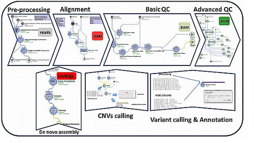
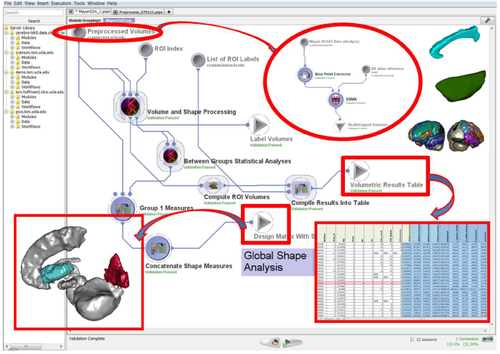
Graphical Workflow Protocol Visualization
(1) Brain Imaging & Genetics Data:
a. ADNI: http://adni.loni.usc.edu/
b. PPMI: http://ppmi-info.org/
c. XNAT Central: https://central.xnat.org/
d. Pipeline Data (see client library)
e. Cloud Services (AWS/Box/Drive)
(2) Pipeline Environment
a. http://pipeline.loni.usc.edu/
b. Web-Java Client: http://pipeline.loni.usc.edu/products-services/pws/
c. Videos: http://pipeline.loni.usc.edu/learn/basic-videos/
d. Publications: http://pipeline.loni.usc.edu/get-started/acknowledgmentscredits/
(3) End-to-end Computational workflows
a. Navigator: http://pipeline.loni.usc.edu/explore/library-navigator/
b. Detailed Descriptions: http://wiki.loni.usc.edu/twiki/bin/view/CCB/PipelineWorkflows
Appendix
Neonate Infant Pain Score (NIPS) Data (Vitamin K shots) Dataset
| Index | Immediate | 30_Sec | 60_Sec | 120_Sec | TotalCryTime |
| 1 | 6 | 7 | 6 | 2 | 63 |
| 2 | 5 | 1 | 2 | 0 | 0 |
| 3 | 7 | 6 | 6 | 7 | 54 |
| 4 | 3 | 7 | 3 | 0 | 27 |
| 5 | 7 | 5 | 6 | 0 | 19 |
| 6 | 6 | 6 | 6 | 2 | 2 |
| 7 | 7 | 7 | 6 | 0 | 46 |
| 8 | 6 | 7 | 0 | 0 | 33 |
| 9 | 5 | 0 | 4 | 0 | 56 |
| 10 | 7 | 7 | 7 | 6 | 63 |
| 105 | 6 | 0 | 0 | 0 | 11 |
| 106 | 7 | 6 | 0 | 0 | 59 |
| 107 | 7 | 4 | 4 | 0 | 28 |
| 108 | 7 | 7 | 7 | 1 | 64 |
| 109 | 7 | 0 | 0 | 0 | 8 |
| 110 | 5 | 0 | 1 | 3 | 64 |
| 111 | 7 | 5 | 7 | 7 | 72 |
| 112 | 4 | 2 | 0 | 2 | 50 |
| 113 | 7 | 6 | 7 | 0 | 44 |
| 114 | 7 | 1 | 0 | 0 | 11 |
Footnotes
- 1 http://journals.plos.org/ploscompbiol/article?id=10.1371/journal.pcbi.1002375
- 2 http://dx.doi.org/10.1111/jon.12252
- 3 http://dx.doi.org/10.4306/pi.2015.12.1.125
See Next
- Back to the Scientific Visualization section
- Back to the Scientific Methods for Health Sciences EBook ToC
- SOCR Home page: http://www.socr.umich.edu
Translate this page: