SOCR EduMaterials Activities BarCharts CategoryPlot
Contents
[hide]BAR CHARTS
CATEGORY PLOT
Background
When comparing groups of data, Bar Charts are one of the best approaches for single category data analysis. Interpreting bar charts are not difficult as observers clearly look for the tallest bar, shortest bar, growth or shrinking of bars over time, comparison of bars, and change in bars representing the same category in different classes since bar charts are a type of visual data presentation.
Although Bar Charts are simple, it is easily abused as users use inconsistent scales, unequal classes, and varying intervals between classes. Still, Bar Charts offer useful statistical data such as mean, maximum, minimum, range, sample size, and standard deviation.
For more references: Wikipedia, How to Create Stacked Bar Charts.
Description
Go to the SOCR Charts and select Bar Charts from the items located on the left. Then select Category Plot:

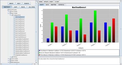
By selecting the first nine sets of demo under this category, these images simply demonstrate how bar charts may vary in sizes, classes, shapes, dimensions, and direction as Bar Charts may be presented vertically and horizontally:


The next three demonstrates how Bar Charts may be more eye appealing as they can be presented in 3-dimensions:

The following two demonstrations show that Bar Charts may also have layering classes in which researchers may easily show that one of their main goals is to show how one set of data may be compared for every interval:

The next four demonstrations show how Bar Charts may be stack upon one another also in comparison of data. Layering and stacking bar charts are similar but have some differences in which stacking is clearly for data that cannot be repeated so that all of the bars may be observed. As for layering, some data may be almost equal to another set of data so that when layering the bars, all data may still be seen on the independent variable axis:

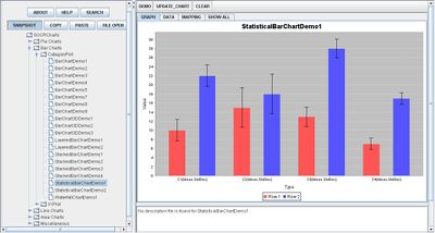
The Statistical Bar Chart adopts the characteristics of a typical Bar Chart except that it illustrates mean and standard deviation as well:

Finally, the Waterfall Bar Chart is a unique way to present a Bar Chart that summarizes all data in one bar chart. Each bar chart builds from the previous bar chart to the last set of data, then one bar chart is created at the end to show the total or sum of the data:

Examples
- Example 1: Suppose you are given the data information for the average height of males and females of age intervals. Plot the category plot of the collected data. Is there a pattern as males and/or females grow older? Can any assumptions be developed from this information?
- Example 2: Comparing the results of studying happen, is individual studying more effective than with groups? Collect data information of test results from those who have studied alone and those who have studied in groups. Can any conclusions be made from the category plot? Are there any independent or dependent variables? What are they?
Data Type and Format
By clicking Data inbetween the Graph and Mapping button, it allows users to input or vary the values of the data set. There are two different types of data that is allowed for plotting data points which are one categorical variable (e.g., Series) and the remaining values as quantitative variables (numerical values). Below these values list the statistical values for each categorical value.

Applications
One of the most persuasive elements when proposing data and literature to others is a well-designed chart presentation. For example, students have the ability to display their outcome of a Statistics project on automobile prices by utilizing the Bar Chart as a reference to compare the class of prices among the data set of different companies of vehicles.
For industries, Bar Charts may be to their advantage for analyzing data as the Statistical Bar Chart will present the mean and standard deviation of the data.
Translate this page: