SOCR EduMaterials Activities EventFrequency
Contents
EVENT FREQUENCY
Background
The Event Frequency displays the number of repetitions or occurrences of one or more events over a period of time. Data values are usually in XY-coordinate form where the horizontal axis represents the independent variable and the vertical axis is the frequency of an event. These charts have a large range of sizes as they may represent data of small numbers of events to large numbers of events. In times, certain values may overlap on the chart as they are repeated in the data set.
For references, visit Wikipedia.
Summary
This exercise describes the use and construction of the event frequency in SOCR. The applets can be accessed at SOCR Charts under the Miscellaneous folder.
Goals
The aims of this activity are to:
- describe how to use the event frequency in SOCR
- discuss its use in daily activities
Description
Go to the SOCR Charts and select Miscellaneous from the items located on the left, then select Event Frequency Demo:
Note that in this demonstration, there are three events as stated in the legend located at the bottom of the chart. The horizontal axis has the independent values and the vertical axis represents the dependent values. Every event has different values and are typically independent of one another.
For Event Frequency presentations, when used with a large set of data that are visually grouped within the chart, it will allow observers to easily distinguish trends among the different events.
Examples & Exercises
- Exercise 1: Suppose you are given the frequencies of earth quakes along the west coast and east coast. Use SOCR Charts event frequency to show the data information.
- Exercise 2: Can conclusions be drawn from event frequency diagrams?
Data Type and Format
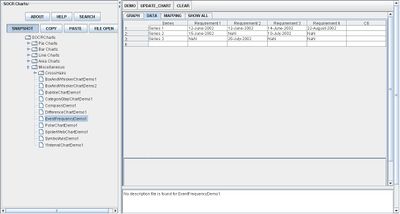
By clicking Data between the Graph and Mapping button, it allows users to input or vary the values of the data set. For Event Frequency Charts, only the independent and dependent variable values are needed. The independent variable is typically categorical (e.g., Dates, Requirements, Events, etc.) and the dependent variable is typically numerical but may also be categorical (e.g., Values, Dates, Colors, Total Sum, etc.). The image below demonstrates the structure of the data:

Applications
One of the most persuasive elements when proposing data and literature to others is a well-designed chart presentation.
Companies may use this application to illustrate the number of persons who purchase their products on a daily or monthly basis.
Suppose students would like to demonstrate the number of peers who purchase lunch during school on a daily basis to show which day of the week promotes the most income for the school.
Translate this page: