Difference between revisions of "SMHS LinearModeling QC"
(→SMHS Linear Modeling - Quality Control) |
|||
| (7 intermediate revisions by one other user not shown) | |||
| Line 1: | Line 1: | ||
==[[SMHS_LinearModeling|SMHS Linear Modeling]] - Quality Control == | ==[[SMHS_LinearModeling|SMHS Linear Modeling]] - Quality Control == | ||
| − | Discussion of data Quality Control (QC) and Quality Assurance (QA) which represent important components of data-driven modeling, analytics, and visualization. | + | Discussion of data Quality Control (QC) and Quality Assurance (QA), which represent important components of data-driven modeling, analytics, and visualization. |
'''Questions: | '''Questions: | ||
| − | + | *Is the data what it’s supposed to be (does it represent the study cohort/population)? | |
| − | + | *How to inspect the quality of the data? | |
| − | Data Quality Control (QC) and Quality Assurance (QA) represent important components of all modeling, analytics and visualization that precede all subsequent data processing steps. QC and QA may be performed manually or automatically. Statistical quality control involves quantitative methods for monitoring and controlling a process or data derived from observing a natural phenomenon. For example, is there evidence in the plots below of a change in the mean of these processes? | + | Data Quality Control (QC) and Quality Assurance (QA) represent important components of all modeling, analytics, and visualization that precede all subsequent data processing steps. QC and QA may be performed manually or automatically. Statistical quality control involves quantitative methods for monitoring and controlling a process or data derived from observing a natural phenomenon. For example, is there evidence in the plots below of a change in the mean of these processes? |
# simulate data with base value of 100 w/ normally distributed error | # simulate data with base value of 100 w/ normally distributed error | ||
| Line 16: | Line 16: | ||
title="Simulation 1", xlab="Index") | title="Simulation 1", xlab="Index") | ||
| − | [[Image:SMHS_LinearModeling_Fig003.png|500px]] | + | <center>[[Image:SMHS_LinearModeling_Fig003.png|500px]]</center> |
| − | Now let’s introduce a trend | + | Now let’s introduce a trend. |
# first 800 points have base value of 100 w/ normally distributed error, | # first 800 points have base value of 100 w/ normally distributed error, | ||
| Line 29: | Line 29: | ||
title="Simulation 2", xlab="Index") | title="Simulation 2", xlab="Index") | ||
| − | [[Image:SMHS_LinearModeling_Fig004.png|500px]] | + | <center>[[Image:SMHS_LinearModeling_Fig004.png|500px]]</center> |
Our goal is to use statistical quality control to automatically identify issues with the data. The qcc package in R provides methods for statistical quality control – given the data, it identifies candidate points as outliers based on the Shewhart Rules. Color-coding the data also helps point out irregular points. | Our goal is to use statistical quality control to automatically identify issues with the data. The qcc package in R provides methods for statistical quality control – given the data, it identifies candidate points as outliers based on the Shewhart Rules. Color-coding the data also helps point out irregular points. | ||
| − | The Shewhart control charts rules (cf. 1930’s) are based on monitoring events that unlikely when the controlled process is stable. Incidences of such atypical events are alarm signals suggesting that stability of the process may be compromised and the process is changed. | + | The Shewhart control charts rules (cf. 1930’s) are based on monitoring events that are unlikely when the controlled process is stable. Incidences of such atypical events are alarm signals, suggesting that stability of the process may be compromised and the process is changed. |
| − | An instance of such an unlikely event | + | An instance of such an unlikely event would be the situation in which the upper/lower control limits (UCL or LCL) are exceeded. UCL and LCL are constructed as ±3? limits, indicating that the process is under control within them. Additional warning limits (LWL and UWL) are constructed at ±2? or ±?. Other rules specifying events having low probability when the process is under control can be constructed: |
1. One point exceeds LCL/UCL. | 1. One point exceeds LCL/UCL. | ||
| Line 61: | Line 61: | ||
plot(MyQC) # , chart.all=FALSE) | plot(MyQC) # , chart.all=FALSE) | ||
| − | [[Image:SMHS_LinearModeling_Fig005.png|500px]] | + | <center>[[Image:SMHS_LinearModeling_Fig005.png|500px]]</center> |
# add warning limits at 2 std. deviations | # add warning limits at 2 std. deviations | ||
| Line 75: | Line 75: | ||
Conf= a numeric value used to compute control limits, specifying the number of standard deviations (if conf > 1) or the confidence level (if 0 < conf < 1) | Conf= a numeric value used to compute control limits, specifying the number of standard deviations (if conf > 1) or the confidence level (if 0 < conf < 1) | ||
| − | [[Image:SMHS_LinearModeling_Fig006.png|500px]] | + | <center>[[Image:SMHS_LinearModeling_Fig006.png|500px]]</center> |
Natural processes may have errors that are non-normally distributed. However, using (appropriate) transformations we can often normalize the errors. | Natural processes may have errors that are non-normally distributed. However, using (appropriate) transformations we can often normalize the errors. | ||
| Line 163: | Line 163: | ||
plot.qcc (demo.data.4, 100) | plot.qcc (demo.data.4, 100) | ||
| − | [[Image:SMHS_LinearModeling_Fig007.png|500px]] | + | <center>[[Image:SMHS_LinearModeling_Fig007.png|500px]]</center> |
Let’s use the "Student's Sleep Data" (sleep) data. | Let’s use the "Student's Sleep Data" (sleep) data. | ||
| Line 176: | Line 176: | ||
obj_avg_test_train <- qcc(q[,1:5], type="xbar", newdata=q[,6:10]) | obj_avg_test_train <- qcc(q[,1:5], type="xbar", newdata=q[,6:10]) | ||
| − | [[Image:SMHS_LinearModeling_Fig008.png|500px]] | + | <center>[[Image:SMHS_LinearModeling_Fig008.png|500px]]</center> |
# How is this different from this? | # How is this different from this? | ||
obj_avg_new <- qcc(q[,1:10], type="xbar") | obj_avg_new <- qcc(q[,1:10], type="xbar") | ||
| − | This control chart has the solid horizontal line (center), the upper and lower control limits (dashed lines), and the sample group statistics (e.g., mean | + | This control chart has the solid horizontal line (center), the upper and lower control limits (dashed lines), and the sample group statistics (e.g., mean; drawn as a piece-wise line connecting the points). The bottom of the plot includes summary statistics and the number of points beyond control limits and the number of violating runs. If the process is "in-control", we can use estimated limits for monitoring prospective (new) data sampled from the same process/protocol. For instance, |
obj_test_1_10_train_11_20 <- qcc(sleep[1:10,], type="xbar", newdata=sleep[11:20,]) | obj_test_1_10_train_11_20 <- qcc(sleep[1:10,], type="xbar", newdata=sleep[11:20,]) | ||
plots the X chart for training and testing (11-20) sleep data where the statistics and the control limits are based on the first 10 (training) samples. | plots the X chart for training and testing (11-20) sleep data where the statistics and the control limits are based on the first 10 (training) samples. | ||
| − | [[Image:SMHS_LinearModeling_Fig009.png|500px]] | + | <center>[[Image:SMHS_LinearModeling_Fig009.png|500px]]</center> |
Now try (range) QCC plot | Now try (range) QCC plot | ||
obj_R <- qcc(q[,1:5], type="R", newdata=q[,6:10]) | obj_R <- qcc(q[,1:5], type="R", newdata=q[,6:10]) | ||
| − | A control chart aims to enhance our ability to monitor and track a process proxied by the data. When special causes of variation (random or not) are present the data may be considered "out of control". Corresponding action may need to be taken to identify, control for, or eliminate such causes. A process is declared to be "controlled" if the plot of all data points are randomly spread out within the control limits. These Lower and Upper Control Limits (LCL, UCL) are usually computed as ±3s from the center (e.g., mean). | + | A control chart aims to enhance our ability to monitor and track a process proxied by the data. When special causes of variation (random or not) are present, the data may be considered "out of control". Corresponding action may need to be taken to identify, control for, or eliminate such causes. A process is declared to be "controlled" if the plot of all data points are randomly spread out within the control limits. These Lower and Upper Control Limits (LCL, UCL) are usually computed as ±3s from the center (e.g., mean). The QCC default limits can be changed using the argument nsigmas or by specifying the confidence level via the confidence level argument. |
<center> | <center> | ||
| Line 211: | Line 211: | ||
|"np"||The number of nonconforming units is plotted. Control limits are based on the binomial distribution. | |"np"||The number of nonconforming units is plotted. Control limits are based on the binomial distribution. | ||
|- | |- | ||
| − | |"c"||The number of defectives per unit are plotted. This chart assumes that defects of | + | |"c"||The number of defectives per unit are plotted. This chart assumes that defects of the quality attribute are rare, and the control limits are computed based on the Poisson distribution. |
|- | |- | ||
| − | |"u"||The average number of defectives per unit is plotted. The Poisson distribution is used to compute control limits | + | |"u"||The average number of defectives per unit is plotted. The Poisson distribution is used to compute control limits; but, unlike the c chart, this chart does not require a constant number of units. |
|} | |} | ||
</center> | </center> | ||
| − | When the process is governed by a Gaussian distribution the ±3s limits correspond to a two-tails probability of p=0.0027. | + | When the process is governed by a Gaussian distribution, the ±3s limits correspond to a two-tails probability of p=0.0027. |
| − | Finally, an operating characteristic (OC) curve shows the probability of not detecting a shift in the process (false-negative, type II error) | + | Finally, an operating characteristic (OC) curve shows the probability of not detecting a shift in the process (false-negative, type II error); i.e., the probability of erroneously accepting a process as being "in control", when in fact, it’s out of control. |
# par(mfrow=c(1,1)) | # par(mfrow=c(1,1)) | ||
| Line 226: | Line 226: | ||
# oc.curves(obj_test_1_10_train_11_20, identify=TRUE) # to manually identify specific OC points | # oc.curves(obj_test_1_10_train_11_20, identify=TRUE) # to manually identify specific OC points | ||
| − | [[Image:SMHS_LinearModeling_Fig11.png|500px]] | + | <center>[[Image:SMHS_LinearModeling_Fig11.png|500px]]</center> |
| − | The function oc.curves returns a matrix or a vector of probabilities values representing the type II errors for different sample-sizes. See help(oc.curves), e.g., identify=TRUE, which allows to interactively identify values on the plot, for all options. | + | The function oc.curves returns a matrix or a vector of probabilities values representing the type II errors for different sample-sizes. See help (oc.curves), e.g., identify=TRUE, which allows to interactively identify values on the plot, for all options. |
Notice that the OC curve is "S"-shaped. As expected, this is because as the percent of non-conforming values increases, the probability of acceptance decreases. A small sub-sample, instead of inspecting the entire data, may be used to determine the quality of a process. We can accept the data as in-control as long as the process percent nonconforming is below a predefined level. | Notice that the OC curve is "S"-shaped. As expected, this is because as the percent of non-conforming values increases, the probability of acceptance decreases. A small sub-sample, instead of inspecting the entire data, may be used to determine the quality of a process. We can accept the data as in-control as long as the process percent nonconforming is below a predefined level. | ||
Latest revision as of 07:51, 23 May 2016
SMHS Linear Modeling - Quality Control
Discussion of data Quality Control (QC) and Quality Assurance (QA), which represent important components of data-driven modeling, analytics, and visualization.
Questions:
- Is the data what it’s supposed to be (does it represent the study cohort/population)?
- How to inspect the quality of the data?
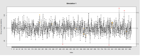
Data Quality Control (QC) and Quality Assurance (QA) represent important components of all modeling, analytics, and visualization that precede all subsequent data processing steps. QC and QA may be performed manually or automatically. Statistical quality control involves quantitative methods for monitoring and controlling a process or data derived from observing a natural phenomenon. For example, is there evidence in the plots below of a change in the mean of these processes?
# simulate data with base value of 100 w/ normally distributed error
# install.packages("qcc")
library(qcc)
demo.data.1 <- rep(100, 1000) + rnorm(1000, mean=0, sd=2)
qcc(demo.data.1, type="xbar.one", center=100, add.stats=FALSE,
   title="Simulation 1", xlab="Index")
Now let’s introduce a trend.
# first 800 points have base value of 100 w/ normally distributed error,
# next 100 points have base value of 105 w/ normally distributed error
# last 100 points have base value of 110 w/ normally distributed error
M <- 110
SD=5
demo.data.2 <- c(rep(100, 800), rep(M, 100), rep(100+(M-100)/2, 100)) + rnorm(1000, mean=0, sd=SD)
qcc(demo.data.2, type="xbar.one", center=100, add.stats=FALSE,
   title="Simulation 2", xlab="Index")
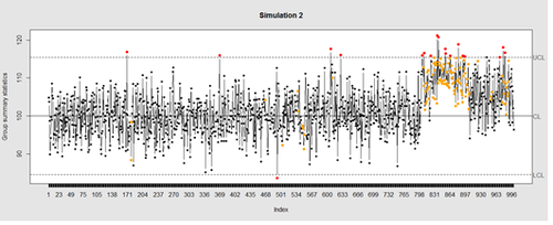
Our goal is to use statistical quality control to automatically identify issues with the data. The qcc package in R provides methods for statistical quality control – given the data, it identifies candidate points as outliers based on the Shewhart Rules. Color-coding the data also helps point out irregular points.
The Shewhart control charts rules (cf. 1930’s) are based on monitoring events that are unlikely when the controlled process is stable. Incidences of such atypical events are alarm signals, suggesting that stability of the process may be compromised and the process is changed.
An instance of such an unlikely event would be the situation in which the upper/lower control limits (UCL or LCL) are exceeded. UCL and LCL are constructed as ±3? limits, indicating that the process is under control within them. Additional warning limits (LWL and UWL) are constructed at ±2? or ±?. Other rules specifying events having low probability when the process is under control can be constructed:
1. One point exceeds LCL/UCL.
2. Nine points above/below the central line.
3. Six consecutive points show increasing/decreasing trend.
4. Difference of consecutive values alternates in sign for fourteen points.
5. Two out of three points exceed LWL or UWL limits.
6. Four out of five points are above/below the central line and exceed ±? limit.
7. Fifteen points are within ±? limits.
8. Eight consecutive values are beyond ±? limits.
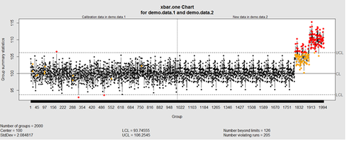
We can define training/testing dataset within qcc by adding the data we want to calibrate it with as the first parameter (demo.data.1), followed by the new data (demo.data.2) representing the test data.
#example using holdout/test sets
demo.data.1 <- rep(100, 1000) + rnorm(1000, mean=0, sd=2)
demo.data.2 <- c(rep(100, 800), rep(105, 100), rep(110, 100)) + rnorm(100, mean=0, sd=2)
MyQC <- qcc(demo.data.1, newdata=demo.data.2, type="xbar.one", center=100, add.stats=FALSE, title="Simulation 1 vs. 2", xlab="Index")
plot(MyQC) # , chart.all=FALSE)
# add warning limits at 2 std. deviations
MyQC2 <- qcc(demo.data.1, newdata=demo.data.2, type="xbar.one", center=100, add.stats=FALSE,  title="Second Simulation 1 vs. 2", xlab="Index")
warn.limits <- limits.xbar(MyQC2$\$$center, MyQC2$\$$std.dev, MyQC2$\$$sizes, 0.95)
 plot(MyQC2, restore.par = FALSE)
 abline(h = warn.limits, lty = 2, lwd=2, col = "blue")

 ## limits.xbar(center, std.dev, sizes, conf)
 Center = sample/group center statistic
 Sizes= samples sizes.
 std.dev= within group standard deviation.
 Conf= a numeric value used to compute control limits, specifying the number of standard deviations (if conf > 1) or the confidence level (if 0 < conf < 1)

<center>[[Image:SMHS_LinearModeling_Fig006.png|500px]]</center>

Natural processes may have errors that are non-normally distributed. However, using (appropriate) transformations we can often normalize the errors.

We can use thresholds to define zones in the data where each zone represents, say, one standard deviation span of the range of the dataset.

 find_zones <- function(x) {
  x.mean <- mean(x)
  x.sd <- sd(x)
  boundaries <- seq(-3, 3)
  # creates a set of zones for each point in x
  zones <- sapply(boundaries, function(i) {
    i * rep(x.sd, length(x))
  })
  zones + x.mean
 }
 head(find_zones(demo.data.2))

 evaluate_zones <- function(x) {
  zones <- find_zones(x)
  colnames(zones) <- paste("zone", -3:3, sep="_")
  x.zones <- rowSums(x > zones) - 3
  x.zones
 }

 evaluate_zones(demo.data.2)

 find_violations <- function(x.zones, i) {
  values <- x.zones[max(i-8, 1):i]
  # rule4 <- ifelse(any(values > 0), 1,
  rule4 <- ifelse(all(values > 0), 1,
                  ifelse(all(values < 0), -1,
                         0))
  values <- x.zones[max(i-5, 1):i]
  rule3 <- ifelse(sum(values >= 2) >= 2, 1,
                  ifelse(sum(values <= -2) >= 2, -1,
                         0))
  values <- x.zones[max(i-3, 1):i]
  rule2 <- ifelse(mean(values >= 3) >= 1, 1,
                  ifelse(mean(values <= -3) >= 1, -1,
                         0))
  #values <- x.zones[]
 values <- x.zones[max(i-3, 1):i]
 rule1 <- ifelse(any(values > 2), 1,
                  ifelse(any(values < -2), -1,
                         0))
  c("rule1"=rule1, "rule2"=rule2, "rule3"=rule3, "rule4"=rule4)
 }

 find_violations(evaluate_zones(demo.data.2), 20)

Now we can compute the rules for each point and assign a color to any violations.

 library("plyr")
 compute_violations <- function(x, start=1) {
  x.zones <- evaluate_zones(x)
  results <- ldply (start:length(x), function(i) {
    find_violations(x.zones, i)
  })
  results$\$$color <- ifelse(results$\$$rule1!=0, "pink",
                          ifelse(results$\$$rule2!=0, "red",
                                ifelse(results$\$$rule3!=0, "orange",
                                        ifelse(results$\$$rule4!=0, "yellow",
                                              "black"))))
 results
}

tail(compute_violations(demo.data.2))
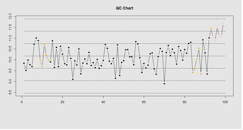
Now let’s make a quality control chart.
plot.qcc <- function(x, holdout) {
 my.qcc <- compute_violations(x, length(x) - holdout)
 bands <- find_zones(x)
 plot.data <- x[(length(x) - holdout):length(x)]
 plot(plot.data, col= my.qcc$\$$color, type='b', pch=19,
       ylim=c(min(bands), max(bands)),
       main="QC Chart",
       xlab="", ylab="")

  for (i in 1:7) {
    lines(bands[,i], col= my.qcc$\$$color[i], lwd=0.75, lty=2)
 }
}
demo.data.4 <- c(rep(10, 90), rep(11, 10)) + rnorm(100, mean=0, sd=0.5)
plot.qcc (demo.data.4, 100)
Let’s use the "Student's Sleep Data" (sleep) data.
library("qcc")
attach(sleep)
q <- qcc.groups(extra, group)
dim(q)
obj_avg_test_1_2  <-  qcc(q[1:2,],  type="xbar")
obj_avg_test_1_5  <-  qcc(q[,1:5],  type="xbar")
summary(obj_avg_test_1_5)
obj_avg_test_train <-  qcc(q[,1:5],  type="xbar", newdata=q[,6:10])
# How is this different from this?
obj_avg_new <-  qcc(q[,1:10],  type="xbar")
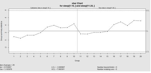
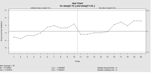
This control chart has the solid horizontal line (center), the upper and lower control limits (dashed lines), and the sample group statistics (e.g., mean; drawn as a piece-wise line connecting the points). The bottom of the plot includes summary statistics and the number of points beyond control limits and the number of violating runs. If the process is "in-control", we can use estimated limits for monitoring prospective (new) data sampled from the same process/protocol. For instance,
obj_test_1_10_train_11_20 <- qcc(sleep[1:10,], type="xbar", newdata=sleep[11:20,])
plots the X chart for training and testing (11-20) sleep data where the statistics and the control limits are based on the first 10 (training) samples.
Now try (range) QCC plot
obj_R  <-  qcc(q[,1:5],  type="R", newdata=q[,6:10])
A control chart aims to enhance our ability to monitor and track a process proxied by the data. When special causes of variation (random or not) are present, the data may be considered "out of control". Corresponding action may need to be taken to identify, control for, or eliminate such causes. A process is declared to be "controlled" if the plot of all data points are randomly spread out within the control limits. These Lower and Upper Control Limits (LCL, UCL) are usually computed as ±3s from the center (e.g., mean). The QCC default limits can be changed using the argument nsigmas or by specifying the confidence level via the confidence level argument.
| Control Chart Variables | |||||||
|---|---|---|---|---|---|---|---|
| "xbar" | Sample means are plotted to control the mean level of a continuous process variable. | ||||||
| "xbar.one" | Sample values from a one–at–a-time data process to control the mean level of a continuous process variable. | ||||||
| "R" | Sample ranges are plotted to control the variability of a continuous process variable. | ||||||
| "S" | Sample standard deviations are plotted to control the variability of a continuous process variable. | ||||||
| Control Charts for Attributes | |||||||
| "p" | The proportion of nonconforming units is plotted. Control limits are based on the binomial distribution. | ||||||
| "np" | The number of nonconforming units is plotted. Control limits are based on the binomial distribution. | ||||||
| "c" | The number of defectives per unit are plotted. This chart assumes that defects of the quality attribute are rare, and the control limits are computed based on the Poisson distribution. | ||||||
| "u" | The average number of defectives per unit is plotted. The Poisson distribution is used to compute control limits; but, unlike the c chart, this chart does not require a constant number of units. | ||||||
When the process is governed by a Gaussian distribution, the ±3s limits correspond to a two-tails probability of p=0.0027.
Finally, an operating characteristic (OC) curve shows the probability of not detecting a shift in the process (false-negative, type II error); i.e., the probability of erroneously accepting a process as being "in control", when in fact, it’s out of control.
# par(mfrow=c(1,1))
oc.curves(obj_test_1_10_train_11_20)
# oc.curves(obj_test_1_10_train_11_20, identify=TRUE) # to manually identify specific OC points
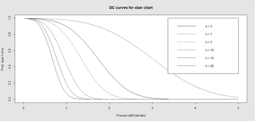
The function oc.curves returns a matrix or a vector of probabilities values representing the type II errors for different sample-sizes. See help (oc.curves), e.g., identify=TRUE, which allows to interactively identify values on the plot, for all options.
Notice that the OC curve is "S"-shaped. As expected, this is because as the percent of non-conforming values increases, the probability of acceptance decreases. A small sub-sample, instead of inspecting the entire data, may be used to determine the quality of a process. We can accept the data as in-control as long as the process percent nonconforming is below a predefined level.
Next see
Multiple Linear Regression for a review and demonstration of computing and visualizing the regression-model coefficients (effect-sizes), (fixed-effect) linear model assumptions, examination of residual plots, and independence.
- SOCR Home page: http://www.socr.umich.edu
Translate this page: