062510
Contents
General Motion Charts CA Ozone Data Activity - Middle School SOCR Motion Charts Case Study of California Ozone Pollution
Summary
This activity is intended for middle school students and demonstrates a study of geographic and time effects of Ozone pollution on human health. The general version of this activity can be found here and is more appropriate for high school and college students.
Goals
The aims of this activity are to:
- Describe a real environmental case study of ozone pollution in California
- Demonstrate real data manipulations and graphical data interpretation
- Illustrate several exploratory data analyses
- Emphasize the concepts probability, sample statistics and inference
Activity video
There are several videos that demonstrate the mechanics of using the SOCR Motion Charts to analyze longitudinal multivariate data:
- A 6-minute video of this California Ozone Pollution Activity: Geographic and Time Effects on Health, which is available YouTube Stream (low resolution), and a high resolution analogue (80MB)
- A video describing the health and environmental implications of this data and activity.
Background
- What is Ozone Pollution?
- The ozone gas is both beneficial and harmful to life. It forms in the stratosphere and serves as a vital and effective protective barrier from the sun's ultraviolet rays. At high altitudes, depletion of the ozone layer, mainly caused by the emission of various chemical pollutants, is associated with an increase of cancer rates due to single nucleotide polymorphism mutations and failures in DNA repair. However at low altitudes, high concentrations of ozone (ground-level ozone pollution) may be harmful to human health. Ozone pollution is a byproduct of the interaction between sunlight, hydrocarbons and nitrogen oxide (emitted by burning fossil fuels). During high temperature and low wind conditions low altitude ozone levels can reach unhealthy levels. The US Environmental Protection Agency's Air Quality Index (AQI) is a marker of severity of the ozone pollution. AQI provides both a qualitative (color) and a quantitative (particles per million, ppm) measures, see Table below.
- Why study Ozone Pollution?
- Ozone pollution is associated with many human health problems. For instance, it is correlated with the prevalence of chronic lower respiratory tract symptoms in children, associated with new onset asthma in adolescents, and implicated in development of adult-onset asthma in adults.
- Ability to predict the level of ozone pollution may reduce exposure, improve the lives of people, and decrease health care costs.
- Where can we find data about Ozone Pollution?
- This dataset contains the California Ozone Pollution measurements from 20 locations between 1980 and 2006. The figure on the right shows a dynamic interactive map of the geographic locations of the data measurements. This dataset consists of 540 rows and 22 variables.
- How do we manipulate the Ozone Pollution Data?
- These data may be copy-pasted, visualized and analyzed online using the SOCR Java Applets:
- SOCR Charts may be used for data visualization and to obtain summary statsitics.
- SOCR Analyses may be used to quantitatively analize these data.
- These data may be copy-pasted, visualized and analyzed online using the SOCR Java Applets:
The goals of the study is to identify relationships and associations between the variables and map geographically ozone pollution across the years.
- Health and Economic Effects of Ozone (smog) pollution in California
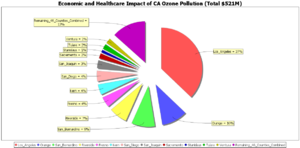
The table below shows the geographic distribution (by county) and the economic costs (total of $521 million/year) attributed only to school absences, restricted activity days, respiratory hospitalization, and asthma Emergency room visits due to smog pollution.
| California_Counties | Proportion |
|---|---|
| Los_Angeles | 37 |
| Orange | 10 |
| San_Bernardino | 9 |
| Riverside | 7 |
| Fresno | 4 |
| Kern | 4 |
| San_Diego | 4 |
| San_Joaquin | 3 |
| Sacremento | 2 |
| Stanislaus | 1 |
| Tulare | 2 |
| Ventura | 2 |
| Remaining_46_Counties_Combined | 13 |
You can use the SOCR Pie chart to graph this distribution of economic costs associated with ozone pollution, as shown on the image. How much, in real dollar terms, is the direct economic impact on Los Angeles county?
Case Study
This Ozone pollution case study addresses the following specific environmental challenges:
- Are there temporal changes in California Ozone?
- What is the geographic distribution of the California Ozone pollution and is it changing with time?
The following chart illustrates the health-related interpretation of the Ozone data in terms of the particulate (particles per million, ppm) recordings, according to the National Oceanic and Atmospheric Administration's (NOAA) Air Quality Index (AQI).
Temporal changes in California Ozone
- Observation: Notice the annualized increase of the ozone pollution with time (increase of the proportion of hot-colored bubbles with time).
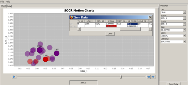
- Motion Chart: Use the following variable-mapping to demonstrate the significant time effect on the increase of the ozone pollution as measured by ppm recordings:
| Variables | ||||||
|---|---|---|---|---|---|---|
| SOCR MotionChart Property | Key | X-Axis | Y-Axis | Size | Color | Category |
| Data Column Name | Year | MTH_1 | MTH_8 | HI_COVER | ANNUAL | Location |
- Note that the variable mapping we used above allows us to track seasonal changes of ozone pollution (Winter, month1, on the X-axis; and Summer, month8, on the Y-axis). If we play this motion chart, the following interpretation of the motion chart is appropriate: For a given bubble (representing one measurement location):
- up-down movement indicate annual Winter (January) increase or decrease of pollution levels, respectively;
- left-right movement indicate annual Summer (August) increase or decrease of pollution levels, respectively;
- bubble-size increase or decrease indicate corresponding changes in the annual percent coverage during typical periods of high concentration;
- color change from cool-to-hot indicates an annual increase of the ozone measurement for that specific location from one year to the next.
- You should see an image like this one shown below. Play this motion charts by clicking the Play button and observe the increase of hot-colored bubbles in the chart as time goes from 1980 to 2006.

Geographic distribution of California Ozone pollution
- Observation: The ozone pollution appears to be a more geographically spread out phenomenon in the 2000's, compared to the 1980's -- most of the bubbles cluster together in later years, whereas there were wider geographic-driven fluctuations in the ozone particles in the earlier years. The size of the bubbles reflects the maximum annual pollution and the bubble color indicates the average annual ozone pollution -- hot-colors represent high and cool-colors represent low ozone pollution levels, respectively.
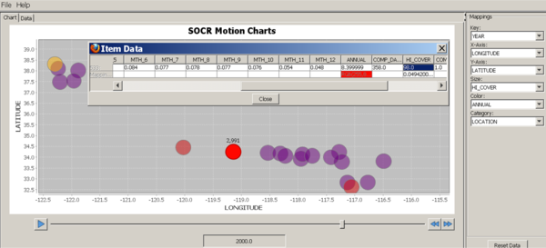
- Motion Chart: Use the following variable-mapping to demonstrate the significant geographic temporal re-distribution of the ozone pollution as measured by ppm recordings:
| Variables | ||||||
|---|---|---|---|---|---|---|
| SOCR MotionChart Property | Key | X-Axis | Y-Axis | Size | Color | Category |
| Data Column Name | Year | LONGITUDE | LATITUDE | HI_COVER | ANNUAL | Location |
- This second variable mapping allows us to track seasonal changes of ozone pollution for each geographic location. Here the X and Y locations of bubbles are locked at the GIS longitude and latitude coordinates. By playing this motion chart, we have the following interpretation: For a given bubble (representing one GIS location):
- bubble-size increase or decrease indicate corresponding changes in the annual percent coverage during typical periods of high concentration;
- color change from cool-to-hot or hot-to-cool indicate annual increase or annual decrease, respectively, of the ozone measurement for that specific location from one year to the next.
- You should see an image like this one shown below. In this mapping, each bubble corresponds spatially to a geographic location, just like in the geographic-map above. Play this motion charts by clicking the Play button and observe the increase of hot-colored bubbles in later years at geographic locations which did not show unhealthy ozone pollution levels in the early years.

Hands-on Activity
You can now try to explore, manipulate and analyze the ozone pollution data yourself. Open 3 tabs in your browser
- One with this activity page,
- The second pointing to the SOCR MotionCharts applet, and
- The third displaying the SOCR California Ozone dataset.
The image below shows this setting.


- Using the mouse, copy the SOCR California Ozone dataset, click on the first cell (top-left) in the DATA tab of the SOCR Motion Charts applet, and paste the data in the spreadsheet.

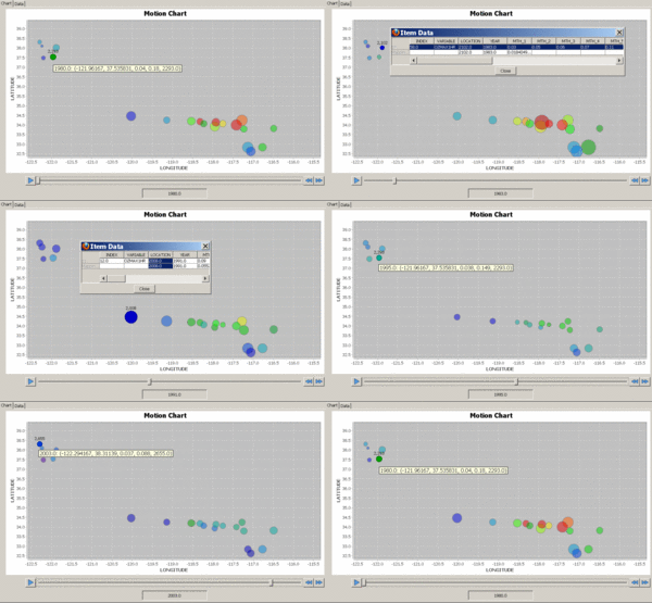
- Next, you need to map the column-variables to different properties it the SOCR MotionChart. For example, you can us the following mapping:
| Variables | ||||||
|---|---|---|---|---|---|---|
| SOCR MotionChart Property | Key | X-Axis | Y-Axis | Size | Color | Category |
| Data Column Name | Year | Longitude | Latitude | MTH_1 | MTH_7 | Location |
The figures below represent snapshots of the generated dynamic SOCR motion chart. In the real applet, you can play (animate) or scroll (1-year steps) through the years (1980, ..., 2006). Notice the position change between different snapshots of the time slider on the bottom of these figures. Also, mouse-over a blob triggers a dynamic graphical pop-up providing additional information about the data for the specified blob in the chart.
You can also change what variables are mapped to the following SOCR MotionCharts properties:
- Key, X-Axis, Y-Axis, Size, Color and Category.

Additional Exploratory Data Analyses
The table below contains a summary of the annual pollution rates (ppm) for each of the 20 locations across the span of 27 years.
| LOCATION | 1980 | 1981 | 1982 | 1983 | 1984 | 1985 | 1986 | 1987 | 1988 | 1989 | 1990 | 1991 | 1992 | 1993 | 1994 | 1995 | 1996 | 1997 | 1998 | 1999 | 2000 | 2001 | 2002 | 2003 | 2004 | 2005 | 2006 |
|---|---|---|---|---|---|---|---|---|---|---|---|---|---|---|---|---|---|---|---|---|---|---|---|---|---|---|---|
| 2008 | 0.12 | 0.11 | 0.15 | 0.14 | 0.14 | 0.13 | 0.11 | 0.17 | 0.11 | 0.19 | 0.11 | 0.11 | 0.13 | 0.11 | 0.106 | 0.135 | 0.12 | 8.7 | 9.8 | 0.088 | 9.3 | 9.2 | 7.4 | 9.7 | 0.109 | 8.2 | 8.2 |
| 2040 | 0.18 | 0.2 | 0.23 | 0.28 | 0.28 | 0.22 | 0.15 | 0.17 | 0.22 | 0.23 | 0.2 | 0.18 | 0.16 | 0.146 | 0.102 | 0.12 | 0.12 | 0.115 | 0.125 | 0.104 | 0.118 | 0.135 | 0.112 | 0.107 | 0.105 | 8.3 | 0.108 |
| 2102 | 0.13 | 0.11 | 0.1 | 0.14 | 0.16 | 0.14 | 0.1 | 0.15 | 0.12 | 0.11 | 0.11 | 7.9 | 0.11 | 0.13 | 0.111 | 0.124 | 0.121 | 8.7 | 0.097 | 9.7 | 0.107 | 0.118 | 0.111 | 9.3 | 8.9 | 9.3 | 0.105 |
| 2125 | 0.15 | 0.13 | 0.1 | 0.17 | 0.11 | 0.13 | 0.1 | 0.12 | 0.1 | 0.1 | 7.9 | 7.9 | 8.9 | 0.1 | 8.3 | 0.14 | 0.097 | 8.9 | 6.5 | 8.2 | 0.083 | 0.105 | 8.9 | 0.113 | 0.097 | 8.3 | 8.4 |
| 2199 | 0.21 | 0.19 | 0.19 | 0.19 | 0.2 | 0.24 | 0.18 | 0.17 | 0.2 | 0.19 | 0.17 | 0.18 | 0.15 | 0.17 | 0.165 | 0.16 | 0.16 | 0.155 | 0.173 | 0.126 | 0.124 | 0.137 | 0.136 | 0.141 | 0.125 | 0.139 | 0.126 |
| 2249 | 0.31 | 0.27 | 0.32 | 0.27 | 0.32 | 0.34 | 0.25 | 0.24 | 0.29 | 0.26 | 0.21 | 0.21 | 0.21 | 0.19 | 0.252 | 0.16 | 0.15 | 0.134 | 0.182 | 0.116 | 0.137 | 0.114 | 0.121 | 0.165 | 9.8 | 9.3 | 0.146 |
| 2293 | 0.19 | 0.16 | 0.14 | 0.16 | 0.15 | 0.15 | 0.14 | 0.16 | 0.13 | 0.12 | 0.13 | 0.12 | 0.12 | 0.13 | 0.12 | 0.153 | 0.1 | 0.109 | 0.115 | 0.133 | 0.102 | 0.109 | 0.11 | 0.123 | 8.9 | 0.105 | 0.102 |
| 2410 | 0.14 | 0.12 | 0.1 | 0.13 | 0.14 | 0.12 | 8.9 | 0.11 | 0.12 | 0.12 | 0.11 | 0.11 | 0.1 | 0.11 | 0.1 | 0.133 | 0.112 | 0.103 | 0.119 | 0.113 | 0.079 | 9.1 | 0.109 | 0.101 | 0.104 | 8.7 | 7.9 |
| 2420 | 0.38 | 0.25 | 0.22 | 0.26 | 0.26 | 0.25 | 0.22 | 0.22 | 0.25 | 0.23 | 0.19 | 0.22 | 0.17 | 0.19 | 0.14 | 0.145 | 0.205 | 0.121 | 0.161 | 0.1 | 0.109 | 0.14 | 0.152 | 0.179 | 0.131 | 0.138 | 0.158 |
| 2460 | 0.23 | 0.19 | 0.18 | 0.18 | 0.16 | 0.22 | 0.16 | 0.17 | 0.19 | 0.2 | 0.17 | 0.15 | 0.17 | 0.187 | 0.147 | 0.146 | 0.138 | 0.136 | 0.164 | 0.124 | 0.121 | 0.135 | 0.121 | 0.125 | 0.106 | 0.113 | 0.121 |
| 2484 | 0.41 | 0.35 | 0.36 | 0.39 | 0.31 | 0.36 | 0.31 | 0.3 | 0.3 | 0.33 | 0.23 | 0.28 | 0.27 | 0.24 | 0.251 | 0.212 | 0.196 | 0.162 | 0.195 | 0.137 | 0.174 | 0.189 | 0.136 | 0.15 | 0.134 | 0.145 | 0.165 |
| 2492 | 0.35 | 0.27 | 0.25 | 0.31 | 0.26 | 0.3 | 0.28 | 0.23 | 0.24 | 0.2 | 0.2 | 0.22 | 0.22 | 0.18 | 0.167 | 0.165 | 0.142 | 0.134 | 0.177 | 0.12 | 0.152 | 0.129 | 0.128 | 0.134 | 0.137 | 0.142 | 0.166 |
| 2499 | 0.32 | 0.35 | 0.32 | 0.28 | 0.34 | 0.3 | 0.26 | 0.29 | 0.29 | 0.27 | 0.33 | 0.27 | 0.28 | 0.24 | 0.265 | 0.256 | 0.234 | 0.205 | 0.244 | 0.174 | 0.176 | 0.17 | 0.161 | 0.163 | 0.163 | 0.182 | 0.164 |
| 2525 | 0.29 | 0.24 | 0.28 | 0.26 | 0.22 | 0.29 | 0.22 | 0.2 | 0.23 | 0.21 | 0.19 | 0.2 | 0.21 | 0.2 | 0.184 | 0.202 | 0.18 | 0.136 | 0.149 | 0.112 | 0.164 | 0.152 | 0.147 | 0.155 | 0.128 | 0.126 | 0.169 |
| 2589 | 0.16 | 0.17 | 0.2 | 0.21 | 0.15 | 0.2 | 0.14 | 0.16 | 0.22 | 0.16 | 0.15 | 0.15 | 0.15 | 0.133 | 9.8 | 0.14 | 9.7 | 0.117 | 9.8 | 0.105 | 9.1 | 0.102 | 0.115 | 7.4 | 0.097 | 9.2 | 8.3 |
| 2596 | 0.37 | 0.3 | 0.31 | 0.36 | 0.32 | 0.35 | 0.25 | 0.29 | 0.28 | 0.27 | 0.29 | 0.24 | 0.26 | 0.26 | 0.253 | 0.213 | 0.203 | 0.187 | 0.195 | 0.142 | 0.14 | 0.143 | 0.155 | 0.169 | 0.141 | 0.144 | 0.151 |
| 2655 | 0.12 | 0.11 | 8.9 | 0.11 | 0.11 | 0.11 | 8.9 | 0.11 | 0.1 | 0.1 | 8.9 | 0.11 | 8.9 | 0.12 | 9.2 | 0.13 | 8.9 | 8.3 | 0.125 | 0.115 | 7.7 | 9.8 | 0.116 | 0.105 | 9.2 | 9.1 | 9.6 |
| 2898 | 0.37 | 0.33 | 0.31 | 0.34 | 0.31 | 0.33 | 0.27 | 0.29 | 0.29 | 0.25 | 0.24 | 0.24 | 0.26 | 0.21 | 0.241 | 0.215 | 0.187 | 0.156 | 0.184 | 0.141 | 0.152 | 0.144 | 0.15 | 0.161 | 0.131 | 0.14 | 0.151 |
| 2899 | 0.29 | 0.32 | 0.4 | 0.26 | 0.29 | 0.3 | 0.22 | 0.22 | 0.21 | 0.25 | 0.2 | 0.19 | 0.2 | 0.16 | 0.193 | 0.167 | 0.144 | 0.12 | 0.148 | 0.128 | 0.136 | 0.116 | 0.122 | 0.152 | 0.11 | 0.121 | 0.108 |
| 2991 | 0.13 | 0.16 | 0.15 | 0.15 | 0.14 | 0.15 | 0.18 | 0.18 | 0.16 | 0.19 | 0.12 | 0.12 | 0.141 | 0.138 | 0.115 | 0.124 | 0.121 | 0.102 | 0.106 | 0.103 | 8.3 | 9.3 | 8.6 | 8.0 | 8.3 | 7.5 | 8.8 |
- Spider Chart
This spider chart visually demonstrates the rapid increase of the pollution levels across the years (radial spokes). For each site the 27 annual measurements are connected with lines of the same color as shown on the 20-locations color-mapping below.


- Box-and-whisker plot
This Box and Whiskers Plot illustrates the same annual (across locations) averages of the ozone pollution for the 27 years on record. Notice the increase in (high-level) outliers, denoted by colored triangles on the top, and the atypically average high pollution levels in the last few years.

See also
- General Motion Charts CA Ozone Data Activity
- The following ZIP file contains the entire activity (data, web-pages, images, applets, appropriate Java libraries, etc.), and can be used to demonstrate the activity offline.
- SOCR Ozone Activity poster (48"w x 36"h) in PPT format (5MB) and PDF format (4MB).
"-----
Translate this page:


